Color Tab and Gradients
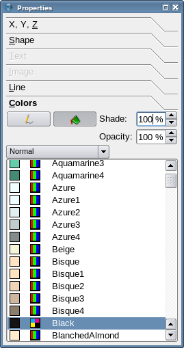
Given sufficient time and patience, you could play around with the Color tab in Properties to figure out how to change line and fill colors. Admittedly, it's takes more time and perhaps a lot more patience to understand how the gradients feature is used. Here we try to give you a head start on this.
On To the Gradients
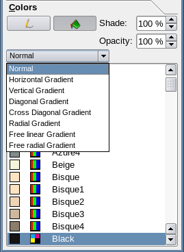
| When you click on the button with the default label Normal, you see the list of choices, as shown to the left. Let's begin with a simple, Horizontal gradient.
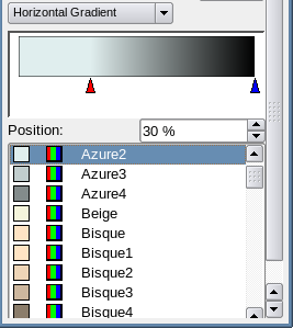
To the right, we now see a dramatic change in our Color tab – we've given up some dialog real estate to this new section in the middle. This rectangle is a simple depiction of our gradient, and since we haven't changed anything, it's still all black. The upward-pointing triangles underneath allow us to determine where a color begins to change toward the next gradient. The red triangle is our selected point, where we can change the color, so lets change to Azure2. |
File:Horizgrandient.png | |
| And here we see the result. You can also see that not only does our display in the tab change, but also the actual shape on the page.
Notice the Position value – 0% tells us this is all the way to the left of the shape, 100% would all the way to the right. Move the triangle or enter a value in the Position box. |

| |
|
So now with the position at 30%, there is a solid color from the left border until we reach the 30% point, where the gradient begins. | 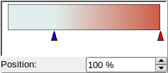
If we click on the rightmost triangle to select it, we can then independently change its color and position. |
| In addition, we are not restricted to only a two-color gradient. Click the area where the triangles are positioned and you can add more colors, all adjusted independently (you should see a + appear next to your cursor).
To remove a color point, click and drag it away. |

| |
More Gradients
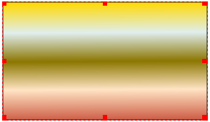
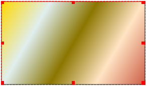
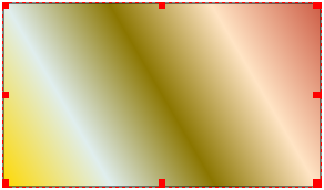
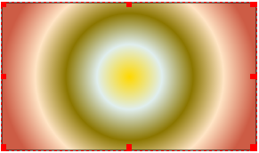
Here is what these other choices for the various types of gradients look like.
