Drop Shadows in 1.5.x: Difference between revisions
Jump to navigation
Jump to search
| Line 8: | Line 8: | ||
In the 1.5.x versions, we now have a new section in Properties. | In the 1.5.x versions, we now have a new section in Properties. | ||
{| | {| cellpadding="15px" width = "50%" | | ||
[[File:Dropshadows3.png]] | |[[File:Dropshadows3.png]] | ||
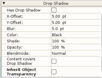
|Because of some particulars of the appearance of Properties, you may not be able to see all of these settings without scrolling. This image is a composite made to show all settings at once. | |Because of some particulars of the appearance of Properties, you may not be able to see all of these settings without scrolling. This image is a composite made to show all settings at once. | ||
|} | |} | ||
So now let's look at a simple situation where we just check the Has Drop Shadow box, leave offsets as they are, color Black, and set Opacity to 80%. | |||
[[File:Dropshadows4.png]] | |||
Revision as of 21:19, 6 September 2016
We now have as of 1.5.x versions of Scribus REAL Drop Shadows. You may be familiar with shadows as a type of text effect. These had very limited adjustments, just the color, the X/Y shift of the color, and the saturation. Here we see an example of this:
I've accentuated the distances, and used a black shadow with 30% saturation. Notice the sharp edges of the shadow, about which you have no choice.
Comes 1.5.x
In the 1.5.x versions, we now have a new section in Properties.

|
Because of some particulars of the appearance of Properties, you may not be able to see all of these settings without scrolling. This image is a composite made to show all settings at once. |
So now let's look at a simple situation where we just check the Has Drop Shadow box, leave offsets as they are, color Black, and set Opacity to 80%.

