Kolory dodatkowe w Scribusie
- Linkownia
- Zrobione w Scribusie
- Gazety i czasopisma
- Polska lokalizacja Scribusa
- Darmowe polskie fonty
- Słowniczek pojęć z DTP
- Pierwsze kroki ze Scribusem
- Praca z ramkami tekstowymi
- Praca z ramkami graficznymi
- Praca ze stronami wzorcowymi
- Praca w Edytorze artykułów
- Tekst na krzywej
- Scribus w Ubuntu Linux
- Klik i Scribus działa
- Instalacja za pomocą Cmake
- Tworzenie spisu treści
- Formularze PDF
- Kolory dodatkowe
- Obrazek ze ścieżką odcięcia
- Instalacja profili ICC
- Dodawanie fontów
- Import grafik EPS
- Zawieszone spójniki
- Twój pierwszy artykuł
- Tworzenie hiperłączy
- Zarządzanie kolorami
- Skąd pobrać Scribusa?
- Podgląd wydruku nie działa
- Scribus dla MacOSX?
- Dodawanie fontów
- Scribus po polsku
- Type 1 i ligatury
- Automatyczne numery stron
- Interlinia w Scribusie
- Pierwsze kroki z DTP
- Skalowanie obrazka w ramce
- Export do PDF/X-3
- Ligatury i cyfry nautyczne?
- Pomoc w rozwoju Scribusa
- Przykładowe dokumenty
- Zgłaszanie błędów
- Słowniki dzielenia na sylaby
Wymagania
|
Kolory spotowe
Spot colours are single ink colours, rather than colours produced by four (CMYK) or six (CMYKOG) inks in the printing process (process colours). They can be obtained by special vendors, but sometimes the printers have found their own way of mixing inks to match defined colours.
Spot colours may be desired for several reasons:
- Economy: if the document to print contains less than four colours, it may be less expensive to use ready mixed inks than to render them as a mixture of inks. The reason is that less plates are required. This is often used in newsprint, where advertisers may be able to use only black and red, for example. Another common use case is business cards.
- Quality: it isn't always possible to equal a certain colour with a mixture of inks, especially when they are printed on different materials or with different machines.
- Spot colours allow the printing of special colours that can't be mixed with the usual CMYK inks. The most common examples are out-of-gamut colours (like some very saturated blues and oranges) and metallic inks (gold, silver, copper print, etc.), but other inks, such as flourescent inks, also exist.
More on spot colours can be found in this Wikipedia article.
The PDF specification supports the concept of spot colours. In terms of PDF information, a spot colour is merely a colour reference which is defined by a name. This name is supposed to be known by the printer and will determine which colour is printed. A PDF spot colour also includes a RGB/CMYK information that may be used in cases where spot colours are not supported, e.g., viewing the file with a PDF reader. It is up to the user to choose a colour that will approximate the spot colour as closely as possible.
More on PDF spot colors in this PDF reference from Adobe (see pages 234 and 532)
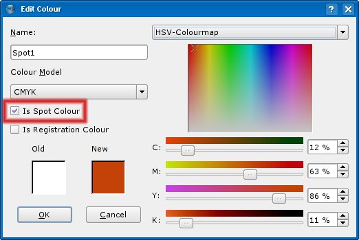
Scribus provides a way to generate PDFs with spot colours: it is as simple as going to Edit/Colours/New or Edit menu item and checking the corresponding checkbox in the Edit Colour window.
Standardy przemysłowe dla kolorów spotowych
There are several industry standards for spot colours, some of which are only used in certain areas of the world. The most widely used colour standard is produced by Pantone.
The Pantone colour set is a list of colours maintained by a company with the same name. Each colour corresponds to a name assigned by Pantone.
In terms of software, Pantone colours are – mostly – used as spot colours. To produce a document with Pantone (spot) colours, one has to:
- Choose the colour(s) from a Pantone colour set (which absolutely essential).
- Create as many colours as needed in RGB or CMYK colour space in in Edit/Colours/New. You should try to match the colour as closely as possible if you want to print a proof on an inkjet or laserjet (optional; it doesn't affect the final result that comes from the press...)
- Assign the the correct Pantone names.
- Go to File/Export/Save as PDF menu item, open the Colour tab, switch the Output indended for: dropdown menu to Printer and uncheck the option Convert spot colours to process colours.
- Pass the PDF file to a print shop that supports Pantone colours.
Although the Pantone colour tables contain RGB, CMYK and HTML values for each colour, the way the colour looks on screen (either in Scribus or a PDF viewer) is irrelevant in offset printing, because it will be printed according to its name.
Some programs like QuarkXpress, InDesign or Illustrator already come with built-in lists of Pantone colour names and RGB/CMYK representations. In terms of workflow this feature eliminates the need for steps 2 and 3. However, since there is no real on screen representation, the most important step, which is step 1, is indispensable.
Nota bene: since exact colour matching requires real world colour tables anyway, this is no real disadvantage. It can even turn out to be an advantage, because Scribus users are not mislead about the nature of built-in spot colour swatches. There are still lots of professional users in the world who believe that the Pantone and other colour swatches in a software really produce spot colours on screen and on deskjets ...
Other vendors of colour standards:
Jak utworzyć własny zestaw kolorów spotowych
As said above, you don't need spot colour swatches in your software, but a real colour reference table. Next, you need to know how to include your colours in Scribus. Open the file scribus13x.rc in your $home/.scribus directory under Linux/Unix, or in Documents and Preferences\username under Win32. Open the file with a text editor (a real text editor, not notepad!). At about line 40 you see the list of colours known to Scribus:
<COLOR Register="0" Spot="0" RGB="#f0f8ff" NAME="AliceBlue" />
<COLOR Register="0" Spot="0" RGB="#faebd7" NAME="AntiqueWhite" />
<COLOR Register="0" Spot="0" RGB="#ffefdb" NAME="AntiqueWhite1" />
<COLOR Register="0" Spot="0" RGB="#eedfcc" NAME="AntiqueWhite2" />
<COLOR Register="0" Spot="0" RGB="#cdc0b0" NAME="AntiqueWhite3" />
<COLOR Register="0" Spot="0" RGB="#8b8378" NAME="AntiqueWhite4" />
<COLOR Register="0" Spot="0" RGB="#7fffd4" NAME="Aquamarine" />
<COLOR Register="0" Spot="0" RGB="#7fffd4" NAME="Aquamarine1" />
Copy the first line into a new document in your text editor. Next, you need a colour reference. Search for the colours you need. For each colour you write a line that looks as follows:
<COLOR Register="0" Spot="1" RGB="#4a39ff" NAME="Pantone 183c" />
Note the changes: The value Spot is set to 1, and the colour is a (faked, in this case) Pantone colour name that will be seen by your printer.
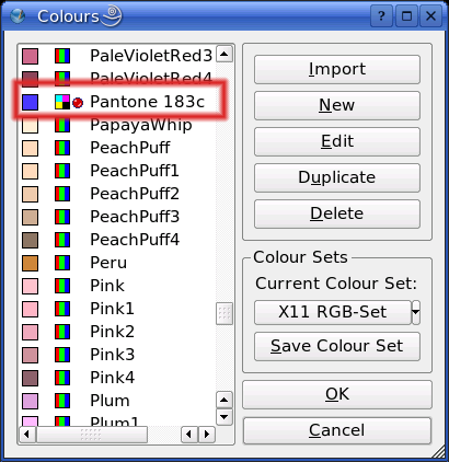
How do you find an approximate colour now? That's easy. You can use KColorEdit for example, which will provide you the Hex digits that need to be inserted after RGB=#". Another opportunity is the Wacker Art RGB Colour Mixer (English and German, requires Java) that will do the same job. Once you have included all spot colours you need, save your file (just in case...). Then copy all lines to the clipboard and insert them right before or after the colour list in scribus13x.rc. Now open Scribus, et voilà: Your spot colours appear in the list:


