Advanced Drop Caps: Difference between revisions
Jump to navigation
Jump to search
C schaefer (talk | contribs) (New page: Initials are the first letter of a text which are bigger than the rest of the text. In old books, they are often colorful and artistic paintings. See [http://en.wikipedia.org/wiki/Initial...) |
m (Changed Category:Tutorials to Category:HOWTO) |
||
| (26 intermediate revisions by 4 users not shown) | |||
| Line 1: | Line 1: | ||
[[Category:Text]][[Category:HOWTO]][[Category:EN]] | |||
Scribus has a built-in function to achieve this effect: in | <div style="font-size: 400%; line-height: 70%; float: left; font-family: serif">D</div>rop caps are the first letter of a paragraph, displayed bigger than the rest of the text, then dropped down below the first line's baseline. In old books, they are often colorful and artistic paintings, and were part of the process of [http://en.wikipedia.org/wiki/Illumination_%28manuscript%29 ''illumination''], in which the pages of a book would be illustrated in the margins, and various colors applied to the text. See [http://en.wikipedia.org/wiki/Initials Wikipedia] for some nice examples.<br>Scribus has a built-in function to achieve this effect: in ''Edit > Paragraph Styles'', the option "Drop Caps" creates a big letter at the beginning of a text: | ||
[[Image:initial0.png]] | [[Image:initial0.png]] | ||
{| cellpadding=5px | | |||
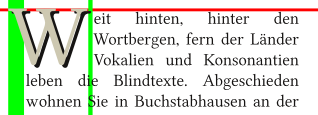
|[[Image:Dropcapshadow.png]]||<div style="font-size: 400%; line-height: 75%; float: left; font-family: serif">T</div>o the left, you see what you can do with the built-in function. You can specify the number of lines that the drop cap uses. You can also specify the distance from text (narrow vertical green bar), and the indentation of the body of the text (wide vertical green bar). A limitation is that you cannot alter the distance from the top of the drop cap to the top of the rest of the text (horizontal red bar). Furthermore as you see, you can in addition make this drop cap have a shadow -- this is a separate operation and will need to be done by selecting the letter after you have applied the style. | |||
|} | |||
<hr> | |||
# Create a | The following method is a bit more flexible and allows more effects: | ||
# Create a text frame and load your text. Adjust the font, size etc. as they fit your needs. | |||
# Delete the first letter of your text. | # Delete the first letter of your text. | ||
# Create a new text frame (we call this frame "initial") and type the letter you have deleted in the other frame. | |||
# Set the size of text frame "initial" to a high value. Remember,it just contains one letter! | |||
# Create a new | # Change the text frame "initial" with "Item > Convert to" into outlines. If necessary, the drop cap's size can now be changed like a graphic | ||
# Set the size of | # In the properties dialog, on the "Shape" tab, enable "Text Flows Around Frame" and then "Use Bounding Box" on the "initial" frame. | ||
# Change the | # Now just move the initial frame in a way, that its position is in the upper left corner of the original textframe. The text in the frame will flow around it. | ||
# In the properties dialog, on the "Shape" | |||
# Now | |||
{| cellpadding=10px width=90% | | |||
|[[Image:initial1.png]] | |||
|The standard version. The text is set in [http://linuxlibertine.sourceforge.net/ Linux Libertine], 12 pt. The drop cap uses the same font, but the size is 50 pt. | |||
|- | |||
| align=right|A second drop cap behind the first one. After some colour changes we have a shadow. | |||
|[[Image:initial2.png]] | |||
|- | |||
|[[Image:Dropcapshadow1.png]] | |||
|With this technique, a "shadow" can be of a different size, even a different font. This example uses a third empty frame to control the text flow around this complex drop cap. | |||
|- | |||
|align=right|Filled with a colour gradient | |||
|[[Image:initial3.png]] | |||
|- | |||
|[[Image:initial4.png]] | |||
|Last, but not least: the outlines can be converted to an image frame. See also [[How to fill a Scribus text with an image]] | |||
|} | |||
(c) Thomas Zastrow, 2007 | (c) Thomas Zastrow, 2007 | ||
'''The content of this page is licenced under the [http://www.fsf.org/licensing/licenses/fdl.html Free Documentation Licence].''' | '''The content of this page is licenced under the [http://www.fsf.org/licensing/licenses/fdl.html Free Documentation Licence].''' | ||
Latest revision as of 02:08, 12 November 2013
D
rop caps are the first letter of a paragraph, displayed bigger than the rest of the text, then dropped down below the first line's baseline. In old books, they are often colorful and artistic paintings, and were part of the process of illumination, in which the pages of a book would be illustrated in the margins, and various colors applied to the text. See Wikipedia for some nice examples.
Scribus has a built-in function to achieve this effect: in Edit > Paragraph Styles, the option "Drop Caps" creates a big letter at the beginning of a text:
The following method is a bit more flexible and allows more effects:
- Create a text frame and load your text. Adjust the font, size etc. as they fit your needs.
- Delete the first letter of your text.
- Create a new text frame (we call this frame "initial") and type the letter you have deleted in the other frame.
- Set the size of text frame "initial" to a high value. Remember,it just contains one letter!
- Change the text frame "initial" with "Item > Convert to" into outlines. If necessary, the drop cap's size can now be changed like a graphic
- In the properties dialog, on the "Shape" tab, enable "Text Flows Around Frame" and then "Use Bounding Box" on the "initial" frame.
- Now just move the initial frame in a way, that its position is in the upper left corner of the original textframe. The text in the frame will flow around it.

|
The standard version. The text is set in Linux Libertine, 12 pt. The drop cap uses the same font, but the size is 50 pt. |
| A second drop cap behind the first one. After some colour changes we have a shadow. | 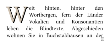
|
|
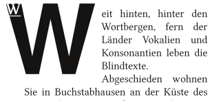
With this technique, a "shadow" can be of a different size, even a different font. This example uses a third empty frame to control the text flow around this complex drop cap. |
| Filled with a colour gradient | 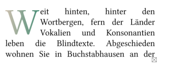
|
|
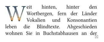
Last, but not least: the outlines can be converted to an image frame. See also How to fill a Scribus text with an image |
(c) Thomas Zastrow, 2007 The content of this page is licenced under the Free Documentation Licence.

