Drop Shadows: Difference between revisions
| (10 intermediate revisions by the same user not shown) | |||
| Line 1: | Line 1: | ||
{{HOWTO Index}} | |||
Scribus as of the writing of this article does not have a built-in drop shadow method. Certainly, one can use Gimp or Inkscape to create some drop shadow-like effects, then import as an image. Here I'd like to show a method which you might consider, created entirely within Scribus. | Scribus as of the writing of this article does not have a built-in drop shadow method. Certainly, one can use Gimp or Inkscape to create some drop shadow-like effects, then import as an image. Here I'd like to show a method which you might consider, created entirely within Scribus. | ||
====The Challenge==== | ====The Challenge==== | ||
We are going to use gradients to accomplish this. The difficulty is that, if we wanted to create this for a rectangular object, as most content is, there is no suitable gradient that works in this fashion, where we have horizontal fading at the vertical | We are going to use gradients to accomplish this. The difficulty is that, if we wanted to create this for a rectangular object, as most content is, there is no suitable gradient that works in this fashion, where we have horizontal fading at the vertical edges and vertical fading at the horizontal edges. | ||
[[File:Dropshadow.png]] | [[File:Dropshadow.png]] | ||
| Line 45: | Line 47: | ||
They say that ''baking is a science, cooking is an art'', and here is where some artistic judgement comes to play, since Scribus seems to be both science and art. We've done all our numbers right – height, width, X-Pos, and Y-Pos, but look at that skinny white cross in our square. This is real and will show in the final PDFs you make. | They say that ''baking is a science, cooking is an art'', and here is where some artistic judgement comes to play, since Scribus seems to be both science and art. We've done all our numbers right – height, width, X-Pos, and Y-Pos, but look at that skinny white cross in our square. This is real and will show in the final PDFs you make. | ||
This will be your own judgement call, but hold down Shift and Alt, so that you can move in hundredths of points, and move each triangle toward the center. I ended up moving each of the four triangles 0. | This will be your own judgement call, but hold down Shift and Alt, so that you can move in hundredths of points, and move each triangle toward the center. I ended up moving each of the four triangles 0.06 pts (0.021 mm or 0.001 inch) toward the center. Use a high Zoom in Scribus, at least 800 to 1600%, and in the end check after export to PDF. Part of the reason this is a judgement is that as you bring the triangles closer you start to see some edge effect at the corners, something like a crease. | ||
====Don't forget to Save==== | ====Don't forget to Save==== | ||
| Line 53: | Line 55: | ||
|- | |- | ||
|[[File:Dropshadow_usage.png]] | |[[File:Dropshadow_usage.png]] | ||
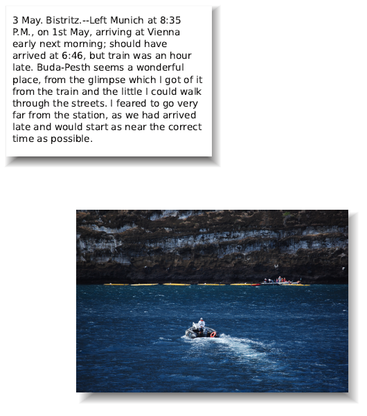
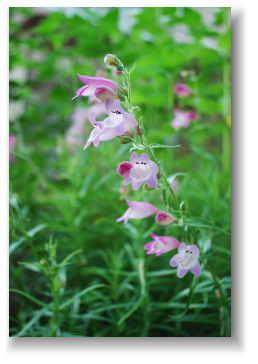
|Here are a couple of instances of usage with a text frame and image frame. With the former, I let just a little of the shadow peak out on top and to the | |Here are a couple of instances of usage with a text frame and image frame. With the former, I let just a little of the shadow peak out on top and to the left, to define those edges of the frame (the screenshot was taken from Adobe Reader, so this is not the frame edge as it might be seen in Scribus). While the shadow looks darker behind the text frame, I think this is just due to the contrast with the white versus the dark edges of the image. | ||
Also note that you can adjust the opacity of the shadow to lighten as needed, which should visually reduce the corner crease effect. If you wish other colors, take a copy from your Scrapbook, ungroup, and change colors as desired. | |||
|- | |||
|[[File:Dropshadow_usage2.png | right]] | |||
|Here is another example, taking it one step further – what I have done is to put the scrapbook item on a custom page barely bigger than the size of the object. Then, I exported the page as a TIFF file, and imported to Gimp. | |||
In Gimp, I then applied a Gaussian blur to soften the edges and content further, then exported as a TIFF to load into an image file. Once in the frame, I check ''Scale to Frame Size'', but leave ''Proportional'' unchecked, so I can adjust the size of the image frame and its contents as needed. Once again, you can save this frame in your Scrapbook for future use. | |||
Gimp has many different sorts of blur and each has various settings to get the look you like. | |||
|} | |} | ||
====Something to Note==== | |||
If you are going to have something like this commercially printed, be sure to check that these shadows will properly be printed, especially if they contain transparency. You will want to use PDF 1.4 or better for your export. Most likely PDF /X-1a will not work, since this is based on 1.3. | |||
Latest revision as of 01:59, 10 September 2012
| Installation • Usage • PDF issues • Imposition • Other |
Scribus as of the writing of this article does not have a built-in drop shadow method. Certainly, one can use Gimp or Inkscape to create some drop shadow-like effects, then import as an image. Here I'd like to show a method which you might consider, created entirely within Scribus.
The Challenge
We are going to use gradients to accomplish this. The difficulty is that, if we wanted to create this for a rectangular object, as most content is, there is no suitable gradient that works in this fashion, where we have horizontal fading at the vertical edges and vertical fading at the horizontal edges.
The Solution
I will warn at the outset that this is hardly a perfect method, but what we will do is to create a square template from triangular elements, and arrange the gradient in each part so that we end up with the edge gradients all going in the correct direction. It's a bit of work, but what you will have at the end is a grouped object you can save in your Scrapbook, then reuse and resize as needed, sort of a make once, use many approach.
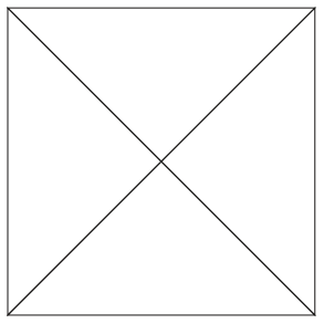
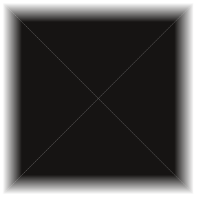
Here is what we want to create:
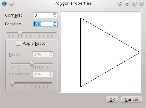
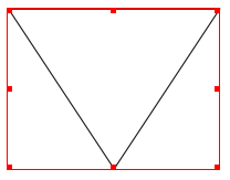
which is made from 4 triangles, and since this is a square, these are all right triangles, with hypotenuses the same size. We will only actually draw 2 of them, then copy. We want particular orientations for these, and here is one:
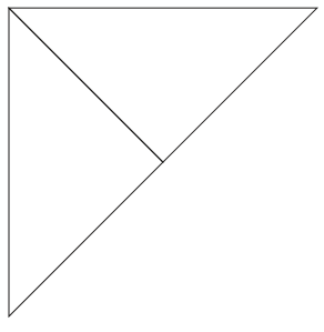
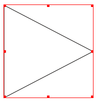
The other should show a rotation of 60°. Make one of each, and as I illustrate here, size and proportions are arbitrary as you create them:
|
|
The Power of Properties
What can we say about the right triangles we want to create? They're special because they're right triangles, but even more so because the sides are equal. What that means is that if we stand each one on its hypotenuse, the height is exactly one-half the base. We don't have to do any trigonometry, because we can see that by definition, the triangles touch in the center of the square.
Since I usually work in units of points, I adjusted the triangle to the left above so that height was 250 pts and width was 125 pts. For the other, the width was 250, and the height 125.
Placement is going to be critical, but with Properties it's easy. Pick round numbers for X-Pos and Y-Pos and match the values for the two triangles:
And it doesn't get any harder to finish. Select these two frames, then select Item > Multiple Duplicate (not Duplicate), make one copy and leave the positions for horizontal and vertical shift at 0. It looks like nothing has happened, but that's because you have a copy of each right on top of the originals. Hold down Shift and select each type (you only want the top layer). Now flip horizontally, and then flip vertically (doesn't have to be in that order, of course), and you've created your basic shape:
Colors and Gradients
Now we work on each triangle one at a time. Up until now, we left the default color of the borders as Black, but we don't want borders, so make that None. The top and bottom triangles need vertical gradient fills, the right and left need horizontal gradient fills. For this example, I will just use Black and White for the colors, but for each, White needs to be on the outside of our square.
What I found was that if you leave the Black color marker at the peaks of the triangles, there won't be enough color at the outer edge to appreciate any gradient. I would suggest moving the mark for the Black at least 80% over from its starting position. Since there are opposite triangles, the actual settings will be either 80% or 20% – the appearance is your guide.
Scribus as Art
They say that baking is a science, cooking is an art, and here is where some artistic judgement comes to play, since Scribus seems to be both science and art. We've done all our numbers right – height, width, X-Pos, and Y-Pos, but look at that skinny white cross in our square. This is real and will show in the final PDFs you make.
This will be your own judgement call, but hold down Shift and Alt, so that you can move in hundredths of points, and move each triangle toward the center. I ended up moving each of the four triangles 0.06 pts (0.021 mm or 0.001 inch) toward the center. Use a high Zoom in Scribus, at least 800 to 1600%, and in the end check after export to PDF. Part of the reason this is a judgement is that as you bring the triangles closer you start to see some edge effect at the corners, something like a crease.
Don't forget to Save
Group the triangles, then Save to your Scrapbook. Now it's ready to use. Even though we made a square, we can stretch it this way and that for our needs. Place as you wish behind other frames – obviously, a text frame will need a background color selected.
The Result
Something to Note
If you are going to have something like this commercially printed, be sure to check that these shadows will properly be printed, especially if they contain transparency. You will want to use PDF 1.4 or better for your export. Most likely PDF /X-1a will not work, since this is based on 1.3.
