Creating a Graph, Part 2: Difference between revisions
m (Geishi ALL THE THINGS!) |
|||
| (23 intermediate revisions by 3 users not shown) | |||
| Line 1: | Line 1: | ||
{| align="right" | | {{Scripting Index}}[[Category:EN]][[Category:Graphics]] | ||
| bgcolor="palegreen"|You may also be interested in:<br> [ | {| align="right" cellpadding=5px| | ||
| bgcolor="palegreen"|You may also be interested in:<br> [[Automatically Creating a Graph]]<br>[[Advanced Graphing]]<br> or <br>[[Making a Pie Chart]] | |||
|} | |} | ||
This page will start with the script '''graph.py''', and create a new '''graph2.py''' to add some additional features. | This page will start with the script '''graph.py''', and create a new '''graph2.py''' to add some additional features. | ||
| Line 43: | Line 44: | ||
==Now, the Results== | ==Now, the Results== | ||
So, here is an example of the final result after entering: | {| | ||
| valign="top" width="40%" cellpadding="20px" |So, here is an example of the final result after entering: | |||
Title = Graph of Time vs Money | Title = Graph of Time vs Money | ||
| Line 59: | Line 61: | ||
Y-Tick mark interval = 1000 | Y-Tick mark interval = 1000 | ||
|| [[Image:Timevsmoneygraph2.png|thumb|400px]] | |||
|[[Image:Timevsmoneygraph2.png|thumb|400px]] | |||
|- | |- | ||
| And here is the information we can use in Scribus (detail of the small text frame above): | | And here is the information we can use in Scribus (detail of the small text frame above): | ||
|- | |- | ||
|[[Image:Timevsmoneygraph_detail.png|thumb|300px]] | |[[Image:Timevsmoneygraph_detail.png|thumb|300px]] | ||
| valign="top" | You would consider this a working frame to use while<br> adding other graph features. | |||
The graph could be edited, and the frame then deleted<br> or [[Working_with_text_frames#XYZ_Tab:_The_Rest|disable printing]]. | |||
|} | |} | ||
{| cellpadding="10px" | | {| cellpadding="10px" | | ||
| bgcolor="palegreen" | Something worth mentioning: | | bgcolor="palegreen" | ''Something worth mentioning:'' | ||
You might be thinking at this point, "Who would want to mess around with a calculator for data points?" The answer is that Scribus will | You might be thinking at this point, "Who would want to mess around with a calculator for data points?" The answer is that Scribus will calculate for you. | ||
For example, let's say you have a data point (150, 5345) in the above graph. Make a small rectangle shape or circle, adjust size to <br>2pts × 2pts. In the X-Pos requestor in the XYZ tab, delete the contents, enter values for <tt>xorigin+xdata*xscale</tt>, or in this case, 150+150*1.096, then press Tab -- the value is calculated, the point shifted, and then Y-Pos highlighted. Then for Y-Pos, <tt>yorigin-ydata*yscale</tt>, or 450-5345*0.035, then Tab (or Return). The shape goes to X-Pos = 314.40, Y-Pos = 262.92 -- simple. | For example, let's say you have a data point (150, 5345) in the above graph. Make a small rectangle shape or circle, adjust size to <br>2pts × 2pts. In the X-Pos requestor in the XYZ tab, delete the contents, enter values for <tt>xorigin+xdata*xscale</tt>, or in this case, 150+150*1.096, then press Tab -- the value is calculated, the point shifted, and then Y-Pos highlighted. Then for Y-Pos, <tt>yorigin-ydata*yscale</tt>, or 450-5345*0.035, then Tab (or Return). The shape goes to X-Pos = 314.40, Y-Pos = 262.92 -- simple. | ||
For more data points, just '''Item > Duplicate''', then enter the formula for the next point. [ | For more data points, just '''Item > Duplicate''', then enter the formula for the next point. [[Working_with_text_frames#XYZ_Tab:_The_Rest|Lock your points]] so they don't accidentally get moved. | ||
|} | |} | ||
==Script: graph2.py== | ==Script: graph2.py== | ||
<syntaxhighlight lang="python"> | |||
#!/usr/bin/env python | #!/usr/bin/env python | ||
| Line 165: | Line 166: | ||
scribus.redrawAll() | scribus.redrawAll() | ||
</ | </syntaxhighlight> | ||
{| | {| | ||
| bgcolor="lightgreen"|Link to:<br> [ | | bgcolor="lightgreen"|Link to:<br> [[Automatically Creating a Graph]] | ||
|} | |} | ||
Latest revision as of 13:46, 24 November 2013
| You may also be interested in: Automatically Creating a Graph Advanced Graphing or Making a Pie Chart |
This page will start with the script graph.py, and create a new graph2.py to add some additional features.
graph.py makes a simple graph with X and Y axes, labels for the axes, and a title. With graph2.py we will add the ability to assign a scale to the axes, make user-defined tick marks, and then give some feed back about the typographic features of this graph.
New requestors
    xrange = int(scribus.valueDialog('Maximum X Scale', 'Enter Top X Value\n(Scale)'))
    xmark = int(scribus.valueDialog('Tick Mark Interval', 'Enter X Interval for Tick Marks'))
The first asks for the value for the total X axis in the units of the graph (no need to name the units here), which we need to convert to an integer. The second asks for the number of units between tick marks on the X axis scale.
From this we can calculate a typographic scale for our graph, using the fact that we have set the width of the graph with the variable xaxis:
xscale = xaxis/xrange # this gives you typographic points per data unit
Now we can generate the tick marks, using a while loop:
    while (xtick < (xorigin + xaxis)):
        xt = scribus.createLine(xtick, yorigin, xtick, yorigin - 10)
        scribus.setLineWidth(t, xt)
        scribus.setLineColor(color, xt)
        scribus.setFillColor(color, xt)
        xtick = xtick + xmark * xscale
These tick marks will appear above the axis line, but could as easily appear below -- change -10 to +10.
Now, as an aid to the Scribus user, let's add a text box that will help with the page measurements for adding other features with Scribus. Also, we will have a reminder about the settings we supplied:
    caption = "Scale for this graph\n\n" "X: " + str(xmark) + "units/mark\n" + "Y: "
    caption = caption + str(ymark) + "units/mark\n" + str(xscale) + " pts/unit (X)\n"
    caption = caption + str(yscale) + " pts/unit (Y)"
# These caption statements can be combined to one line
    S = scribus.createText(200, 120, 150, 80)
    scribus.setTextColor("Blue", S)
    scribus.setText(caption, S)
    scribus.setTextAlignment(1, S)
    scribus.setFont("Nimbus Roman No9 L Bold", S)
    scribus.setFontSize(8, S)
Now, the Results
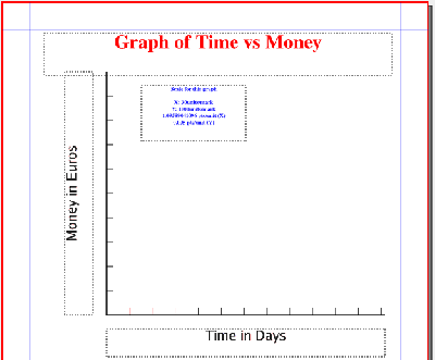
| So, here is an example of the final result after entering:
Title = Graph of Time vs Money X-label = Time in Days Y-label = Money in Euros Maximum X value = 365 X-Tick mark interval = 30 Maximum Y value = 10000 Y-Tick mark interval = 1000 |
|
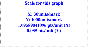
| And here is the information we can use in Scribus (detail of the small text frame above): | |
| You would consider this a working frame to use while adding other graph features. The graph could be edited, and the frame then deleted |
| Something worth mentioning:
You might be thinking at this point, "Who would want to mess around with a calculator for data points?" The answer is that Scribus will calculate for you. For example, let's say you have a data point (150, 5345) in the above graph. Make a small rectangle shape or circle, adjust size to For more data points, just Item > Duplicate, then enter the formula for the next point. Lock your points so they don't accidentally get moved. |
Script: graph2.py
#!/usr/bin/env python

# File: graph2.py
# originally 2006.05.17
# this version 2006.05.18
# creates basic graph with axis labels

import scribus

xorigin = 150      # x-origin of graph
yorigin = 450     # y-origin of graph
xaxis=400      #x axis length
yaxis=350      #y axis length
color="Black"
a = 1.5 # width of lines
t = 0.8 # width of scale markers
if scribus.haveDoc():
    title = scribus.valueDialog('Title','Enter Title')
    xlabel = scribus.valueDialog('X-axis Label','Enter X-Label')
    ylabel = scribus.valueDialog('Y-axis Label','Enter Y-Label')
    xrange = int(scribus.valueDialog('Maximum X Scale', 'Enter Top X Value\n(Scale)'))
    xmark = int(scribus.valueDialog('Tick Mark Interval', 'Enter X Interval for Tick Marks'))
    xtick = xorigin
    xscale = xaxis/xrange # this gives you typographic points per data unit
    yrange = int(scribus.valueDialog('Maximum Y Scale', 'Enter Top Y Value\n(Scale)'))
    ymark = int(scribus.valueDialog('Tick Mark Interval', 'Enter Y Interval for Tick Marks'))
    ytick = yorigin
    yscale = yaxis/yrange # this gives you typographic points per data unit
    scribus.setRedraw(1)
    scribus.setUnit(0)
    d = scribus.createLine(xorigin,yorigin,xorigin+xaxis,yorigin) # create X axis
    scribus.setLineWidth(a, d)
    scribus.setLineColor(color, d)
    scribus.setFillColor(color, d)
    e = scribus.createLine(xorigin,yorigin,xorigin,yorigin-yaxis) # create Y axis
    scribus.setLineWidth(a, e)
    scribus.setLineColor(color, e)
    scribus.setFillColor(color, e)
    xtick = xtick + xmark * xscale
    ytick = ytick - ymark * yscale
    while (xtick < (xorigin + xaxis)):
        xt = scribus.createLine(xtick, yorigin, xtick, yorigin - 10) # creating X axis tick lines
        scribus.setLineWidth(t, xt)
        scribus.setLineColor(color, xt)
        scribus.setFillColor(color, xt)
        xtick = xtick + xmark * xscale
    while (ytick > (yorigin - yaxis)):
        yt = scribus.createLine(xorigin, ytick, xorigin + 10, ytick) # creating Y axis tick lines
        scribus.setLineWidth(t, yt)
        scribus.setLineColor(color, yt)
        scribus.setFillColor(color, yt)
        ytick = ytick - ymark * yscale
    T = scribus.createText(60, 45, 500, 60) # Title frame
    scribus.setTextColor("Red", T)
    scribus.setText(title, T)
    scribus.setTextAlignment(1, T)
    scribus.setFont("Nimbus Roman No9 L Bold", T)
    scribus.setFontSize(28, T)
    XL = scribus.createText(xorigin, yorigin + 20, 400, 40) # X axis label
    scribus.setText(xlabel, XL)
    scribus.setTextAlignment(1, XL)
    scribus.setFont("Luxi Sans Regular", XL)
    scribus.setFontSize(20, XL)
    YL = scribus.createText(90, 450, 350, 40) # Y axis label
    scribus.setText(ylabel, YL)
    scribus.setTextAlignment(1, YL)
    scribus.setFont("Luxi Sans Regular", YL)
    scribus.setFontSize(20, YL)
    scribus.rotateObject(90,YL)
    caption = "Scale for this graph\n\n" "X: " + str(xmark) + "units/mark\n" + "Y: "
    caption = caption + str(ymark) + "units/mark\n" + str(xscale) + " pts/unit (X)\n"
    caption = caption + str(yscale) + " pts/unit (Y)"
# These caption statements can be combined to one line
    S = scribus.createText(200, 120, 150, 80) # create information frame
    scribus.setTextColor("Blue", S)
    scribus.setText(caption, S)
    scribus.setTextAlignment(1, S)
    scribus.setFont("Nimbus Roman No9 L Bold", S)
    scribus.setFontSize(8, S)

scribus.redrawAll()| Link to: Automatically Creating a Graph |

