Page Layout - The Basics: Difference between revisions
m (Added HOWTO and EN headers.) |
m (→Magazine Layout: Added link to White space article.) |
||
| (7 intermediate revisions by the same user not shown) | |||
| Line 1: | Line 1: | ||
{{HOWTO Index}} [[Category:EN]] | {{HOWTO Index}} [[Category:EN]] [[Category:Design]] | ||
== Background == | == Background == | ||
This article will explain some basic page layout options, giving a short introduction | This article will explain some basic page layout options, giving a short introduction to such concepts as: | ||
* White Space | * White Space | ||
* Reading a Page | * Reading a Page | ||
| Line 39: | Line 39: | ||
All of the text and images were taken from the Wikipedia [https://en.wikipedia.org/wiki/London London] page. | All of the text and images were taken from the Wikipedia [https://en.wikipedia.org/wiki/London London] page. | ||
{{Annotation|note|All of the text used in these examples is left-justified. A discussion about text justification - which then leads on to hyphenation - is beyond the scope of this article.}} | {{Annotation|note|All of the text used in these examples is left-justified. A discussion about text justification - which then leads on to hyphenation - is beyond the scope of this article.}} | ||
== Word Processor Layout == | == Word Processor Layout == | ||
| Line 109: | Line 106: | ||
{{Annotation|note|If your reader keeps getting confused as to how to read your document that'll be less likely to concentrate on what you're saying. And if they're going to ignore what you're saying then why bother reading it in the first place?}} | {{Annotation|note|If your reader keeps getting confused as to how to read your document that'll be less likely to concentrate on what you're saying. And if they're going to ignore what you're saying then why bother reading it in the first place?}} | ||
So how about shifting things round? | {{Callout|idea|Baseline Grid|Something that's well worth mentioning here is the Baseline Grid. If you look at the page in figure 4 you'll see that the lines of text in each column "line-up" across the page. In other words, the bottom of the characters of the lines in each column are aligned at the same vertical positions as the bottoms of the characters in the other columns. This was achieved by using the '''Baseline Grid'''. Using the baseline grid makes it really easy to achieve this alignment without messing around moving columns up and down until they look right. If you haven't used the baseline grid before then it is recommended that you read this [[Baseline Grid Explained]] which explains a bit more about it. For most non-trivial layouts, using the baseline grid is essential as mis-aligned text can look very unprofessional. Please get to know your baseline grid, it really is a friend indeed.}} | ||
So, the images look like they're in the wrong place; how about shifting things round a bit? | |||
<br clear=all> | <br clear=all> | ||
== Alternative Three-Column Layout == | == Alternative Three-Column Layout == | ||
| Line 168: | Line 168: | ||
If you try and fill every space on the page it will start to look cluttered. It will look like you're desperate to fill every bit of page to get your money's worth. While this may in some cases be true, you should try and leave space where it looks fine and isn't compromising the content. In this way, you could say, that it's being deliberately put there. And so the earlier advice still holds. | If you try and fill every space on the page it will start to look cluttered. It will look like you're desperate to fill every bit of page to get your money's worth. While this may in some cases be true, you should try and leave space where it looks fine and isn't compromising the content. In this way, you could say, that it's being deliberately put there. And so the earlier advice still holds. | ||
So, to modify the original advice on white space: "If your text is nicely readable, and your images are placed to balance the page well, any white space left over is probably fine.".}} | So, to modify the original advice on white space: "If your text is nicely readable, and your images are placed to balance the page well, any white space left over is probably fine.". | ||
You can find out more about white space [[Whitespace|here]].}} | |||
Is this all you need to do? Well, no, not really. | Is this all you need to do? Well, no, not really. | ||
| Line 178: | Line 180: | ||
What about if you want to get a bit more "funky" with your layout? | What about if you want to get a bit more "funky" with your layout? | ||
{{clear}} | |||
== Mixed-Columns Layout == | == Mixed-Columns Layout == | ||
| Line 189: | Line 192: | ||
== Editing == | == Editing == | ||
It's worth taking the time to | It's worth taking the time to mention editing at this point. | ||
The examples in this article have all used the same text, styles, font and images because the purpose of the article was to show how different layouts affect your document. | The examples in this article have all used the same text, styles, font and images because the purpose of the article was to show how different layouts affect your document. | ||
| Line 226: | Line 229: | ||
* White Space - Don't let it rule you. Make it work for you. | * White Space - Don't let it rule you. Make it work for you. | ||
* Page Balance - With experience, when a page looks well balanced you'll know. | * Page Balance - With experience, when a page looks well balanced you'll know. | ||
* Editing - Don't force yourself | * Editing - Don't force yourself to stick with what you've got. Edit where necessary. | ||
Latest revision as of 09:56, 25 March 2015
| Installation • Usage • PDF issues • Imposition • Other |
Background
This article will explain some basic page layout options, giving a short introduction to such concepts as:
- White Space
- Reading a Page
- Page Balance
- Editing
It is not meant as a comprehensive tutorial showing you how to make a page layout. A whole book could be written on this subject and it may still not cover the kind of layout you need for your specific project. Several basic examples are shown with a short critique of each. It is hoped that once you have read the article you will have a better general understanding of page layout.
The advice and guidelines given here are for more "general" documents such as:
- Newsletters
- Magazines
- Reports
They don't not relate well to documents such as:
- Restaurant Menus
- Music Posters
- Books
Layout requirements for more specific documents like that are very much different and outside the scope of this article.
Notes
All of the layouts given in this article use the same:
- text
- font family
- images
- styles
The same text and styles are used throughout to show what happens to that same text under different layouts. A basic font family - Arial/Helvetica - is used so as not to confuse typography with layout design. Basic rectangular images - those that haven't been isolated from their backgrounds - are used as they are the most common types of images available.
This is done to show the differences between different layout designs, not different page designs.
You can think of page design as how you want the whole page to eventually look including fonts, colours, effects and everything else that goes into making a finished page. Layout design is more about the basic structure of how you put things on the page.
All of the text and images were taken from the Wikipedia London page.
Word Processor Layout
If you've come to Scribus from a Word Processor background, figure 1 is the sort of layout that you're probably used to seeing - or even producing yourself.
Unless you are told to make documents that look like this, please don't. You'll not be doing yourself or your readers any favours.
This type of layout:
- is very boring to look at
- has long lines of text that don't keep the reader's attention
- has lots of white space which isn't helping the layout
You might also notice that not all of the text can be put on the page; the "Heritage" section just stops without any warning. Obviously something needs to be done about this.
So what alternatives are there?
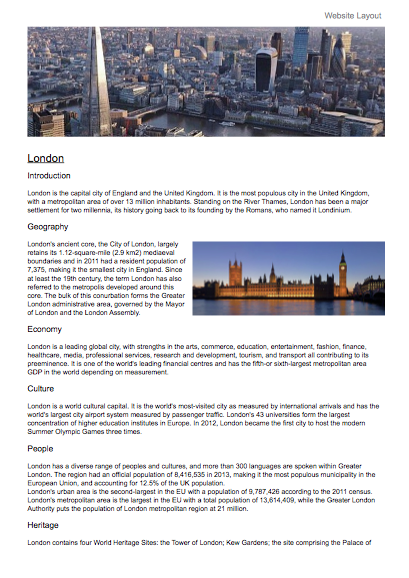
Website Layout
You might be coming from a website creation background and so may well be used to seeing the sort of layout in figure 2.
Here you've got a nice large image at the top of the page to catch the reader's attention and you've also got a secondary image - "floated" off to the right - to add a bit more interest.
While this might look nice, a PDF page or printed page - as opposed to a web page - has a finite size. So, as before, the text stops abruptly because it doesn't all fit on the page. You also, again, have very long lines of text that make it difficult to keep your place when reading them.
So what else is there? Well, what about using two columns of text instead?
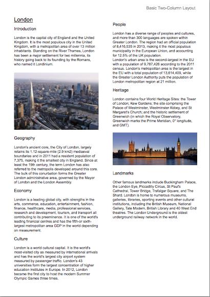
Basic Two-Column Layout
Multiple columns of text create shorter lines which are generally easier to read and they tend to reduce the amount of "unused" white space.
Figure 3 shows a simple two-column layout.
Hopefully this layout looks quite pleasing. The lines of text are shorter and it's still very easy to see how you are expected to read the page.
You'll also notice that you can get all of the text on the page now. You even have a gap which could be used for something else, such as another image or a quotation from the text.
You can fit all of the text on the page now because of the way sentences that don't go all the way up to the end of the line leave white space at their "ends". This "end space" adds up, sentence after sentence, to quite a bit of space.
While this layout looks reasonable, I think you'll agree that it's also quite boring. Read a bit, look a the image, read a bit more, another image, read a bit more, then finished. It's not very interesting to look at. In many ways it's just like the previous layout, but with less space wasted.
So what can you do about all of that? Well, what happens if you try three columns instead of two?
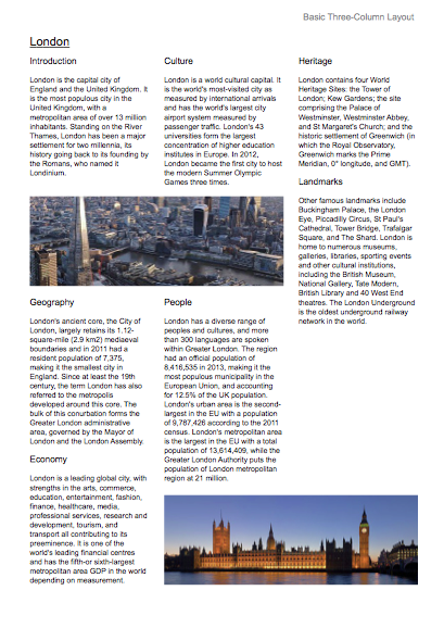
Basic Three-Column Layout
Figure 4 shows a basic three-column layout.
It's certainly a bit more interesting. The lines of text are nice and short and easy to read. Also notice that putting the image across the columns breaks the text up a bit, but there's a problem.
Once you've read the first paragraph, it's a bit confusing as to where you go next. Do you go over to the side or do you skip over the image and follow down from there? The image looks nice where it is but it gets in the way of the text a bit.
So, the images look like they're in the wrong place; how about shifting things round a bit?
Alternative Three-Column Layout
Figure 5 shows a different three-column layout.
While this layout gives you much more of an idea how you are supposed to read the page - straight down the columns - it still has a flaw which is that the first left-hand column now looks a bit uninviting to read.
The text looks a bit like you might find in the instructions for a medicine, or maybe it looks a little like something you might find in a recipe book. Either way, it's not pretty.
The problem is that, while increasing the number of columns will - depending on your language - usually reduce the amount of unused white space on your page (up to a certain point), it can - if you go too far - stop the text looking nice. There's no hard-and-fast rule, there's nothing to say which number of columns is correct; you just have to try it and see.
So, with all of this in mind, can you still use a three-column layout? Well, yes you can, but you need to be a bit more clever about it.
You might have noticed that in all of the examples so far - except from the first one - the images have been spread about the page, some to the left, some to the right, some at the top, some at the bottom. This has been done to "balance" the text and images.
Images like the ones used in the examples are full of colour; they totally cover the area on the page. This makes them look "heavier" than the text which has lots of little gaps in between the characters and words.
Because the images are heavier than the text it is better - in general - to arrange them around the page so that they're not in the same place.
Figure 6 shows an unbalanced layout where the images are all to one side of the page.
You can see that the left third of the page has a lot more colour on it than the right two-thirds and, as such, the page looks a bit strange.
Sometimes you might want to have this sort of effect but, in general, it's best to try and avoid it.
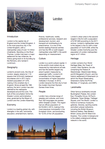
Company Report Layout
Figure 7 shows another three-column layout. It is the sort of layout you might see in a document that a company produces for something like an end-of-year shareholder report.
As you can see there are still three columns of text, but the way the text flows between the columns it's much easier to see where you have to read. It doesn't look as pretty as the previous example - the one before the "unbalanced" one - but you know where you are with it.
Also, while all of the text is in the middle of the page but it doesn't look too bad. It's not great but it's not terrible.
Can you do better? Well, yes you can.
Magazine Layout
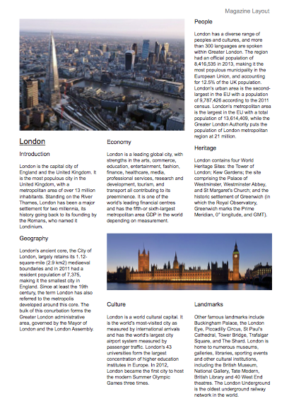
Figure 8 shows yet another three-column layout. It's more like something you might see in a magazine. The images are larger but you can still get all of the text on the page and still have a bit of space left for something else.
The two-section left-hand column gives you an idea of how to read the page while not being a whole column of text and one of the images is used to break-up the text to give it a better flow and balance.
You were told that unused white space was bad in order to get you to look at the layouts in a critical way. However, white space can be good for a page layout, even if you didn't deliberately put it there.
For instance, in the Magazine Layout you've just been looking at there's a space down at the bottom-left of the page. Is it wrong to have this space there? Well, no, not really. All of the text and images are on the page so there's no trouble there. And the page looks balanced so that's not an issue. So why try and fill the gap? The answer is that there's no real reason to.
If you try and fill every space on the page it will start to look cluttered. It will look like you're desperate to fill every bit of page to get your money's worth. While this may in some cases be true, you should try and leave space where it looks fine and isn't compromising the content. In this way, you could say, that it's being deliberately put there. And so the earlier advice still holds.
So, to modify the original advice on white space: "If your text is nicely readable, and your images are placed to balance the page well, any white space left over is probably fine.".
You can find out more about white space here.Is this all you need to do? Well, no, not really.
This is just one layout that happens to work - at least reasonably well - for this particular subject.
You'll hopefully be pleased to hear that Scribus doesn't force you into having to use "boring" columns all of the time, oh no.
What about if you want to get a bit more "funky" with your layout?
Mixed-Columns Layout
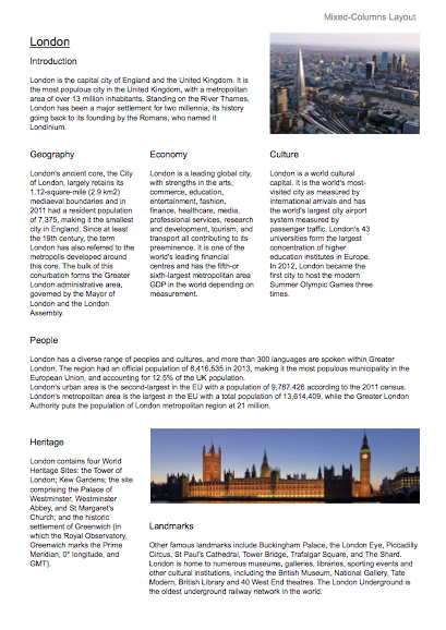
Figure 9 shows a layout that mixes different widths of columns to make the page look more interesting.
It's by no means perfect - the white space is in the wrong places and there's too much of it - but it shows that simply using different column widths can make the page look quite nice while still allowing for a good reading experience.
Editing
It's worth taking the time to mention editing at this point.
The examples in this article have all used the same text, styles, font and images because the purpose of the article was to show how different layouts affect your document.
However, in the real world, you don't always have these constraints. Unless you're forced into using proscribed text that can't be changed, in conjunction with specific images that must be used in certain ways, you have a chance to change things to help your layout.
For instance, in the Mixed Columns Layout, the "Economy" and "Culture" sections have too much white space at the bottom of them. The page would look better if there was more text in each section to bring their "bottoms" closer to the top of the "People" section. If you can't change the text then there's not a lot you can do, but if you can change the text then why not do so?
Page layout - and the much more complex page design - should be an evolving thing. The content, layout and design should be free to change both independently and together. If you like the layout but the content doesn't quite fit right then why not change the content slightly?
- Not enough text to fill the space? Why not add some extra text that doesn't change the meaning of what's being said?
- Too much text? Can you see any words that can be removed or changed so that it fits better in the space you've got planned for it?
Don't be afraid to change your text - or images - to suit your layout. Don't force yourself to use a bad layout just because the content doesn't fit right. By all means make sure that your content is always correct and don't introduce, change, or remove anything that makes it wrong. But don't be afraid to edit as appropriate to get what you want.
Non-columnar Layout
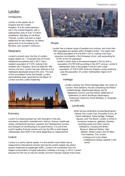
This has been a long article and you've probably got a lot to think about already but, just for fun, have a look at figure 10. It shows the sort of thing that can be achieved using trapezium-shaped text and image frames instead of using normal rectangular columns.
It's probably not the sort of layout you'd use very often - you may never use something like it at all - but it's worth knowing that you can do this sort of thing. You never know when you might want something a little different.
Experiment
In this article you've seen how to create various document layouts. You should hopefully also be getting a good idea that not all layouts work for all types of documents or all articles within those documents.
Try experimenting. What works for one article may not work for another of the same sort of article, even if it's in the same document.
Page layout is not about you being told what to do and then just going along with what you've been told. It's about finding out what looks right for the thing you're working on at the time. There are no hard-and-fast rules but it doesn't hurt to keep in mind the following things:
- White Space - Don't let it rule you. Make it work for you.
- Page Balance - With experience, when a page looks well balanced you'll know.
- Editing - Don't force yourself to stick with what you've got. Edit where necessary.

