Making a Pie Chart: Difference between revisions
| (6 intermediate revisions by the same user not shown) | |||
| Line 99: | Line 99: | ||
# Script works with Scribus versions 1.2.x, 1.3.3.x, 1.3.4+, and 1.5.3svn | # Script works with Scribus versions 1.2.x, 1.3.3.x, 1.3.4+, and 1.5.3svn | ||
########################################## | ########################################## | ||
import math | import math | ||
| Line 129: | Line 128: | ||
# If you don't like my colors -- here's where to fix the ugliness. | # If you don't like my colors -- here's where to fix the ugliness. | ||
# If you need more than 9, add as many as you like | # If you need more than 9, add as many as you like | ||
colors = ['red','blue','yellow','magenta','orange','slateblue','slategrey','greenyellow','wheat'] | colors = ['red','blue','yellow','magenta','orange','slateblue','slategrey','greenyellow','wheat', 'violet'] | ||
bordercolor = 'black' | bordercolor = 'black' | ||
for n in sectors: | for n in sectors: | ||
| Line 193: | Line 192: | ||
==A new version== | ==A new version== | ||
Here are a few modifications to the original script. One is that this one incorporates the key as noted above. In addition, I have changed | Here are a few modifications to the original script. One is that this one incorporates the key as noted above. In addition, I have changed the mode of data entry to a single '''valueDialog()''' (instead of a loop), so that instead of putting numbers in one by one, you would put them all in together, like '234 200 345 53.7' with the numbers separated by white space. The split function breaks this up and we '''map''' all the numbers to '''float'''. There is also now a text frame that gives the total of all the numbers, since in many cases, a pie chart has less meaning when you don't understand the sample size. In addition, I have reduced the thickness of the borders of the segments and the key frames. | ||
As before, there are only 10 color choices, so if you have more data points than that, you will need to add further colornames. | |||
<syntaxhighlight lang=python> | <syntaxhighlight lang=python> | ||
#!/usr/bin/env python | #!/usr/bin/env python | ||
| Line 213: | Line 214: | ||
svgfile = scribus.valueDialog('SVG File','Enter name of file to save to\n".svg" will be appended') | svgfile = scribus.valueDialog('SVG File','Enter name of file to save to\n".svg" will be appended') | ||
svgfile = svgfile + '.svg' | svgfile = svgfile + '.svg' | ||
nvalues = [] | nvalues = [] | ||
newvalues = scribus.valueDialog('Data Entry','Enter Data Values, separated by spaces') | newvalues = scribus.valueDialog('Data Entry','Enter Data Values, separated by spaces') | ||
| Line 229: | Line 229: | ||
lasty = 0 | lasty = 0 | ||
ykey = 40 | ykey = 40 | ||
colors = ['red','blue','yellow','magenta','green','slateblue','slategrey','greenyellow','wheat'] | colors = ['red','blue','yellow','magenta','green','slateblue','slategrey','greenyellow','wheat','violet'] | ||
bordercolor = 'black' | bordercolor = 'black' | ||
for n in nvalues: | for n in nvalues: | ||
Latest revision as of 01:05, 23 November 2016
The difficulty with making a pie chart with Scribus is that, if there is a way to use the various drawing tools to do it, the programming is quite beyond anything one would want to tackle. What we need then, is a more elegant way. Fortunately, with SVGs, there is a way.
What you cannot do is draw a circle, then subdivide it, because what we really want is a series of segments like variably sized pieces of pie, each of which can have its own fill color. What I want to show in this page is the process of putting information together to make the python script you will find at the end.
SVG Specifications and Drawing Arcs
For the details and much more information about SVG specifications, check this link.
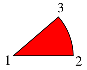
The first line shows our directions. M is the command for our starting point, the center of our pie circle, and relates to a point relative to the screen origin of our SVG space -- the upper left hand corner. After this all subsequent commands will be relative ones (in this example). Next the l says to draw a line from the starting point 150 X-units, but Y stays the same. (For this first segment, we could have used the h command, which will draw a horizontal line, but we need to generalize our process, and most or all of the other segments will not have a horizontal line.)
Now we draw our arc, using the a command, which is followed by X and Y radii, each of which we have set to 150 -- if they were not equal, we would be drawing an elliptical arc. Next are three zeros, but only the middle might need to be changed for our pie chart. Since we are only specifying two points along a hypothetical circle, we need to specify whether we will take the short route or the long route around the circle. Our middle zero says to take the short route (our piece of pie is less than half the pie).
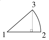
Now, the tricky part. The last two numbers (-37, -97) are the relative distances from point 2 to point 3, in Cartesian X,Y computer-display coordinates. Finally, the z at the end says to complete this shape to a closed form -- go back to point 1.
How do we figure out these relative measurements along our arc? Trigonometry.
Trigonometry Awakens
Let's think about what pie charts represent. Pie charts merely show us visually how some whole list of data values is subdivided into its components, with the size of each piece corresponding to the size of its share of the pie. So to know how big this piece should display, I need to divide it by the total size of the pie. Since the circle of our pie spans 360°, our formula looks like this:
angle = [(size of piece)/total] × 360
which gives us the angle of the circle occupied by our segment.
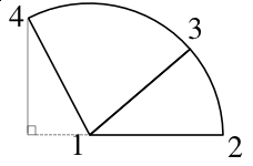
| But what about the next segment? We relied on the starting line being along the X-axis for our calculations. For the subsequent segments, let's stay with that reference point. We don't necessarily need to know the angle occupied by each segment, what we need are the corner points for our SVG calculations.
Add the original data value for the first pie piece to the value of the second, and divide that by the total, for the fraction of our pie circle: angle = [(size of piece A + size of piece B)/total] × 360 |
|
Now if we use our cosine and sine formulas again with this obtuse angle, we will get the correct X,Y values for point 4.
Eventually, we work our way around the pie, so that we have the coordinates for all these points, making the relative calculations as we go, as you see in piechart.py. From a mathematical point-of-view, we end up with more consistent results when we calculate from the same starting point. If we made successive calculations by shifting the reference point, we are likely to see additive errors related to the slight imprecision of our calculations -- the result might be either a gap or an overlap with the final segment.
Using piechart.py
When you start piechart.py, you first get a requester asking for the filename to save to. Whatever you enter, ".svg" will be appended to your name.
Next a requester appears asking for data -- your data values from which the calculations and pie chart will be created. After you enter one number, the requester appears again and will keep reappearing until you press Enter with no entry, or enter "0" (the number).
A message box appears telling you that the file has been created.
News for 1.5.3svn
Originally I was trying to use an undocumented command importSVG(), and could not get this to work. There is now a command placeSVG(), and this does work as expected, so I have edited the script to add this. The SVG will still be saved also.
| Some Examples | ||||
|---|---|---|---|---|
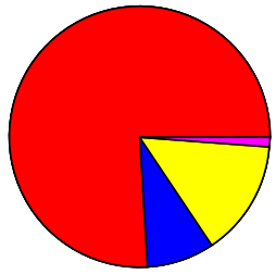 |
Here are two examples of output with the same data. The one on the right can be made by changing piechart.py so that the bordercolor is 'none', setting the stroke-width to "0", or editing in Scribus. | |||
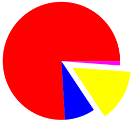 |
This last example can easily be done in Scribus -- first ungroup the SVG (Item > Ungroup, keyboard: Ctrl+Shift+G (Ctrl+U in 1.2.4.1 and 1.3.3.2), or find in Context Menu - right-click on SVG). Then individual segments can be selected and manipulated/edited in various ways. If you want to change the fill color of an individual segment, you must ungroup first. Alternatively, you can edit your SVG with Inkscape outside of Scribus. You don't need to ungroup there. |
|
Don't Try This At Home (or At Work/School)
| Here is a note on the interaction between aesthetics and an accurate depiction of data. You will sometimes see pie charts given a "tilted" appearance, presumably to enhance the aesthetic appeal. This example is made to show what happens when you do this. In both of these partial pie charts, the wedges are made from identical data. On the right, even though these segments should appear the same overall size to reflect their data, they do not, or at least it is hard to discern -- the position of the segment on the pie affects its apparent size. | 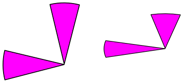
|
piechart.py
#!/usr/bin/env python
# File piechart.py
# Created 2006-05-29
# Gregory Pittman
# Automatically creates a piechart SVG file
# from a list of data
# Script works with Scribus versions 1.2.x, 1.3.3.x, 1.3.4+, and 1.5.3svn
##########################################

import math
import scribus
# We'll create a list L, append to it, then copy the list to a file at the end
L = ['<?xml version="1.0" encoding="UTF-8" standalone="no"?>\n']
L.append('<!DOCTYPE svg PUBLIC "-//W3C//DTD SVG 1.1//EN"\n')
L.append('"http://www.w3.org/Graphics/SVG/1.1/DTD/svg11.dtd">\n')
L.append('<svg width="20cm" height="20cm" xmlns="http://www.w3.org/2000/svg" version="1.1">\n')
svgfile = scribus.valueDialog('SVG File','Enter name of file to save to\n".svg" will be appended')
svgfile = svgfile + '.svg'
sectors = []
while 1:
    newvalue = scribus.valueDialog('Data Entry','Enter Data\n Enter 0 or no value to End')
    if (newvalue == ''):
        newvalue = '0'
    newnum = float(newvalue)
    if newnum == 0:break
    sectors.append(newnum)
total = 0
i = 0
seg = 0
radius = 150
startx = 200   # The screen x-origin: center of pie chart
starty = 200   # The screen y-origin: center of pie chart
lastx = radius # Starting coordinates of
lasty = 0      # the first arc
ykey = 25
# If you don't like my colors -- here's where to fix the ugliness.
# If you need more than 9, add as many as you like
colors = ['red','blue','yellow','magenta','orange','slateblue','slategrey','greenyellow','wheat', 'violet']
bordercolor = 'black'
for n in sectors:
    total = total + n  # we have to do this ahead, since we need the total for the next for loop

for n in sectors:
    arc = "0"                   # default is to draw short arc (< 180 degrees)
    seg = n/total * 360 + seg   # this angle will be current plus all previous
    if ((n/total * 360) > 180): # just in case this piece is > 180 degrees
        arc = "1"
    radseg = math.radians(seg)  # we need to convert to radians for cosine, sine functions
    nextx = int(math.cos(radseg) * radius)
    nexty = int(math.sin(radseg) * radius)

# The weirdly placed minus signs [eg, (-(lasty))] are due to the fact that
# our calculations are for a graph with positive Y values going up, but on the
# screen positive Y values go down.

    L.append('<path d="M '+str(startx)+','+str(starty) + ' l '+str(lastx)+','+str(-(lasty))+' a' + str(radius) + ',' + str(radius) + ' 0 ' + arc + ',0 '+str(nextx - lastx)+','+str(-(nexty - lasty))+ ' z" \n')
    L.append('fill="'+colors[i]+'" stroke="' + bordercolor + '" stroke-width="2" stroke-linejoin="round" />\n')
    L.append('<rect x="375" y="'+ str(ykey) + '" width="40" height="30" fill="'+colors[i] + '" stroke="black" stroke-width="1"/>\n') # this line and next create the key
    ykey = ykey + 35
# We are writing the XML commands one segment at a time, so we abandon old points
# we don't need anymore, and nextx becomes lastx for the next segment
    lastx = nextx
    lasty = nexty
    i += 1
L.append('</svg>')         # End tag for the SVG file
output = open(svgfile,'w') # We've done all the calculations and filled
output.writelines(L)       # up list L with our commands, so now we just
output.close()             # write to a file all at once.
endmessage = svgfile + ' was created'
scribus.messageBox("Finished",endmessage,icon=scribus.ICON_NONE,button1=scribus.BUTTON_OK)  # Just for some user feedback

 if scribus.haveDoc():
    scribus.placeSVG(svgfile, 100, 100) # This will place your SVG on the current page - works on 1.5.3svn at least
    Totalframe = scribus.createText(340, 300, 100, 50)
    scribus.insertText("Total = " + str(total), 0, Totalframe)
But wait! There's more!
What about a key for our piechart? Easy. Somewhere around the line lasty = 0 add this line:
ykey = 25
Then just before the line lastx = nextx add these two lines:
    L.append('<rect x="375" y="'+ str(ykey) + '" width="40" height="30" fill="'+colors[i] + '" stroke="black" stroke-width="1"/>\n')
    ykey = ykey + 35
I've updated the script above with these changes.
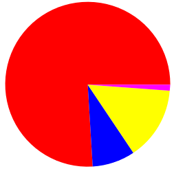
So now, when we run this new modified script, we get:
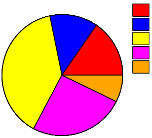
|
A recommendation you will find in the Scribus Documentation is that when you get ready to add text labels and any other annotations to this piechart, you will want to do these in Scribus, since this will lead to a better result in your eventual PDF as far as text resolution. |
If for some reason you may not want a key, and will simply add annotations to the pie itself, you can ungroup your SVG and delete these key elements. Alternatively, add another requester at the beginning asking if a key is desired, then turn the L.append('<rect... statement into a conditional with an if depending on the requester response. If you are not making a key, the assignment and changes in the ykey variable do not matter.
Something else which is of importance is to give feedback on the total that this pie represents, so at the very end I've added a text frame and inserted the total number of all the segments. Note that this is not part of the SVG, but is created in Scribus afterward. This makes it easy to delete, or move around and edit at your liking.
A new version
Here are a few modifications to the original script. One is that this one incorporates the key as noted above. In addition, I have changed the mode of data entry to a single valueDialog() (instead of a loop), so that instead of putting numbers in one by one, you would put them all in together, like '234 200 345 53.7' with the numbers separated by white space. The split function breaks this up and we map all the numbers to float. There is also now a text frame that gives the total of all the numbers, since in many cases, a pie chart has less meaning when you don't understand the sample size. In addition, I have reduced the thickness of the borders of the segments and the key frames.
As before, there are only 10 color choices, so if you have more data points than that, you will need to add further colornames.
#!/usr/bin/env python
# File piechart.py
# Originally created 2006-05-29
# This version 2016-11-22
# Gregory Pittman
# Automatically creates a piechart SVG file
# from a list of data
##########################################

import math
import scribus
# We'll create a list L, append to it, then copy the list to a file at the end
L = ['<?xml version="1.0" encoding="UTF-8" standalone="no"?>\n']
L.append('<!DOCTYPE svg PUBLIC "-//W3C//DTD SVG 1.1//EN"\n')
L.append('"http://www.w3.org/Graphics/SVG/1.1/DTD/svg11.dtd">\n')
L.append('<svg width="20cm" height="20cm" xmlns="http://www.w3.org/2000/svg" version="1.1">\n')
svgfile = scribus.valueDialog('SVG File','Enter name of file to save to\n".svg" will be appended')
svgfile = svgfile + '.svg'

nvalues = []
newvalues = scribus.valueDialog('Data Entry','Enter Data Values, separated by spaces')

nvalues = map(float, newvalues.split())
i = 0
total = 0
i = 0
seg = 0
radius = 150
startx = 200
starty = 200
lastx = radius
lasty = 0
ykey = 40
colors = ['red','blue','yellow','magenta','green','slateblue','slategrey','greenyellow','wheat','violet']
bordercolor = 'black'
for n in nvalues:
    total = total + n

for n in nvalues:
    arc = "0"
    seg = n/total * 360 + seg
    if ((n/total * 360) > 180):
        arc = "1"
    radseg = math.radians(seg)
    nextx = int(math.cos(radseg) * radius)
    nexty = int(math.sin(radseg) * radius)

    L.append('<path d="M '+str(startx)+','+str(starty) + ' l '+str(lastx)+','+str(-(lasty))+' a150,150 0 ' + arc + ',0 '+str(nextx - lastx)+','+str(-(nexty - lasty))+ ' z" \n')
    L.append('fill="'+colors[i]+'" stroke="' + bordercolor + '" stroke-width="0.5" stroke-linejoin="round" />\n')
    L.append('<rect x="375" y="'+ str(ykey) + '" width="40" height="30" fill="'+colors[i] + '" stroke="black" stroke-width="0.5"/>\n')
    ykey = ykey + 35
    lastx = nextx
    lasty = nexty
    i += 1
L.append('</svg>')
output = open(svgfile,'w')
output.writelines(L)
output.close()
endmessage = svgfile + ' was created'
scribus.messageBox("Finished",endmessage,icon=scribus.ICON_NONE,button1=scribus.BUTTON_OK)

if scribus.haveDoc():
    scribus.placeSVG(svgfile, 100, 100)
    Totalframe = scribus.createText(340, 300, 100, 50)
    scribus.insertText("Total = " + str(total), 0, Totalframe)