Avoiding Design Problems: Difference between revisions
| Line 22: | Line 22: | ||
|} | |} | ||
===Photo Montage Example=== | ===Photo Montage Example=== | ||
{| width= | {| width=90% cellpadding=10px | | ||
|[[Image:Photomontage.png]] | |[[Image:Photomontage.png]] | ||
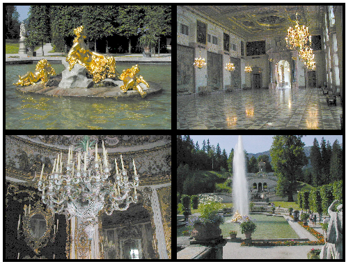
|Here is a montage of photos taken at Schloss Lindenhof in Bavaria. Perhaps with the idea of creating a photo album effect, the images have been given borders. The outside border is at best mildly distracting, but the central borders create this cross effect and become a major visual element in this montage. Why not just get rid of the borders? | |Here is a montage of photos taken at Schloss Lindenhof in Bavaria. Perhaps with the idea of creating a photo album effect, the images have been given borders. The outside border is at best mildly distracting, but the central borders create this cross effect and become a major visual element in this montage. Why not just get rid of the borders? | ||
|- | |- | ||
| [[Image:Photomontage1.png]] | |||
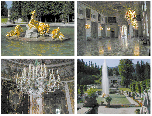
| Well, we've lost the effect on the outside edges, but we '''''still''''' have this cross, now in white. So what can we do? | | Well, we've lost the effect on the outside edges, but we '''''still''''' have this cross, now in white. So what can we do? | ||
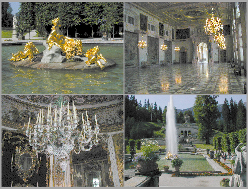
* Separate the pictures, perhaps even stagger them. | * Separate the pictures, perhaps even stagger them. | ||
* Butt the pictures together, eliminating this cross. | * Butt the pictures together, eliminating this cross. | ||
* Tone down the contrast of the edge effect. | * Tone down the contrast of the edge effect. | ||
|- | |- | ||
| [[Image:Photomontage2.png]] | | [[Image:Photomontage2.png]] | ||
Revision as of 12:30, 9 October 2007
There are many design problems which can occur, some of which involve a matter of style, color choices, placement of elements in a pleasing way, but what will be discussed here are things that have to do with visual perception.
Design and layout can have quite a range of appearance, depending on the purpose of the document, poster, or presentation you might be working on. In some cases, a goal is first of all to attract attention to your design, but even then, once you have that attention, you want to convey some information or meaning. Certain elements can either guide the eye to the important portion or maybe even guide the eye along a certain path. What you don't want to do is have non-informational elements blocking eye flow or causing the eye to keep returning to non-information.
Problems with Lines
| This is why in many cases, in Wikis for example, it is recommended to be very sparing in the use of horizontal lines -- they impede eye flow.
The other thing to notice above is that while there are two black lines drawn on the white background, the positioning creates what has been termed a '1 + 1 = 3 effect', so that what you perceive is two black lines, with a third white line created by the boundaries of the black lines. |
Photo Montage Example
Lines and Text Example
This is one of the most common mistakes you will see. Say, for example, we have a list -- of items, of dates, perhaps the cast of a play.
Intuitively, or perhaps merely because we've seen this so often, we decide that items in the list need some kind of separator, as if they will somehow move about the page if we don't corral them.


