Making a Pie Chart: Difference between revisions
| Line 51: | Line 51: | ||
|} | |} | ||
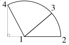
Now if we use our cosine and sine formulas again with this obtuse angle, we will get the correct X,Y values for point '''4'''. | Now if we use our cosine and sine formulas again with this obtuse angle, we will get the correct X,Y values for point '''4'''. | ||
Eventually, we work our way around the pie, show we have the coordinates for all these points, and once we have that, we make the relative calculations you see in piechart.py. | |||
==piechart.py== | |||
Revision as of 03:17, 1 June 2006
The difficulty with making a pie chart with Scribus is that, if there is a way to use the various drawing tools to do it, the programming is quite beyond anything one would want to tackle. What we need then, is a more elegant way. Fortunately, with SVGs, there is a way.
What you cannot do is draw a circle, then subdivide it, because what we really want is a series of segments like variably sized pieces of pie, each of which can have its own fill color. What I want to show in this page is the process of putting information together to make the python script you will find at the end.
SVG Specifications and Drawing Arcs
For the details and much more information about SVG specifications, check this link.
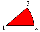
The first line shows our directions. M is the command for our starting point, the center of our pie circle, and relates to a point relative to the screen origin of our SVG space -- the upper left hand corner. After this all subsequent commands will be relative ones (in this example). Next the l says to draw a line from the starting point 150 X-units, but Y stays the same. (For this first segment, we could have used the h command, which will draw a horizontal line, but we need to generalize our process, and most or all of the other segments will not have a horizontal line.)
Now we draw our arc, using the a command, which is followed by X and Y radii, each of which we have set to 150 -- if they were not equal, we would be drawing an elliptical arc. Next are three zeros, but only the middle might be changed. Since we are only specifying two points along a hypothetical circle, we need to specify whether we will take the short route or the long route around the circle. Our middle zero says to take the short route (our piece of pie is less than half the pie).
Now, the tricky part. The last two numbers (-37, -97) are the relative distances from point 2 to point 3, in Cartesian X,Y computer-display coordinates. Finally, the z at the end says to complete this shape to a closed form -- go back to point 1.
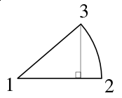
How do we figure out these relative measurements along our arc? Trigonometry.
Trigonometry Awakens
Let's go back to what pie charts charts represent. Pie charts merely show us visually how some whole collection of data points is subdivided into its components, with the size of each piece corresponding to the size of its share of the pie. So to know how big this piece should display, I need to divide it by the total size of the pie. Since the circle of our pie spans 360°, our formula looks like this:
(size of piece)/total × 360
| But what about the next segment? We relied on the starting line being along the X-axis for our calculations. For the subsequent segments, let's stay with that reference point. We don't necessarily need to know the angle occupied by each segment, what we need are the corner points for our SVG notation.
So let's just add the original data value for the first pie piece to the value of the second, and divide that by the total, for the fraction of our pie circle. (size of piece A + size of piece B)/total × 360 |

|
Now if we use our cosine and sine formulas again with this obtuse angle, we will get the correct X,Y values for point 4.
Eventually, we work our way around the pie, show we have the coordinates for all these points, and once we have that, we make the relative calculations you see in piechart.py.

