Avoiding Design Problems: Difference between revisions
No edit summary |
No edit summary |
||
| Line 1: | Line 1: | ||
[[Category:Other]] | [[Category:Other]] | ||
[[Category:Tips]] | |||
{| width=90% | | {| width=90% | | ||
|There are many design problems which can occur, some of which involve a matter of style, color choices, placement of elements in a pleasing way, but what will be discussed here are things that have to do with visual perception. | |There are many design problems which can occur, some of which involve a matter of style, color choices, placement of elements in a pleasing way, but what will be discussed here are things that have to do with visual perception. | ||
Revision as of 13:38, 15 October 2007
| There are many design problems which can occur, some of which involve a matter of style, color choices, placement of elements in a pleasing way, but what will be discussed here are things that have to do with visual perception.
Design and layout can have quite a range of appearance, depending on the purpose of the document, poster, or presentation you might be working on. In some cases, a goal is first of all to attract attention to your design, but even then, once you have that attention, you want to convey some information or meaning. Certain elements can either guide the eye to the important portion or maybe even guide the eye along a certain path. What you don't want to do is have non-informational elements blocking eye flow or causing the eye to keep returning to non-information. Something to keep in mind as you go through these is the limited resolution of computer monitors. This somewhat limits what can be demonstrated here, so in the end using Scribus to play with your layout should show you what doesn't work, what works, and what works better. |
Problems with Lines
| This is why in many cases, in Wikis for example, it is recommended to be very sparing in the use of horizontal lines -- they impede eye flow.
The other thing to notice above is that while there are two black lines drawn on the white background, the positioning creates what has been termed a '1 + 1 = 3 effect', so that what you perceive is two black lines, with a third white line created by the boundaries of the black lines. |
Photo Montage Example
Lines and Text Example
This is one of the most common mistakes you will see. Say, for example, we have a list -- of items, of dates, perhaps the cast of a play.
Intuitively, or perhaps merely because we've seen this so often, we decide that items in the list need some kind of separator, as if they will somehow move about the page if we don't corral them.
Problems with Graphs
Bar Graphs
One of the first problems with graphs is that in many cases they are unnecessarily used. Even when they may have some utility, they become cluttered with non-informational material.
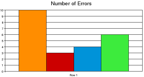
Here is an example of a graph unworthy of the space it uses up:
In general, bar graphs are an inefficient and visually noisy way to depict data. The colors have no meaning, the width of the bars has no meaning, and there may not necessarily be any meaning to the order in which the data appears in the graph.
Indeed, one might more succinctly present this information as its data:
| Number of Errors | 10 | 3 | 4 | 6 |
There are many ways to make this bar graph even worse -- lines could be thicker, we could have added patterns or images to the bars, turned them into a pseudo-3D graph with depth and shadows or some strange perspective.
There are those, of course, who make use of bar graphs to promote some erroneous idea, by putting unrelated information next to each other to make it seem connected, manipulating the colors to draw more attention to one piece of data, using strange scales of the axes or even a different scale for different bars, or selectively choosing data which portray some desired conclusion. In some cases, no scale may be depicted at all.
In general, bar graphs should be considered a poor, inefficient way to depict data, yet look at this re-creation of a stem-and-leaf depiction of data having a bar graph-like feature:
 0|98766562
 1|97719630
 2|69987766544422211009850
 3|876655412099551426
 4|9998844331929433361107
 5|97666666554422210097731
 6|898665441077761065
 7|98855431100652108073
 8|653322122937
 9|377655421000493
10|0984433165212
11|4963201631
12|45421164
13|47830
14|00
15|676
16|52
17|92
18|5
19|39730
Of course, this on its face is only a collection of numbers, so you need to understand what it represents. This is 218 data points, representing the individual heights of all the world's volcanoes. Each data point consists of 2 or 3 digits, depicted in an x|y fashion, where x is the 1 or 2-digit indication of the number of thousands of feet, and the y is is a single-digit indicating hundreds of feet.
Thus, for example, the line 13|47830 indicates 5 volcanoes, of heights 13,400, 13,700, 13,800, 13,300, and 13,000 feet respectively.
This depiction can therefore be dissected to its individual data points, yet at the same time you get, by the length of each line, a sense of the distribution of volcano heights worldwide. Imagine a bar or line graph trying to be this data-rich.
References
- Tufte, Edward R (1983), The Visual Display of Quantitative Information, Graphics Press.
- Tufte, Edward R (1990), Envisioning Information, Graphics Press.


