How to make a parody magazine cover: Difference between revisions
(Created page with "centre <div style="float: left;">__TOC__</div>{{TutorialKey}}{{clear}} == Introduction == This tutorial will show you how to make a parody of a "F...") |
mNo edit summary |
||
| Line 469: | Line 469: | ||
* Select the right-hand gradient stop and then change the "Opacity" to 0% (zero). | * Select the right-hand gradient stop and then change the "Opacity" to 0% (zero). | ||
* Drag the right-hand gradient stop to the left (the 50% mark should be okay but whatever you think looks best). | * Drag the right-hand gradient stop to the left (the 50% mark should be okay but whatever you think looks best). | ||
== Conclusion == | |||
And that's it, you're done. Hooray. Phew! | And that's it, you're done. Hooray. Phew! | ||
Revision as of 08:51, 18 August 2015
Button … Menu → Choice … Keyboard
Introduction
This tutorial will show you how to make a parody of a "Famous Monsters of Filmland" magazine cover.
The tutorial is very long and you should already know how to:
- Create text frames and change basic text formatting.
- Create image frames and change scaling.
- Create shapes and set fill and outline colours.
Set-up
Before you start you'll need a few resources.
Fonts
You need three fonts to replicate the cover shown above.
The first is "Misfits" which is used for the logo and can be downloaded from here.
The second is "FreakFinder", used for the main text, and can be downloaded from here. You only need to install the main "freakfinder.ttf" font; this tutorial doesn't use any of the other variants.
The third is any Bold - or preferably Black - variant of Arial or Helvetica. You've probably got one of these on your system but they can be downloaded from various websites.
Images
You also need two images.
The first is the face of Frankenstein's monster and can be downloaded from here.
The second, and most important image, is the main cover picture of "The Fly" and you can get a copy from here. (Right-click on the image and save it to your local storage.)
- Do not print or attempt to sell this image, modified versions of it, or derivatives of it.
- Do not try and pass this image off as your own work.
- Observe and comply with all the rights of the original artist.
- Only use this image for this tutorial.
Now you've got the resources that you need you can start putting the cover together.
Page Set-up
- Start Scribus, but don't create a new document just yet as you need to set the margins correctly.
- Set the Paper Size to "A4" and the Orientation to "Portrait".
- Set the Default Units to "Points".
- Set the margins as: Left - 20pt, Right - 30pt, Top - 30pt, Bottom - 40pt.
- OK the dialog to create the new document.
- Choose menu Page and make sure that Snap to Guides is checked.
- Choose menu File → Document Setup… .
- Go to the Guides tab and make sure that "In the Foreground" is set as the guides placement.
- Press Apply and OK to complete the basic document set-up.
Now you need to create some colours that you'll be using later.
Colours
- Choose menu Edit → Colours… .
- Press Removed Unused to lose all but the basics.
If you don't know how to create colours in Scribus then you need to read this article before continuing.
Create the following colours:
- "Main Logo Fill" - R = 248, G = 29, B = 28.
- "Sub Logo Fill" R = 255, G = 234, B = 83.
- "Inkscape" - R = 172, G = 248, B = 0.
- "Scribus" - R = 32, G = 125, B = 255.
- Duplicate "Main Logo Fill" as "GIMP".
- Duplicate "Sub Logo Fill" as "Blender".
- Duplicate "Scribus" as "Boxout Fill".
- Duplicate "Inkscape" as "Featuring".
- Duplicate "White" as "Main Logo Outline".
- Duplicate "Black" as "Sub Logo Outline".
You should now have some colours set-up as in Figure 1.
You could have re-used the same colours between different items but if you decide to change the colour of, for example "Main Logo Fill", the colour of the "GIMP" text will also change. For something like this tutorial that's probably fine but on more complex documents you might not notice the change until it's too late.
That's quite a bit of work so far but it's most of the "grunt work" done and you can get into creating the page for real now.
Background
- Choose menu View → Fit to Height to show the whole page.
- Choose menu Insert → Insert Image Frame .
- Drag from near the top-left corner of the page to near the bottom-right corner.
Because you set Snap to Guides on earlier, the frame should have snapped to the page boundaries. If it didn't, make sure that Snap to Guides is checked and drag the control handles of the frame so that it snaps to the page edges.
- Right-click the frame and choose Get Image… from the menu.
- Locate the "Fly" image you downloaded earlier, select it and press OK.
The image is a little small for the frame at the moment, and it's a bit too high up the page, see Figure 2.
- With the image selected go to
 Properties and into the Image tab.
 - Select "Free Scaling".
- Change the X-Pos value to -67 points (minus sixty seven).
- Change the Y-Pos value to 30 points.
- Set both the X-Scale and Y-Scale values to 120%.
The image is now larger and has also been moved down a bit to accommodate the logo you'll be creating later. Unfortunately however, you've now got a big white block at the top of the page. No problem…
- Choose menu Insert → Insert Shape → Default Shapes → Rectangle.
- Drag the shape between the top-left corner of the page to the right-hand side of the page and make it about 50pt in height (you don't need to be exact, just make sure the shape overlaps the image by more than half the height of the white gap).
- Go to
 Properties Colours.
 - Click on the "Fill" icon.
- Choose "Vertical Gradient" from the menu below the "Fill" icon.
- In the gradient bar below the menu, select the right-hand gradient stop so that it turns red.
- Change the "Opacity" (under the list of colours) to 0% (zero percent).
- Now drag the left-hand gradient stop to the 60% position. If the white gap has totally disappeared then that's good. If not, drag the left-hand gradient stop further to the right until the gap goes away.
Your page should now look like figure 3. You next need to make the logo.
Logo
- Choose menu Windows → Layers to open the
 Layers organiser.
 - Press the + button to create a new layer.
- Double-click the name of the new layer and rename the layer as "Logo".
By putting the logo on a separate layer you can be sure that when you are working on the it you can't mess up - or accidentally select - anything on other layers by mistake.
The Main Logo
- Choose menu Insert → Insert Text Frame .
- Hold the SHIFT key down and click anywhere near the middle of the page.
Using the shift-click method of inserting a frame makes that frame automatically size to the nearest guides (including margins and page edges).
- In the
 Layers organiser set the "Background" layer to invisible (press the left-hand check mark under the "eye" symbol). (You don't need the background at the moment.)
 - Double-click the text frame and enter "MonsTers" (without the quotes). Make sure that you get the case of each letter correct as shown (I.e. The "M" and "T" need to me upper case).
- De-select the text frame (click anywhere that's not an object on the page) and re-select it.
- In
 Properties Text, change the font to "Misfits".
 - Change the font size to 154 points.
- In the Colour and Effects tab, change the colour to "Main Logo Fill".
- In the Advanced Settings tab, change "Manual Tracking" (it's an A|V with a double arrow underneath) to -8% (minus eight).
- Back in the Text tab, change the alignment to "Align Right".
You should now have something that looks like Figure 4.
- In the Colour and Effects tab, press the icon for "Outline".
- Change the Outline Colour (just above the "outline" icon) to "Main Logo Outline".
- Press the "Outline" icon and keep the mouse button pressed - a "Long-click" - until a small adjustment dialog pops up.
- Change the "Line Width" value to 3%.
You've just created the main logo.
In the ![]() Layers organiser, make the "Background" layer visible again to see the effect, as in Figure 5.
Layers organiser, make the "Background" layer visible again to see the effect, as in Figure 5.
The "Sub-Logo" Parts
Publication
- Make the "Background" layer invisible again.
- Choose menu Insert → Insert Text Frame and drag a rectangle shape that's around half the page width and about half the logo height.
- Double-click the text frame you've just created and enter the text "A NONSUCH PUBLICATION" (without the quotes).
- De-select everything and then re-select the text frame.
- Go to
 Properties Text.
 - Change the font to "Arial Black" (or whatever you have).
- Change the font size to 10 points.
- Change the alignment to "Align Text Right".
- Drag the text frame up and to the right so that it snaps to the inside of the margins.
- Back in
 Properties Text, open the "Colour & Effects" expander and change the colour to "White". (The text should disappear.)
 - Select the main logo text.
- In
 Properties Text, open the "Columns & Text Distances" expander and set the "Top" distance to 10 points.
 - Make the "Background" layer visible to see the result.
Next you need to complete the text that makes up the name of the magazine.
Infamous
- Make the "Background" layer invisible again (so you can more easily see what you're doing).
- As before, choose menu Insert → Insert Text Frame and drag a rectangle shape that's around half the page width and about half the logo height.
- Double-click the text frame you've just created and enter the text "INFAMOUS" (without the quotes).
- De-select everything and then re-select the text frame.
- Go to
 Properties Text.
 - Change the font to "Arial Black" (or whatever you have).
- Change the font size to 22 points.
- Open the "Colour & Effects" expander (if it's not already open) and change the "Fill Colour" to "Sub Logo Fill".
- Still in "Colour & Effects", press the "Outline" icon (you can use the tooltips to find it).
- Make sure that "Black" is set for the Outline colour (above the Outline icon).
- Long-click the "Outline" icon and change the "Line Width" value to 3%.
Now you need to use your judgement to drag the text frame between the "M" and "T" of the main logo. Make sure that it's in the middle of both. (If it's not just right you can always adjust it later.)
Fossland
- With the "INFAMOUS" text frame selected choose menu Item → Duplicate .
- Double-click the duplicated text frame and change the text to "OF FOSSLAND" (without the quotes).
- De-select everything and then re-select the "OF FOSSLAND" text frame.
- Go to
 Properties Text.
 - Change the alignment to "Align Text Right".
- Drag the frame to the right so that it snaps against the right-hand margin.
- Make the "Background" layer visible.
- As before, use your judgement to adjust the vertical placement of the frame so that it looks right. You can also adjust the "INFAMOUS" frame too if needed.
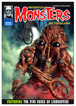
You should now have your finished logo that looks like Figure 6.
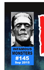
Next you are going to create the issue information box at the top-left.
Issue Boxout
- Choose menu Windows → Layers to open the
 Layers organiser (if it's not already open).
 - Press the + button to create a new layer.
- Double-click the name of the new layer and rename the layer as "Boxout".
- Move your mouse pointer to the left of the Scribus canvas so that it's over the vertical ruler. (If the rulers are not visible choose menu View → Show Rulers .)
- Drag the ruler to the right and release the mouse button when you're around the 90 points mark to create a new vertical guide (while you're dragging a tooltip will be displayed to tell you where the guide will be created, it doesn't need to be exact).
- Move your mouse pointer to the top of the Scribus canvas so that it's over the horizontal ruler.
- Drag the ruler down and release the mouse button when you're around the 190 points mark to create a new horizontal guide.
- Choose menu View → 200% to zoom in and then scroll so that you can see the top-left of the page.
Creating guides makes it much easier to create the things that will go in the space you've created between the margins and the guides.
- Choose menu Insert → Insert Shape → Default Shapes → Rectangle.
- Shift-click inside the space between the margins and guides to create a new rectangle.
- Go to
 Properties Colours.
 - Press the "Outline" icon and set the colour to "None".
- Press the "Fill" icon and set the colour to "Boxout Fill".
Next you'll create the image to go with the issue information.
Frankenstein's Monster
- Choose menu Insert → Insert Image Frame .
- Shift-click inside the space between the margins and guides to create the new frame.
- Drag the bottom control handle of the image frame up so that the frame covers the top two-thirds of the blue rectangle. (You don't need to be accurate.)
- Right-click the image frame and choose Get Image… from the menu.
- Locate the image of Frankenstein's monster, select it and press OK.
- Right-click the image frame and choose Adjust Image to Frame from the menu.
You've now got the image in the frame but it's too small. Some adjustment needs to be made.
- In
 Properties Image select "Free Scaling".
 - Change the X-Pos/Y-Pos/X-Scale/Y-Scale values until the face is large within the frame and is nicely centred. The values you need will be dependent on where you created the guides and how you resized the frame.
Once you've got the image as you want it, it's time to add the text underneath.
Issue Information
- Choose menu Insert → Insert Text Frame .
- Shift-click inside the space between the margins and guides to create the new frame.
- Double-click the text frame and enter the text of "INFAMOUS" (without the quotes).
- De-select everything and then re-select the "INFAMOUS" text frame.
- In
 Properties Text change the font to "Arial Black" (or whatever you're using).
 - Change the font size to 10 points.
- Change the alignment to "Align Text Centre".
- Drag the top control handle of the text frame down until it's just below the bottom of the image frame.
That's the first bit of text. Now for the rest of it.
- With the text frame selected, choose menu Item → Multiple Duplicate then OK the dialog to create a duplicate frame on top of the original. (You can also use Copy/Paste to do this.)
- Select the new duplicated frame and change the text to "MONSTERS" (without the quotes).
- De-select everything and then re-select the "MONSTERS" text frame.
- In
 Properties Text open the "Advanced Settings" expander and change the "Scaling Height" of the characters to 140%. (Use the tooltips to see which field you need to change.)
 - Drag the top control handle of the text frame down until it's just below the bottom of the "INFAMOUS" text.
Now repeat the actions in the last section but change: the text of "INFAMOUS" to "#145"; the colour to "White"; the font size to 16 points. Drag the top of this new frame to below the bottom of the "MONSTERS" text.
Repeat those same actions but change: the text to "Sep 2015"; the colour to "White"; the font size to 9 points. Drag the top of this new frame to below the bottom of the "#145" text.
You should now have all of the text for this box but it might need adjusting so that it looks right. Once you've made the necessary adjustments you should have something that looks like Figure 7. Zoom in to get more control over what you're doing. If you're not happy with what you have got then just keep making adjustments. You can make the background rectangle bigger if that helps.
Now you'll create the text for the feature at the bottom of the page.
Featuring
- Choose menu Windows → Layers to open the
 Layers organiser (if it's not already open).
 - Press the + button to create a new layer.
- Double-click the name of the new layer and rename the layer as "Feature".
- Choose menu Insert → Insert Text Frame .
- Shift-click in the space below the bottom margin of the page to create the new frame.
- Drag the left-hand control handle to the left so that it snaps to the left-hand edge of the page.
- Drag the right-hand control handle to the right so that it snaps to the right-hand edge of the page.
The frame should now completely cover the small area below the bottom margin.
- Double-click the text frame and enter the text of "FEATURING THE FIVE FACES OF LIBREOFFICE" (without the quotes).
- De-select everything and then re-select the "FEATURING…" text frame.
- In
 Properties Text change the Font to "FreakFinder".
 - Change the Font Size to 33 points.
- Change the Colour to "White".
- Change the Alignment to "Align Text Centre".
- Open the "Advanced Settings" expander and change the "Manual Tracking" to 6%. (This opens the text out a bit.)
- Open the "Columns & Text Distances" expander and change the "Top" distance to 7 points.
- Double-click the text frame and select just the "FEATURING" word.
- In
 Properties Text change the colour to "Featuring".
 - De-select the text frame to see the changes.
- Re-select the text frame.
- In
 Properties Colours select "Fill" and change the colour to "Black".
- Choose menu View → Fit to Height to see the whole page.
Your page should now look like Figure 8. It's coming along nicely but there's still a lot of work to do. So if you're ready, you'll next create the headlines. This is the complicated bit.
Headlines
Basic Headlines
- Choose menu Windows → Layers to open the
 Layers organiser (if it's not already open).
 - Press the + button to create a new layer.
- Double-click the name of the new layer and rename the layer as "Headlines".
- Choose menu Insert → Insert Text Frame .
- Click somewhere under the Issue information (don't drag the frame out).
- Enter a Width of 300 points and a Height of 140 points and OK the dialog to create the text frame.
You created the text frame at a certain width and height as these values have already been determined as being good for the purposes of this tutorial.
- With the text frame selected, go to
 Properties Text.
 - Change the Font to "FreakFinder".
- Change the Font Size to 46 points.
- Change the Line Spacing to 42 points.
- Change the Colour to "White".
- Choose menu Item → Multiple Duplicate .
- Go to the By Rows & Columns tab.
- Change the value of "Rows" to 4 and OK the dialog.
You've now got four text frames but you can't see them because they contain no text yet.
- Choose menu Edit → Select All to select everything on the current layer (the four text frames).
- Drag the frames to the left until they snap to the left-hand margin (not the guide you added).
Don't worry at this point about getting them lined up vertically just yet. You'll need to adjust that later.
- De-select everything and then double-click the uppermost text frame.
- Enter the text "TREMBLE BEFORE THE RAZOR-SHARP INKSCAPE" (without the quotes).
- Double-click the next text-frame down and enter the text "AN ENCOUNTER WITH THE CUNNING SCRIBUS" (without the quotes).
- Double-click the next text-frame down and enter the text "WRITHE IN THE BLOOD & GUTS[ENTER] OF GIMP" (without the quotes) where [ENTER] means you should press the ENTER key to create a manual line break.
- Double-click the next text-frame down and enter the text "BEHOLD THE BEAST OF BLENDER[ENTER] NOW IN 3D!" (without the quotes) not forgetting to add the manual line break where shown.
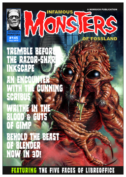
You should now have something that looks like Figure 9.
- Choose menu Edit → Select All to select all of the text frames.
- Use the UP and DOWN keys to nudge the all of the frames up or down to make the text distributed between the frames nicely spaced between the issue box at the top of the page and the feature banner at the bottom.
You're making the text nicely spaced, not the frames, so it might be a good idea to switch "Preview Mode" on so the frames don't get in the way (see earlier in the tutorial for how to do this).
- Select the top text frame and choose menu Item → Convert To → Outlines .
- Re-select the text again and choose menu Item → Ungroup .
Now repeat the last two steps on the other text frames on the same layer. Once that's done you will have lots of individual characters drawn as vectors.
Headline Alignment
From this point you're going to manipulate the text so that it flows around the creature on the main image. You need to do this manually but it's always good to have a guide to work from. As Scribus only allows straight line guides you're going to have to improvise.
- Open the
 Layers organiser and create a new layer (don't bother renaming it).
 - Choose menu Insert → Insert Shape → Default Shapes → Circle.
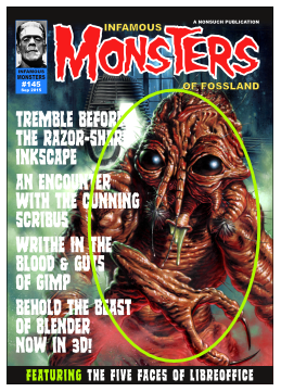
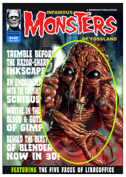
- Draw an ellipse that covers most of the creature. Figure 10 shows an example (in green).
- Use
 Properties Colours to change the Outline colour of the ellipse to something bright and easily seen.
 - Use
 Properties Line to change the Width of the line to around 4pt (so you can see the outline better).
You can now use the left-hand side of the ellipse as a guide to align/resize your text to.
- Using
 Layers go back to the "Headlines" layer.
You're now going to start resizing the text so that it meets, but doesn't overlap, the ellipse "guide".
- Drag-select the characters that make up the first line of text "TREMBLE BEFORE".
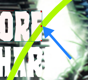
- Use the right-hand control handle of the selected text to drag the right-hand side of the text to where it meets the centre of the line of the ellipse. (The blue arrow in Figure 11 should give you an idea of what you need to do.)
Now repeat the last two steps for each line of text. You should now have something that looks like Figure 12.
Headline Adjustments
For a better effect you can now make some of the small words - such as THE, OF, etc. - smaller so the more important words can be made bigger.
- Drag-select the "THE" in the line "THE RAZOR-SHARP" and drag the right-hand control handle of the selection to the left a bit.
- Drag-select the "RAZOR-SHARP" text and drag its left-hand side to the left to make it bigger while keeping a decent gap between it and the "THE".
Repeat the above steps making one bit of the text smaller for:
- The "AN" in "AN ENCOUNTER"
- The "WITH THE" in "WITH THE CUNNING"
- The "IN THE" in "WRITHE IN THE"
- The "OF" in "OF GIMP"
- The "OF" in "OF BLENDER"
…while making the other side of the line of text wider (all while making sure that the ellipse "guide" is still adhered to).
Once you've done all of that, it's probably a good idea to slightly alter the "3" and "!" in "3D!" - in the Blender section of text - just to make those characters the same size. To do that…
- Select the "3", then shift-select the "!" then shift-select the "D".
- Choose menu Windows → Align & Distribute to open the
 Align & Distribute dialog.
 - From the "Relative To" menu select "Last Selected".
- From the "Align Sides By" menu select "Resizing".
- Press the icon that relates to the "Align Tops" function (tooltips will give you an idea).
That's some of the adjustments done but you're not quite finished yet.
You're done with the ellipse "guide" now so you can either delete that layer or just make it invisible, the choice is yours.
Final Adjustments
Now you're going to give the text a bit more of a "dynamic" feel.
- Select a character in the first line of text then shift-select another three or four on the same line at random.
- Using the top control handle of the selection drag it down a little bit so that those characters are now a bit smaller.
- Use the UP key to nudge those letters a little bit up from the rest of the text on that line.
Now repeat the last few instructions on different characters making them slightly smaller and nudging them up a bit more.
Once you've done that repeat the resize and nudge instructions for each line of text. When the line of text only contains one word you might only need to resize one group of characters. Basically you have to use your own judgement to see what you think looks best. You should end up with text that looks a bit like figure 13.
Now to give the text some colour.
Colouring In
For this tutorial the application names will remain white while the other related text will be coloured.
- Select any character on the first line, e.g. the "T" in "TREMBLE".
- In
 Properties Colours make sure that "Fill" is selected.
 - Drag-select all of "TREMBLE BEFORE".
- In
 Properties Colours select the fill colour as "Inkscape".
Repeat the same steps for the "THE RAZOR-SHARP" line of text making sure that you select one of the letters and open the Colours tab before drag-selecting all of the line.
Now use the same workflow to colour the other lines of text with the colour that relates to that particular application.
You're almost done. Just one more thing to do.
Final Fix
You might notice that the text and background clash a bit in some places. You can fix that with a quick gradient fill.
- Use the
 Layers organiser to select the "Background" layer.
 - Choose menu Insert → Insert Shape → Default Shapes → Rectangle.
- Drag the shape from the top-left of the page to the bottom-right. Make sure you're close to the page corners so that it snaps to the sides.
- Go to
 Properties Colours and press the "Outline" icon.
 - Change the Outline colour to "None".
- Press the "Fill" icon.
- From the menu below the icon select "Horizontal Gradient". Your background image should have disappeared behind a black rectangle but that's fine.
- Select the right-hand gradient stop and then change the "Opacity" to 0% (zero).
- Drag the right-hand gradient stop to the left (the 50% mark should be okay but whatever you think looks best).
Conclusion
And that's it, you're done. Hooray. Phew!
Did you think so much work would be involved in creating a magazine cover? Maybe you did or maybe you didn't, but I hope you can appreciate that it was all worth it in the end.
If you think anything on the layout is out of place then feel free to adjust it as necessary.


