Advanced Graphing: Difference between revisions
m (added more categories and 'You may be interested in' Green table) |
|||
| Line 179: | Line 179: | ||
===The Current Working Script (subject to change)=== | ===The Current Working Script (subject to change)=== | ||
test | |||
<syntaxhighlight lang='python'> | <syntaxhighlight lang='python'> | ||
#!/usr/bin/env python | #!/usr/bin/env python | ||
Revision as of 00:55, 28 February 2018
| You may also be interested in: Automatically Creating a Graph Creating a Graph, Part 2 or Making a Pie Chart |
Here are the Scribus operations you will find examples for in this script:
|
This is an article about a script to create axes with tick marks, then plot data points to the scale of the graph.
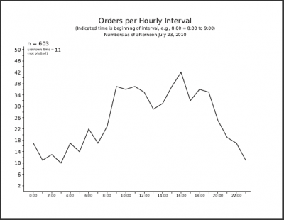
This article explains the workflow that led to the script, and I imagine will continue to suggest improvements. What I wanted to do was to accumulate information about when orders were coming in according to time of day, then see if as data accumulated whether patterns became apparent.
Beginnings
Like many such projects it began quite manually, making a graph structure by hand, trying out and not liking a grid, and in essence making my own grid to lay out data points. I was getting the data from a spreadsheet, collating manually since there wasn't so much at first, then making a polyline, again manually. This gave me an opportunity to fiddle with various parameters to get the look I wanted. This ugly self-created grid would not be printed or exported to the PDF.
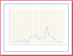
The data collection began in mid-April, and continues. Quite early, and you can easily see it in this graph from late April, there was this interesting peak at 4pm, so this led if nothing else to continuing the process to see what would happen with larger numbers.
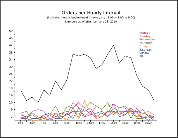
As I began updating the graph, I realized I needed some help from the manual drudgery. The first thing I did was to enter the information I wanted into a postgresql database, so I could dissect in various ways, such as by time of day. Later, as the number of data rose, I wanted to be able to look at this by day of week also. This also was helped by having postgresql, where I could for example transform all instances of 23May to M23May, thus making selecting for day of week easier.
This was still quite manual, since I would export an ordered list to a text file, edit it a bit to making counting how many orders came in per hour, then use Scribus – Properties > Shape > Edit to manually change the nodes of the graph line as needed. Doable but tedious. What became especially annoying was counting lines of a text file, but of course postgresql can use an external script if you write one.
select * from orders order by time;
select * from orders where time < '01:00' order by time;
select * from orders where time > '00:59' and time < '02:00' order by time;
select * from orders where time > '01:59' and time < '03:00' order by time;
select * from orders where time > '02:59' and time < '04:00' order by time;
select * from orders where time > '03:59' and time < '05:00' order by time;
select * from orders where time > '04:59' and time < '06:00' order by time;
select * from orders where time > '05:59' and time < '07:00' order by time;
select * from orders where time > '06:59' and time < '08:00' order by time;
select * from orders where time > '07:59' and time < '09:00' order by time;
select * from orders where time > '08:59' and time < '10:00' order by time;
select * from orders where time > '09:59' and time < '11:00' order by time;
select * from orders where time > '10:59' and time < '12:00' order by time;
select * from orders where time > '11:59' and time < '13:00' order by time;
select * from orders where time > '12:59' and time < '14:00' order by time;
select * from orders where time > '13:59' and time < '15:00' order by time;
select * from orders where time > '14:59' and time < '16:00' order by time;
select * from orders where time > '15:59' and time < '17:00' order by time;
select * from orders where time > '16:59' and time < '18:00' order by time;
select * from orders where time > '17:59' and time < '19:00' order by time;
select * from orders where time > '18:59' and time < '20:00' order by time;
select * from orders where time > '19:59' and time < '21:00' order by time;
select * from orders where time > '20:59' and time < '22:00' order by time;
select * from orders where time > '21:59' and time < '23:00' order by time;
select * from orders where time > '22:59' order by time;
So what does this get you? Here is a fragment of the output near the end of the list from the first command into the next few lines:
A26Jun | 23:29:00 T20Jul | 23:44:00 F28May | 23:48:00 A10Jul | 23:50:00 F21May | 23:55:00 (603 rows) date | time --------+---------- M19Jul | 00:00:00 A22May | 00:07:00 H22Jul | 00:09:00 S27Jun | 00:17:00 A26Jun | 00:17:00 W21Jul | 00:19:00 H3Jun | 00:21:00 M19Apr | 00:25:00 W12May | 00:38:00 F23Jul | 00:38:00 T20Jul | 00:40:00 H24Jun | 00:43:00 W28Apr | 00:43:00 T13Jul | 00:47:00 W21Jul | 00:50:00 T29Jun | 00:51:00 H10Jun | 00:59:00 (17 rows) date | time --------+---------- M19Jul | 01:09:00 T6Jul | 01:16:00 S18Jul | 01:19:00 H15Apr | 01:20:00 H3Jun | 01:20:00 T29Jun | 01:21:00 W23Jun | 01:25:00 H22Jul | 01:38:00 H20May | 01:42:00 H24Jun | 01:43:00 F2Jul | 01:55:00 (11 rows) |
Now I get the list broken down, and can even use these indicators of the number of items that are in each group, but really that is all that I want. I could edit this list, but much easier is to use grep: grep row all_orders.txt > data.txt (603 rows) (17 rows) (11 rows) (13 rows) (10 rows) (17 rows) (14 rows) (22 rows) (17 rows) (23 rows) (37 rows) (36 rows) (37 rows) (35 rows) (29 rows) (31 rows) (37 rows) (42 rows) (32 rows) (36 rows) (35 rows) (25 rows) (19 rows) (17 rows) (11 rows) |
Here is the contents of the file data.txt – see below and in the script how we can import this line-by-line, process the lines, then create a Python list. Incidentally, note that I used row rather than rows for grep matching. What I found on smaller lists was that postgresql has the grammatically correct (1 row) if there is only one item. |
Finally, On to the Script
I went back and looked at Creating a Graph, Part 2, which is simple, and has a number of elements of a graph, but not the actual line itself. I decided not to have the script create headers and labels for the axes, but just focus on the graph. One of the things that happened as time went on was that the Y-axis scale needed to change periodically, so I wanted to make something a bit generic.
Although up to this point my graphs did not use tick marks, I wanted to add that feature, although I wanted to move them outside the lines rather then inside. So I left 2 value dialogs, one to specify the maximum value on the Y-axis, and then at what interval I wanted tick marks. If I was going to do this, I might as well automatically generate the X-axis, but here I would have a very constant X-axis, denoting the times of day. The times were in a text frame with custom tabs, so I moved that frame to a Master Page, once I had settled on a spacing of the tick marks.
Why not just have the entire X-axis on the Master Page? Easily enough done, but as I make the PolyLine for the graph I need those X-Pos values for the tick marks, so why not just generate them on the fly for both the graph and tick marks, then I would be sure that they line up every time.
So now you see the current final version of the script. One feature of the createPolyLine command is that it wants the values to alternate – x1, y1, x2, y2, and so on. Furthermore, when it says it wants a list it means it wants a Python list, i.e., an array name. Otherwise you get an error that it can only have a maximum of 2 elements, the list name and an optional name for the Polyline. This explains the code that creates the polyvalue list in the script. I also realize that I could have combined this interleaving in the first while loop, but separating it makes understanding the code easier, in my view.
Update!
I decided for the intellectual curiosity to go ahead and import the data from a file, the format of which corresponds to the data.txt file you see above. First I made a Perl script, and since I could use regexp easily in Perl, I could strip out the parts I needed. But this still leaves me with something I would be running outside of the script in Scribus, so I decided to write a similar function in Python.
Python can use the fileinput module to get lines from a file. We skip over the first line, since that is the total number of orders, something not graphed. Next we strip off the initial "(" with line[1:], and then we can use the split string function to break the line at the space, putting the parts in the list bits[ ]. Now bits[0] will contain the string for our first value, so we convert to integer and append to the yvalue[ ] list.
One final nicety was to show our values in the dialog asking about the Y-Axis maximum value, and for this we need the string yvalues.
A newer addition is the capability to choose to not draw the axes. A Create Axes? dialog appears with a 'Yes' default, and changing to anything but that results in only the polyline being created. In case you've seen previous versions, I've also rearranged some lines so that only one test for 'Yes' is needed.
Some other things we might consider
- adding a line to select the polyline at the end of the script:
scribus.selectObject(poly)
- adding a line to the data.txt file which could be imported as a color for the polyline.
- making the script recursive.
- a bigger project, of course, would be to allow for manipulation of the X-axis.
The Current Working Script (subject to change)
test
#!/usr/bin/env python
# -*- coding: utf-8 -*-

# ****************************************************************************
#  This program is free software; you can redistribute it and/or modify
#  it under the terms of the GNU General Public License as published by
#  the Free Software Foundation; either version 2 of the License, or
#  (at your option) any later version.
#
#  This program is distributed in the hope that it will be useful,
#  but WITHOUT ANY WARRANTY; without even the implied warranty of
#  MERCHANTABILITY or FITNESS FOR A PARTICULAR PURPOSE.  See the
#  GNU General Public License for more details.
#
#  You should have received a copy of the GNU General Public License
#  along with this program; if not, write to the Free Software
#  Foundation, Inc., 59 Temple Place - Suite 330, Boston, MA 02111-1307, USA.
#
# ****************************************************************************

# File: axes_graphing.py
# originally 2006.05.17 as graph2.py on Scribus wiki
# this version 2010.07.29 © Gregory Pittman, 2010
# creates graph with axes and plots Y values
# X values are fixed

"""
This script as written assumes a US Letter page in landscape orientation.
The various position and dimension values you see are appropriate for page units
of points. If you prefer other units, there are commands to get your units type, switch
to points, and then at the end back to your preferred units.
No headers are created and even the axis labels are not part of this script.
It was written to plot events over a 24 hour day, so the X axis denotes hours
(i.e., 24 tick points), and the Y axis number of events.

In this latest version, the data is loaded from a file, with the particular logic
meant to handle data on individual lines. Note that this will come in as string
data and needs conversion to integers for the values to work.

The other user input when the script runs is to specify the range of the Y axis,
and indicate the value of individual tick marks. The reason for not making this
automatic is that you might wish to have a family of graphs with a range of values
from graph to graph, yet keep the same scale. You do get to see your data in this
dialog. Now there is also the option to not draw the axes, in case you might want to
draw multiple polylines on one graph.

There is also virtually no error detection, or at least no messages other than
the traceback that will show up.

"""

import scribus
import fileinput

xorigin = 64      # x-origin of graph
yorigin = 536     # y-origin of graph
xaxis=637         # x axis length
yaxis=408         # y axis length
color="Black"
a = 1.5           # width of lines
l = 2.0           # width of plotted line
t = 0.8           # width of scale markers
xvalue = []
polyvalue = []
i=1
yvalue = []
yvalues = ''
datafile = scribus.fileDialog('Select Your Data File','Text Files (*.txt)')
for line in fileinput.input(datafile):
    if (i > 1):
        line = line[1:]
        bits = line.split()
        yvalue.append(int(bits[0]))
        yvalues = yvalues + bits[0] + ' '
    i += 1

if scribus.haveDoc():
    scribus.setRedraw(1)
    scribus.setUnit(0)
    xtick = xorigin
    xscale = xaxis/24     # this gives you typographic points per data unit
    yrange = int(scribus.valueDialog('Y Axis Maximum', 'Enter Top Value for Y Axis\n'+yvalues+'\n(Here is your data)'))
    ytick = yorigin
    yscale = yaxis/yrange # this gives you typographic points per data unit
    createaxes = scribus.valueDialog('Create Axes?','Do you want to create axes for this graph?\nChanging to anything else means No','Yes')
    nticks = 0
    while (nticks < 24):
        xtick = xtick + xscale
        xvalue.append(xtick)
        if (createaxes == 'Yes'):
            xt = scribus.createLine(xtick, yorigin, xtick, yorigin + 5) # creating X axis tick lines
            scribus.setLineWidth(t, xt)
            scribus.setLineColor(color, xt)
            scribus.setFillColor(color, xt)
            if (nticks == 0):   # only need to to these once
                d = scribus.createLine(xorigin,yorigin,xorigin+xaxis,yorigin) # create X axis
                scribus.setLineWidth(a, d)
                scribus.setLineColor(color, d)
                scribus.setFillColor(color, d)
                e = scribus.createLine(xorigin,yorigin,xorigin,yorigin-yaxis) # create Y axis
                scribus.setLineWidth(a, e)
                scribus.setLineColor(color, e)
                scribus.setFillColor(color, e)
                ymark = int(scribus.valueDialog('Tick Mark Interval', 'Enter Y Interval for Tick Marks'))
                ytick = ytick - ymark * yscale
                while (ytick > (yorigin - yaxis)):
                    yt = scribus.createLine(xorigin, ytick, xorigin - 5, ytick) # creating Y axis tick lines
                    scribus.setLineWidth(t, yt)
                    scribus.setLineColor(color, yt)
                    scribus.setFillColor(color, yt)
                    ytick = ytick - ymark * yscale
        nticks += 1
    item = 0
    while (item < 24): # this interleaves the X and Y data for createPolyLine
        polyvalue.append(xvalue[item])
        polyvalue.append((yorigin - yvalue[item] * yscale))
        item += 1
    poly = scribus.createPolyLine(polyvalue) # this is the actual plotting
    scribus.setLineWidth(l, poly)
    scribus.setLineColor(color, poly)
    scribus.setFillColor("None",poly)

scribus.redrawAll()
Variation on a Theme: adv_graphing.py
Here is a slight variation that is less hardwired in its treatment of the X axis, and looks at the number of data points, then creates the right number of X-axis ticks for the number of points. If nothing else, this avoids a script failure when there is a mismatch in the number of points expected and what actually are in the data file.
An example data file might look like this:
(192 rows)
(171 rows)
(184 rows)
(180 rows)
(180 rows)
(167 rows)
(167 rows)
(153 rows)
so as before, the parsing strips off the first character, then uses the split string function to choose only the numbers from each line as our data points (Y values), converting the string to integer. This time, we're using all the lines as data, not ignoring the first.
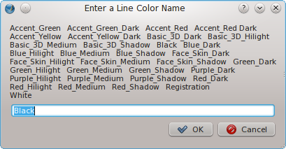
This version also gives you a dialog for choosing a color of the line. The first step is to see what color choices are available, so we getColorNames() and then display them in the valueDialog. I had thought the script would crash if you misspell a name to something not available, but for whatever reason, Black will be chosen (perhaps some default behavior of Scribus). If you were using the Scribus Gnome color set, this is what it would look like:
Even if the color name has a space in the middle of it, entering it just as seen in this dialog is necessary and will work (see 'Accent_Red Dark', where presumably a typo left out a second underline character).
#!/usr/bin/env python
# -*- coding: utf-8 -*-

# File: adv_graphing.py
# originally 2006.05.17 as graph2.py on Scribus wiki
# this version 2011.01.20
# creates graph with axes and plots Y values
# X values are fixed

"""
This script as written assumes a US Letter page in landscape orientation.
The various position and dimension values you see are appropriate for page units
of points. If you want to use A4, adjust the numbers appropriately.

If you prefer other units, there are commands to get your units type, switch
to points, and then at the end back to your preferred units.
No headers are created and even the axis labels are not part of this script.
This version will import your data, and note the number of data points (Y-axis values), then create
the correct number of X-axis ticks for your data.

The data is loaded from a file, with the particular logic
meant to handle data on individual lines. Note that this will come in as string
data and needs conversion to integers for the values to work.

The other user input when the script runs is to specify the range of the Y axis,
and indicate the value of individual tick marks. The reason for not making this
automatic is that you might wish to have a family of graphs with a range of values
from graph to graph, yet keep the same scale. You do get to see your data in this
dialog. There is an option to not draw the axes, in case you might want to
draw multiple polylines on one graph.

"""

import scribus
import fileinput

xorigin = 64      # x-origin of graph
yorigin = 536     # y-origin of graph
xaxis=637         # x axis length
yaxis=408         # y axis length
color="Black"
colors = ''
linecolor = 'Black'
colorcount = 0
a = 1.5           # width of lines
l = 2.0           # width of plotted line
t = 0.8           # width of scale markers
xvalue = []
polyvalue = []
i=0
yvalue = []
yvalues = ''
datafile = scribus.fileDialog('Select Your Data File','Text Files (*.txt)')
for line in fileinput.input(datafile):
    line = line[1:]
    bits = line.split()
    yvalue.append(int(bits[0]))
    yvalues = yvalues + bits[0] + ' '
    i += 1

scribus.messageBox('Your Data','Your data has '+str(i)+' data points') # this line is optional, but I like the information
if scribus.haveDoc():
    colornames = scribus.getColorNames()
    for coloritem in colornames:
        colors = colors + coloritem + '   ' # 3 spaces between names so we can note names with a space in them
        colorcount += 1
        if (colorcount == 4):
            colorcount = 0
            colors = colors + '\n'
    linecolor = scribus.valueDialog('Enter a Line Color Name',colors,'Black')
    scribus.setRedraw(1)
    scribus.setUnit(0)
    xtick = xorigin
    xscale = xaxis/i    # this gives you typographic points per data unit
    yrange = int(scribus.valueDialog('Y Axis Maximum', 'Enter Top Value for Y Axis\n'+yvalues+'\n(Here is your data)'))
    ytick = yorigin
    yscale = yaxis/yrange # this gives you typographic points per data unit
    createaxes = scribus.valueDialog('Create Axes?','Do you want to create axes for this graph?\nChanging to anything else means No','Yes')
    nticks = 0
    while (nticks < i):
        xtick = xtick + xscale
        xvalue.append(xtick)
        if (createaxes == 'Yes'):
            xt = scribus.createLine(xtick, yorigin, xtick, yorigin + 5) # creating X axis tick lines
            scribus.setLineWidth(t, xt)
            scribus.setLineColor(color, xt)
            scribus.setFillColor(color, xt)
            if (nticks == 0):   # only need to to these once
                d = scribus.createLine(xorigin,yorigin,xorigin+xaxis,yorigin) # create X axis
                scribus.setLineWidth(a, d)
                scribus.setLineColor(color, d)
                scribus.setFillColor(color, d)
                e = scribus.createLine(xorigin,yorigin,xorigin,yorigin-yaxis) # create Y axis
                scribus.setLineWidth(a, e)
                scribus.setLineColor(color, e)
                scribus.setFillColor(color, e)
                ymark = int(scribus.valueDialog('Tick Mark Interval', 'Enter Y Interval for Tick Marks'))
                ytick = ytick - ymark * yscale
                while (ytick > (yorigin - yaxis)):
                    yt = scribus.createLine(xorigin, ytick, xorigin - 5, ytick) # creating Y axis tick lines
                    scribus.setLineWidth(t, yt)
                    scribus.setLineColor(color, yt)
                    scribus.setFillColor(color, yt)
                    ytick = ytick - ymark * yscale
        nticks += 1
    item = 0
    while (item < i): # this interleaves the X and Y data for createPolyLine
        polyvalue.append(xvalue[item])
        polyvalue.append((yorigin - yvalue[item] * yscale))
        item += 1
    poly = scribus.createPolyLine(polyvalue) # this is the actual plotting
    scribus.setLineWidth(l, poly)
    scribus.setLineColor(linecolor, poly)
    scribus.setFillColor("None",poly)
    scribus.selectObject(poly)

scribus.redrawAll()


