A Brief Tutorial on Forms
| Installation • Usage • PDF issues • Imposition • Other |
This wiki entry has been graciously submitted with the permission of Gerrit Bruijnes. It's currently a work in progress, trying to maintain the essential content and flavor of the original version.
Excerpt from ‘Waar zit de Kneep?’, ISBN 97890 72445 00 1
A book on Scribus 1.4.1 and publishing, in Netherlands language (Dutch), by Gerrit Bruijnes, www.ipaa.nl
Assumptions: You’re proficient in the operating system that you use. You use Scribus 1.4.1 (language: English – British) and you are familiar with this program at a reasonable advanced level. We do not explain here at length how to perform common tasks such as defining a new document, typing text in a text frame and applying properties, drawing lines, using the properties box and so on. If, on the other hand, you’re an experienced programmer you may find this article rather verbose.
PDF forms - Contents
- PDF-tools
- Design
- JavaScript
- Add pdf-controls
- Events
- Button with button face
- Setup Fields
- Add program snippets
- Programming terms
- Calculations in a form
- Test the form
- Form results
PDF forms
PDF forms are designed so that a user, viewing them online or locally on a computer, can add data to a form, after which the user may print it or return it to you by e-mail.
What does a PDF form consist of?
Since it is at bottom a PDF, you can add anything you like to it: text, images, shapes, in short anything that Scribus has to offer. If you are going to make a PDF form, you must also learn how to use the special PDF Tools. You will find them in the PDF-toolbar. From left to right we see:
- PDF-Button – A button is used to trigger some action. In the example that we’ll make shortly, we will create two buttons: one to print the form and one to send it as an e-mail. A button can be enhanced with a button face which we call ‘icon’. An individual button may use up to three different icons, which enable us to show a button-press-effect and even an icon that is shown when the mouse moves over the button.
- Text Field – A text field is comparable to a text frame, but with the possibility to use numbers, think of numbers that are represented as dates or that a have a particular number of decimals or which are shown as a percentage.
- Check Box – A familiar little box that shows a tick mark [×] when we click it. In our example we’ll use this box to denote a male or a female applicant for a course.
- Combo Box – A combo box is a drop-down list with choices presented in a folded-in form. The user opens the list to make a choice.
- List Box – A list box is also used to present choices, but in this case at least some elements from the list are always visible. The user can scroll the list, but does not have to open it first.
- Text Annotation – This is a text field with notes. An annotation is in principle not visible in the pdf-form. You cannot only use it to add text to the form but also links to locations elsewhere in the document or to websites on the internet.
- Link Annotation – Also used for links to locations in the document in which case even the exact coordinates can be used in point, according to the measurement systems used in Scribus. Also links to external websites can be used.
How do we go about making a PDF form?
When designing a PDF form, we need to consider these features:
- A lay-out – Try to design your form in advance. You can add text frames, tables, images and shapes, in short anything that Scribus can produce. These items will be used to represent the house style which your company or organization uses. Furthermore it will be necessary to show on the form what information is expected from the user.
- PDF fields – You will have to use the available fields that Scribus has to offer, and as you have seen there are several types. Keep in mind that not everything has been implemented yet in Scribus 1.4.1! It’s an ongoing development effort.
- Set up – You will have to familiarize yourself with the many possible tweaks for the fields. You can set up the fields in several dialog boxes. There are many possibilities, but not all are functioning properly yet.
- Validations – It is possible to set limits for entries made in a field. For instance you may restrict input of a number to certain boundaries, something which we do in this example.
- Calculations – In a dialog you can set up a certain calculation for a field. Possibilities are adding the contents of two or more fields or multiplication and so on. It is possible to have highest or lowest values calculated of even an average of the values in a great many fields. Other more complicated calculations are also possible but that requires more significant programming.
- Programming – If you want to add intelligence to your form, you will have to familiarize yourself with programming in JavaScript. This is a programming language not only used in PDF-forms but also on websites. If you have never programmed before, expect to take some months to become somewhat proficient. The next box will present you with some hints and tips where to find more information on JavaScript.
JavaScript
|
Java is a programming language which was marketed in 1995 by Sun Microsystems. The responsible developers, James Gosling, Mike Sheridan and Patrick Naughton spent about four years to develop the language. The story goes that the gents drank a lot of coffee, something you are bound to do when you take up programming! The coffee brand came from the island of Java, hence the name of the programming language and the Java icon showing a styled coffee cup. JavaScript took many conventions and naming definitions from Java but yet has a different set up. Originally the language was used on the client side in browsers. If you surf the internet and have a peek at a page that the server offers you, you are the client. The language was developed in 1995 by Brendan Finch who worked for Netscape. This company designed a well-known browser that has given Microsoft’s Internet Explorer tough competition for a considerable time. JavaScript for Acrobat The software company Adobe laid out the PDF standard. You will probably find Acrobat Reader on your PC, since it is a reader for PDF documents and used worldwide. Therefore it is no surprise that this company goes at great lengths to explain how JavaScript is utilized best in PDF-forms. You can find many examples and tutorials at this website: Scribus and Javascript It is somewhat challenging to find out how much Scribus 1.4.1 “understands” as far as JavaScript and forms is concerned. You can find some examples in the wiki, unfortunately not all of them are working correctly or are not fully explained. Let’s say everybody tries hard. Here you’ll find more about Scribus and JavaScript in pdf-forms: |
The PDF Form
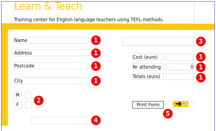
The next image shows the form that we’re going to build step by step, as it appears in Scribus. The red circles are simply markers to denote the following form elements.
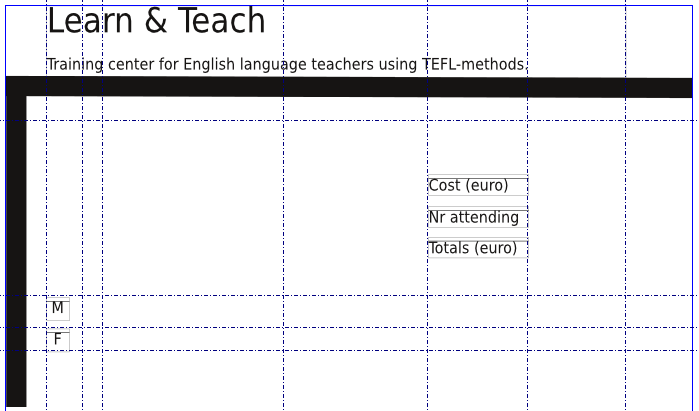
Everything else, such as the header and the lines are regular Scribus objects. There are also some simple text frames – those with M and F, Cost (euro), Nr attending, and Totals (euro) are simply labels for the adjacent form elements.
|
|
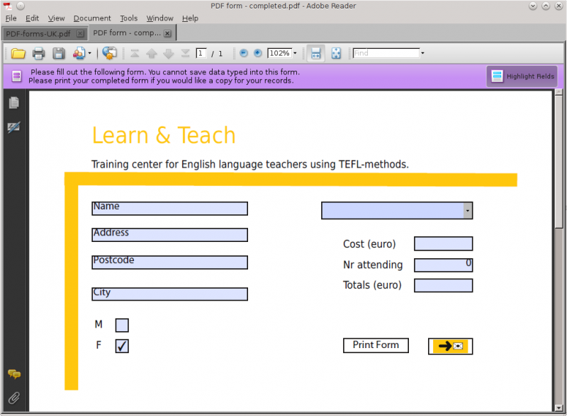
Below we see the form as it appears in Adobe Reader. Except for the buttons, the light blue shows the areas where some input can be entered in the form. The word Name is a default entry that also indicates the type of input, so you would delete that and enter your name to fill out this form.
It’s important that you realize that while the design of a form is done in Scribus, it cannot be tested in this environment! In other words, all the form elements are nonfunctional in Scribus. So every time you have taken a step in the design process and you want to check if it works, you will have to take the following steps:
- Save the form in Scribus as .sla-file.
- Export the form in the PDF format.
- Find the resulting PDF file and open it in Adobe Reader.
- Test the form.
- If you find any mistakes or want to continue the design, you close Adobe Reader and return to the Scribus environment.
- Make changes or expand the form.
- Save it again in Scribus, export the PDF and overwrite the previous PDF version! This may seem an obvious thing to do but in reality it is often forgotten, thus leading to many different versions and absolute confusion on your part as you try to figure out which is the “true” final version.
- Repeat these steps as often as necessary until the form performs exactly as you envisioned. With some experience you will become comfortable with the various form elements, and not find it necessary to recheck the PDF after every change.
Layout
For our example we will make an imaginary enrollment form for a particular type of training for teachers of English as a foreign language (EFL), who want to qualify in a certain methodology.
- Prepare a new document A4 size. (US Letter is similar.)
- We need some text frames. At the top the name of the institute is placed. Colors will be applied later. We will take the color from the color in the button face. We will design our own icon for the buttons, using a simply drawing program such as Paint (if you run Windows).
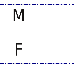
- In the lower left hand corner we will use two small text frames that will read M(ale) and F(emale).
- On the right we find three text frames with the texts ‘Cost (euros)’, ‘Nr attending’ and ‘Totals (euro)’. Height of the frames is 5,5 mm approx., font is Arial, 12 pt and anything similar. (The examples here on the wiki created on Linux use DejaVu Sans Condensed.)
- We’ll lower the text in the frames a wee bit, it gives a better look. Click in the Properties box under Text on Columns & text distances and apply 1 mm spacing above (the Top setting).
- Two thick lines are added. The results so far are shown in the next image. The positions of the guides are not so important, an estimate will do. Note that their main purpose is to help align various objects and create some balance of the layout.
Adding PDF form elements
The next step will be to add the PDF form elements – seven text fields, two check boxes, one combo box and two buttons. Each has its own method:
- Text field – The person using the form can fill in information in a text field. In this example we will add default text, showing the user which information is expected. In the next image you’ll see two completed text fields on the left and one that still has to be filled with a suitable text. You may type text directly into the text fields, just as you are used to with regular text frames. Select a text field and click on the button Frame Contents or use the Story editor.
- Check boxes – There are two fields that can be filled with a tick mark. We use them to denote the sex. It is hard to be a woman and a man at the same time, therefore the form should only allow for one tick mark in one of the boxes. With a small piece of programming we will make sure that a tick in one of the boxes removes the tick mark from the other box. In some other situations, we might have a list of non-exclusive options that a user could choose from, and since there would be more than one choice to make, we wouldn't need this restrictive programming.
- Combo box – We will fill the combo box with a number of training options. The filling of the box will be performed momentarily by a little program when the user clicks the box. Once a choice has been made to enlist in a particular training, the cost will be filled in one of the text fields. This also requires a bit of programming. The way we will do it here, a result will be entered only when the user clicks in another field. We will force the user to do so by filling in zero for the number of applicants. The user will have to change that and thus the program will be executed; check the next box titled ‘Events’.
There are other ways of doing this, but they lay outside the scope of this introduction into programming pdf-forms . - Buttons – By clicking a button one can initiate an action. As an experience software user you are accustomed to this. The most well-known button that we all use daily is the OK-button. Scribus also allows us to add such a button to a form. Behind the button for printing the form we find a program snippet that performs this action for us. The button to send the form does not need any programming because this action can be set in a dialog box.
Events
| Clicking a button or clicking in a text field is an event. Also if you fill in something in a text field, or if you make a choice in a list box or a combo box and consequently click in another field, we call this an event. An event is connected to a text field, a button or any other control in a PDF form. Every event that is detectable, offers the possibility to add a program snippet to it.
Now take the time to let the next sentence sink in: If no programming is connected to an event, then nothing will happen when the event occurs. If a program is connected to an event, then it will be executed every time the event takes place! In our form we will add a button that will print the form when the user clicks the button. We will use the mouse down event (the mouse button is clicked when the mouse pointer is positioned over the button) to program the fragment that will execute this task. If the user was to click the button let’s say ten times, the form would be printed ten times. This programming method is called event-driven programming. All currently available operating systems for computers such as Apple OS X, OS/2, Linux, Windows and others, are constructed around this principle. You’re already used to working with it, now you will acquaint yourself with the backside of this technique and program it yourself. |
- Draw a pdf text field on the left of the form.
- Set it up as follows:
Font: Arial, 12 pt, 1mm spacing above, width approx. 60 mm and height 5,5 mm. - Copy this field three times (Windows: Ctrl + C and then Ctrl + V). Position the copies neatly below one another.
Note that you might also use Item > Multiple Duplicate for a task like this, either by making a series of copies with a certain vertical spacing, or creating a number of rows, with your set spacing. - Click in the first text field and choose in the popup menu Edit text… The next image just shows this for the field that will have to contain the postal code.
- The Story editor is opened, type the text, then choose Edit text and close in the File menu. The text will appear in the text field.
- Repeat this procedure to add the following texts to the next four fields: Name, Address, Postal code and City.
- Draw two square check boxes next to the text frames that read M and F respectively.
On the right hand side of the form we need the following pdf controls:
- On top a combo box.
- Three text fields below the combo box, to the right of the three already present text frames.
- Below this group you draw two buttons.
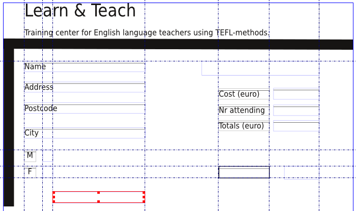
- The next image shows you what it should look like so far. Note that the selected frame (outlined in red) is not mentioned above, but is a Text Annotation frame.
Icon on a button
Buttons can be enhanced with a little image on them. We call this an icon. Alternatively you might just add a short text to the button face. Adding text to a button in Scribus is comparable to adding text to a text field. An icon for a button is also quite doable.
- Use a drawing program. The images in this example were made using Windows’ Paint (Dutch version).
- Define the canvas (size of the drawing) which should fit the size of the button. It doesn’t need to be very big, 200 x 100 pixels should be more than sufficient. You may find this in any program under Properties in the menu File.
- A drawing program will allow you to add text, use a font like Wingdings or Symbol to add special signs such as a computer keyboard, an arrow and an envelope.
- Add some background color and a few thick lines in a slightly darker shade will add a sense of a shadow effect.
- Save the button face drawing and switch to Scribus.
| The actual graphic you see above was created entirely in Scribus, using Dingbats font, grabbed with a screenshot program, then saved as a PNG to be used for the form. There were actually 3 frames here, in the front a text frame with no background color and the symbols, underneath an empty copy of the text frame with orange background, and in between a small frame with a white background so the envelope would be white. So as you can see, Scribus qualifies also as a “drawing program” |
Set up fields
The next task that awaits us is to set up all fields through the dialog box Field Properties. Let’s start with the one of the buttons.
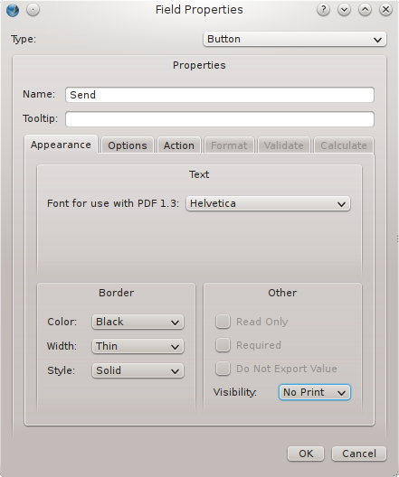
- Double click the button on the right. The dialog box Field Properties will be opened.
- Assign a name to the field. If you skip that all controls on the form will receive a generic name consisting of the type of field and a number. It’s not very clear. Rather go to the tab Appearance and assign a name that clearly states the purpose of the field behind Name.
- At Visibility we choose No Print. After all, if the user decides to print the form it will not be necessary to print the buttons now, will it?
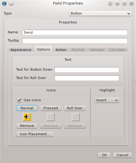
- Select the tab Options and click the button Normal.
- The dialog box Open will be opened and you select the button face (icon) that you have just prepared.
- Take into account that you can use up to three icons: Normal (what is visible most of the time), Pressed (what is visible when the button is clicked) and Roll over (visible when the mouse pointer hovers over the button. In this example we stick to just one icon.
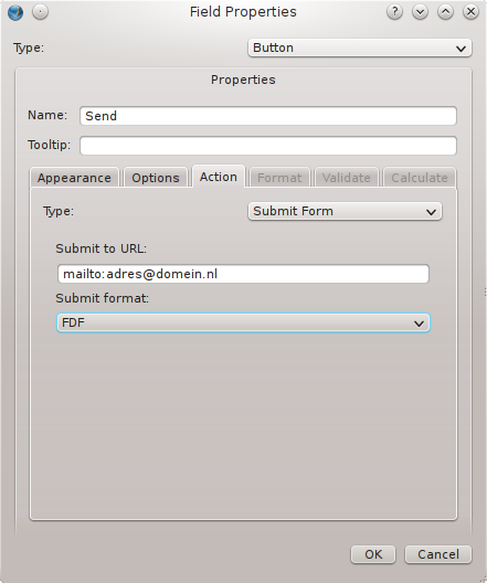
- Click the tab Action and select at Type: Submit form.
- Type the url in the box Submit to url:. The image below to the right shows how an e-mail address is used. Adobe Acrobat Reader will try to open a mail client on the user’s computer. If this fails a dialog with choices will be shown.
- The button’s set up is complete now.
- The left button, which deals with printing of the form, can be enhanced with an icon in the same way. We just used the Story editor here to add a text; see the next images.
- If you use a background color for the button that e-mails the form results just like we did, you may use Scribus’ Pipet tool to add this color to the document’s colors and use it to enhance the form’s title and the two lines that we added earlier.
|
|
Naming Conventions
| Names assigned to fields enable us at ‘the backside’ of the form to perform certain tasks through program snippets. The user’s side, ‘the front’ and programmer’s side, ‘the back’ of the form need not look the same.
In practice generic names are cumbersome, because they are also used to present the results of a form when it is send by e-mail. It’s much nicer to receive a result that looks like this: |
| Name | G. Bruijnes | ||
| Address | Langstraat 6 | ||
| Postal code | 1234 AA | ||
| City | Stadje | ||
| Female | ON |
| A much less clear result with generic names would look like this: |
| Text22 | G. Bruijnes | ||
| Text37 | Langstraat 6 | ||
| Text42 | ON |
| Naming can be in a language that differs from the language used in the form, because the results may be processed by employees who, in this case, do not speak English. Anyway, it is not necessary and you may use anything you want.
Programmers often use a different type of naming, the so called Hungarian Notation. The type of object is mentioned in the name (we call a field an object or control). In this case English is the predominant language and names would look like this: |
| chkFemale | ||
| txtAcqAddress | ||
| btnPrintForm |
| The prefix chk makes it immediately clear that we are dealing with a check box, txt would denote a textfield, and btn refers to a button. |
Set up other fields
You know now that you can set up the fields by double clicking them in order to make choices in the dialog box Field properties. The next table gives you all necessary information:
| Control | Tab | Set up |
| Checkbox (M) | Appearance Options |
Name: M Default is Not checked |
| Checkbox (F) | Appearance Options |
Name: F Default is Checked (Most teachers are female!) |
| Combo box | Appearance | Name: Training |
| Field next to Cost | Appearance Format |
Name: Cost Field formatted as: Number Decimals: 0 (zero) Use Currency symbol: No tick mark (Does not work well) Formatting: 9,999.99 |
| Field next to Nr Attending | Appearance Format |
Name: NrAt Field formatted as: Number Decimals: 0 (zero) Use Currency Symbol: No tick mark Formatting: 9,999.99 |
| Validate | Value must be greater than or equal to: 1 | |
| In Story Editor: Input Alignment |
0 (zero) right | |
| Field next to Totals | Appearance Format |
Name: Totals Field formatted as: Number Decimals: 0 (zero) Use Currency symbol: No tick mark Formatting: 9,999.99 |
| If you have added an Annotation Field | Type: Destination: |
External weblink www.ipaa.nl (the author's website) |
Remarks
When defining the field NrAt you will see that we use a validation. This means that as long as the number 0 (zero), the form is considered to be not completed correctly. Thus we force the user to fill in a number equals to or larger than 1. By doing so the price of the training selected in the combo box will be processed in the text field Cost.
Check out the other possible links in the Annotation field. You’ll see that it is also possible to refer to particular locations inside the document. This completes the setup of the fields.
Adding programming (code snippets)
As I have explained before we use JavaScript to automate certain events. There is no need for you to have any specific programming experience to be able to understand the code snippets that we use here. If you want to make more pdf forms yourself, there will be no escape, you’ll have to foot it and learn the language, not meaning English here!
Remember:
- A correct working piece of programming can only be obtained by using all kinds of special characters which very often have a special meaning. Every semicolon (;) and every equals sign (=) is essential. Sometimes even a space can make the difference!
- Copy all examples in exactly the same way, maintain the same lay-out.
- JavaScript uses braces abundantly. Use the right type { (open) or } (close) in the correct spot.
- Check your code snippets on correct spelling of the words. One misplaced letter and the fragment will not perform its task without any warning.
- Press the Enter-key at the end of each line.
- If you can’t get it to work, File:PDF form - completed.sla.gz is a fully-fledged version so you can still check out how it works.
The check boxes
First we’re going to fix the check boxes. Most teachers are females so that’s we tick off the check box F (see previous table).
- Double click check box M.
- Select the tab Action in the dialog box Properties.
- Choose Type: JavaScript.
- Choose Event: Mouse up.
- Click the button Edit.
- Copy the following code snippet:
var v = this.getField("F");
v.value="Off";
How to interpret this? The snippet is located in the Mouse up event of the check box M. So if some clicks here as a result a tick mark will be placed in the box. This means however that the standard tick mark in checkbox F must be removed. In the code snippet we first point to the field F. Once we have established this, we can turn its value “Off”.
- If you’re done, you chose Save and Exit… in the Editor’s File menu.
- Now you will see the code snippet in the dialog box.
