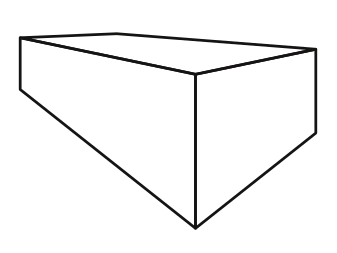
How to draw a perspective box
| Installation • Usage • PDF issues • Imposition • Other |
Button … Menu → Choice … Keyboard
Introduction
This tutorial will show you how to create a simple box with perspective. It is not a complete guide to perspective drawing or anything like that, just something easy that will show you how to get started.
Specific techniques used in this tutorial
- Setting up and displaying a grid.
- Creating simple shapes.
- Creating Bezier lines.
- Converting Bezier lines to Polygons.
- Cutting Polygons with Bezier lines.
- Simple Node editing.
- Using a Path Operation to create a new shape.
- Changing the formatting of a shape.
This tutorial is okay for beginners. As long as you can navigate your way around the basic Scribus windows you should be fine.
Set-up
- Open Scribus and create a new document. (A4/Letter in any orientation will be fine but landscape will give you more space.)
Grid
First you need to set-up a grid. This will make drawing the box really easy.
- Choose menu File → Document Setup…
- Go to the "Guides" section.
- Check "Display Grid".
- Set the "Major Grid" Spacing to 64pt, and the "Minor Grid" Spacing to 8pt. (Any grid spacing will do but this set-up gives you a good amount of granularity.)
- Press Apply and OK the dialog.
- Choose menu Page → Snap to Grid
Vanishing Points
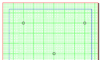
Now you need to draw three vanishing points (VPs). For a bit more information on vanishing points you can have a look at this article. The first two VPs need to be on your "horizon line". This is where your perspective lines would stretch to if your box was of infinite size. The third VP should be "below" your field of view. Don't worry if that all sounds complicated, it will become clearer when you start drawing.
- Near the top-left of your page choose a point on the grid - it's best to use a point where the major grid spacings lines cross - and use Insert → Insert Shape → Default Shapes → Circle to draw a small circle around that point.
- Do the same over to the top-right of your page at the same vertical position as the first circle.
These are the two VPs on your "horizon line".
- Select a new point that is below the "horizon line" and equidistant between the first two VPs, and draw another circle around it. (For the purposes of this tutorial make it three or four major grid spacings below.)
You should now have three VPs like that in figure 1.
Left Face
- Choose menu Insert → Insert Bezier Curve
- Click somewhere vertically above the bottom VP. (About 5 or 6 minor grid spacings up will be fine.)
- Click somewhere vertically above your first click. (About 5 or 6 minor grid spacings below the "horizon line" will be fine.)
- Click on the point you drew your first VP circle around.
- Right-click to stop drawing the bezier line.
- Choose menu Item → Convert To → Polygon
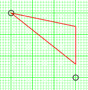
Scribus has automatically closed the line you've just drawn into a triangular polygon - see figure 2 in red.
- Choose menu Insert → Insert Bezier Curve
- Click somewhere above and to the right of the left-hand VP. (About one major grid spacing to the right should be fine.)
- Click anywhere under your first click so that you draw a line vertically downward that crosses both the top and bottom lines of the triangle - see figure 3 in red.
- With the line you've just drawn selected, shift-select the triangle.
- Choose menu Item → Path Tools → Cut Polygon
Scribus has now used the line you drew as a "knife" to cut the triangle into two pieces - see figure 3.
- Select the left-hand triangle - in red in figure 3 - and right-click, then choose Delete
You have now got the start of your box, the left-hand face.
Right Face
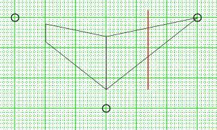
For the right-hand face, do what you did for the left-hand face but mirror your actions about the vertical line in the middle of your drawing. Try placing the "knife" line to the right or left of the exact mirror of the first "knife" line to show a box that isn't the same on both sides - see the red line figure 4.
You should now have your left- and right-hand faces similar to that in figure 5.
Now you'll draw the top face of the box, which is done a little differently.
Top Face
Duplicates
To make it easier to create the top face you'll duplicate the originals so you have something to work from.
- Select one of the faces and shift-select the other one so both are selected.
- Choose Item → Multiple Duplicate…
- OK the dialog - without making any changes - to create duplicates of the two original shapes on top of the originals.
Node Editing
- Select the left-hand shape - it's actually the duplicate that you're selecting - and double-click to bring up the
 Node Editor"
dialog.
- Press the "Add Nodes" icon - second from top-left in the dialog - and click near the middle of the top line of the shape (you don't have to be accurate in placing the node).
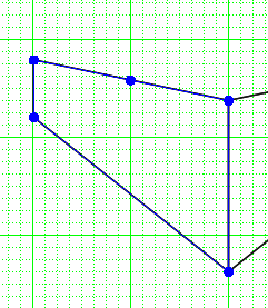
A new node should have been created in the middle of the line - see figure 6.
- Press the "Mode Nodes" icon - top-left - and drag the new node to the point surrounded by the right-hand VP circle - see figure 7.
- Press End Editing to close the Node Editor.
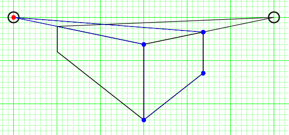
Now repeat the actions you've completed in this "Node Editing" section but for the right-hand shape, creating the new node near the middle of the top line as before but dragging the node to the centre of the left-hand VP circle. Figure 8 shows the new shape in blue.
- Press End Editing to close the Node Editor if you haven't already done so.
- Select the shape you've just edited and shift-select the shape you edited previously.
- Choose menu Item → Path Tools → Path Operations…
- Select the "Intersection" icon - the middle one under "Operations" - and OK the dialog.
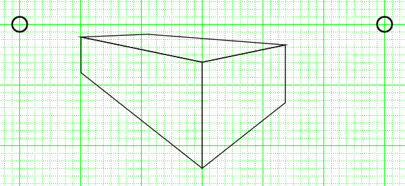
You should now have your perspective box - as in figure 9 - but there's still a bit of work to do.
Tidy Up
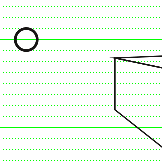
If you zoom in to the left-hand side of your box you might see that something looks wrong with the top-left corner - figure 10. (The same will probably be true for the top-right corner.) This happens because of the way that Scribus performs Path Operations, but it's easily fixed in this situation.
- Select the top face of the box.
- Go to the
 Properties palette and go to the Line tab.
 - Shift-select the left-hand face, then shift-select the right-hand face.
- In
 Properties ⟩⟩ Line, change the "Edges" setting to "Round Join".
The corners of the whole box should now be okay for most purposes (other than very high quality printing). The bottom corner of the box - if you zoom in - still isn't perfect but you can increase the line widths of all the shapes to obscure the problem - see figure 11. (This isn't really a fix but it gets round the problem simply.)
- You can now delete the VP circles as they're no longer needed.
Beyond the Plain
What you do with your perspective box is now up to you.
Figure 12 shows the faces filled with different shades of black to give a very basic lighting effect.
Figure 13 shows the each face converted to an image frame and given a purple crepe effect. (Each face has had a "Brightness" Image Effect applied to make it darker than the others.)
And figure 14 shows a box made of water, though why you'd want that is your own business.
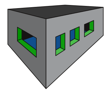
And the image at the top of this article - if you're interested - shows something you can do if you've got way too much time on your hands. (If you want to try it you will need to "layer" some parts of the drawing so that things don't get in the way of other things.)
Anyway, that's all for this tutorial. Have a go and experiment with various shapes and see what you can create.
