There are many design problems which can occur, some of which involve a matter of style, color choices, placement of elements in a pleasing way, but what will be discussed here are things that have to do with visual perception.
Design and layout can have quite a range of appearance, depending on the purpose of the document, poster, or presentation you might be working on. In some cases, a goal is first of all to attract attention to your design, but even then, once you have that attention, you want to convey some information or meaning. Certain elements can either guide the eye to the important portion or maybe even guide the eye along a certain path. What you don't want to do is have non-informational elements blocking eye flow or causing the eye to keep returning to non-information.
Something to keep in mind as you go through these is the limited resolution of computer monitors. This somewhat limits what can be demonstrated here, so in the end using Scribus to play with your layout should show you what doesn't work, what works, and what works better.
Problems with Lines

|
Look at this pair of lines. Regardless of the angle of orientation, the brain reacts very strongly to the edges, especially when there is a sharp contrast, in this case black to white and black again. What you may also notice is that it's hard to block out these lines as you read this text, and that your eyes keep getting drawn back to them. The information is here in the text, the lines are a prop, yet they command your attention.
|
| This is why in many cases, in Wikis for example, it is recommended to be very sparing in the use of horizontal lines -- they impede eye flow.
The other thing to notice above is that while there are two black lines drawn on the white background, the positioning creates what has been termed a '1 + 1 = 3 effect', so that what you perceive is two black lines, with a third white line created by the boundaries of the black lines.
|
| When there are embellishments, such as arrowheads, this distractability is enhanced, and we create perceived shapes between the lines. Someone might believe that a second arrow here merely enforces the meaning, when actually this pair becomes a distraction and creates visual elements that were not intended.
|

|
| To see the effect magnified, look at this set of lines. Imagine someone using this as a border around another object. There is almost a perceptual vibration this pattern creates, and in case you think this relates to viewing this on a monitor, print something like this on paper and you will see the same effect.
|

|
Photo Montage Example

|
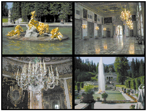
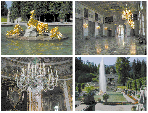
Here is a montage of photos taken at Schloss Lindenhof in Bavaria. Perhaps with the idea of creating a photo album effect, the images have been given borders. The outside border is at best mildly distracting, but the central borders create this cross effect and become a major visual element in this montage. Why not just get rid of the borders?
|

|
Well, we've lost the effect on the outside edges, but we still have this cross, now in white. So what can we do?
- Separate the pictures, perhaps even stagger them. Larger spaces between elements will reduce the edge effect.
- Butt the pictures together, eliminating this cross.
- Tone down the contrast of the edge effect.
|

|
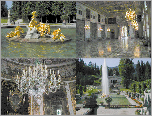
This is an example of the third suggestion, not only choosing a color similar to some tones in the images, but narrowing the intervening space. Now you see the pictures and not the framing elements.
|
Lines and Text Example
This is one of the most common mistakes you will see. Say, for example, we have a list -- of items, of dates, perhaps the cast of a play.
Intuitively, or perhaps merely because we've seen this so often, we decide that items in the list need some kind of separator, as if they will somehow move about the page if we don't corral them.
| So we do something like this. We look back, it has a nice, regular structure, rows delineated, columns delineated. We're satisfied.
But what about the reader? Just look at all this edge effect -- from the lines, the letters -- we've had to make the text Bold so it can compete with the lines. We even get this sense of visual vibration. Imagine the fatigue if you were reading page after page of this.
We might even make this worse, by making rows or columns different colors -- maybe even have words colored like a rainbow. We could make a column's background a bright color. Distractions, distractions, and more distractions.
|

|

|
Ok, here's a step in the right direction -- the horizontal lines are now a fraction of a point and gray. We've been able to switch to a Regular/Book font, which reduces edge effects, increases legibility.
But again, do we need these lines at all?
|
| Look Ma, no lines! And the letters don't roam around the page! You can still perceive the tabular structure, and now everything you see is information, no visual barriers. While you might be tempted to make a border around this, just using white space sets this apart and does not distract.
|

|

