How to create a neon sign
| Installation • Usage • PDF issues • Imposition • Other |
Introduction
In this tutorial you'll create a simple neon sign.
You'll be creating something like that which you can see in Figure 1, but the same techniques can be used to create the sign shown above. You just need to put in more time and effort.
Specific techniques used in this tutorial
- Creating new colours.
- Converting text to outlines.
- Creating and managing layers.
- Creating a new line style and applying it to a shape.
- Transforming a shape by re-scaling.
- Using layer opacity.
This tutorial can be followed by anyone with a good grasp of the Scribus basics.
Set-up
Font
If you're following this tutorial to the letter you'll need the Dosis Bold font. You can get it for free from here.
If you're not using Dosis Bold you'll find that a medium-thickness rounded font works best. Some of the thicker fonts tend to mess up the effect - thin fonts also mess things up, but differently - and angular fonts tend to look a bit odd, but feel free to experiment.
Colours
- Start Scribus and create a new blank document (A4 Portrait will do).
You first need to set-up the colours for the sign. You should already have White and Black in your palette but we'll need three others.
- Choose menu Edit → Colors…
- Press New
- Enter the name of the colour as "Neon Red 1".
- Select "CMYK" as the colour model.
- Set the CMYK values as: C 0%, M 50%, Y 12%, K 0%.
- Press OK to create the new colour.
You now need to repeat the above for the following colours: "Neon Red 2" - C 0%, M 68%, Y 25%, K 0%. "Neon Red 3" - C 0%, M 95%, Y 83%, K 0%.
- OK the Colors dialog when you've created all three new colours.
Figure 2 shows all of the colours you'll need.
The Background
Now you need to draw a dark background. You'll use a classic black for this tutorial but feel free to try others.
- Choose menu Insert → Insert Shape → Default Shapes → Rectangle
- Draw a rectangle from the top-left of your page to the middle of the right-hand side.
- Go to "Properties / Colors" and make the fill colour Black.
The Basic Text
- Under the black rectangle - so you can see what we're doing - create a text frame the width of the page and about a quarter of the page height. (This makes sure it's big enough for the large text.)
- Double-click the text frame and enter "NEON" (without the quotes) into the frame.
- Click somewhere off the text frame and re-select it.
- Go to "Properties / Text" and select the "Dosis Bold" font (or whatever you're using).
- Set the font size to 140pt (or whatever size you want, but make it very large).
Converting the Text
- Choose menu Item → Convert To → Outlines
- Re-select the text and choose menu Item → Ungroup
- Choose menu Item → Combine Polygons
The text is now all one shape and can be easily modified. You should have something that looks like Figure 3.
Adding a New Layer
- Choose menu "Windows -> Layers".
- Press the "+" icon (at the bottom of the dialog) to create a new layer.
- Double-click the name of the new layer and rename it "Sign" (without the quotes).
- Click the "Background" layer in the dialog.
- Select the converted text.
- Right-click and choose menu "Send to Layer -> Sign".
- In the "Layers" dialog click on the "Sign" layer.
You've now moved the text we'll use for the sign to its own layer. The purpose of this should become clear later.
The Neon Effect
Now we need to create the effect we are going to use for the neon effect. And for that we'll be using a Line Style.
- Choose menu "Edit -> Styles".
- Press "New" and select "Line Style" from the drop-down.
- Rename the style as "Red Neon" (or whatever you want, but make it relevant so you know what it's for).
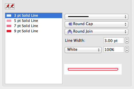
We now need to create the different lines that will make up our new line style.
- Press the "+" icon (just under the style name). This will create a new line within the style.
- Press the "+" icon twice more so we have four lines.
- Click on the top-most line.
NOTE: When editing a line style you need to watch out for Scribus re-sorting the lines by width. This is because Scribus makes sure that thinner lines are always displayed above thicker lines.
- To the right of the list of lines change "Flat Cap" to "Round Cap".
- Change "Miter Join" to "Round Join".
- Increase the Line Width to 9pt. (Did you notice Scribus re-sort the line?)
- Change the colour to "Neon Red 3" (the darkest red).
We've set-up one of our lines; now we need to do the same for the others.
- Select the top line again (it's a different one to the last one we changed as we haven't changed it yet.)
- Change both the Cap and Join to "Round" as before.
- Increase the width to 7pt (a bit smaller than the last line).
- Change the colour to "Neon Red 2" (the second darkest).
You can start to see our line style building up on the bottom-right of the dialog.
- Select the top line again, change the Cap and Join to "Round", increase the width to 5pt, and change the colour to "Neon Red 1".
- Select the top line again, change the Cap and Join to "Round", increase the width to 3pt, and change the colour to "White".
We've now created our new line style. Figure 4 shows what you should have.
- Press "Apply" and then "<< Done". You can also close the Style Manager dialog if it's getting in your way.
Now it's time to apply our new Line Style to our converted text.
Applying the Style
- Select the converted text.
- In "Properties / Line" select our new "Red Neon" line style.
It's looking okay so far - or it should be! - but it's not finished yet.
- In "Properties / Colors" set the fill colour to "None". (This makes sure we can use the text over any background, not just the black rectangle we're using.)
- Drag the text over to the middle of the black rectangle we're using as a background.
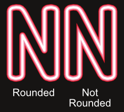
In case you were wondering why we set the Caps and Joins to "Round" earlier, see Figure 5 to see the difference.
We could just leave it like this but we'll add a little embellishment that will make it look a bit better (hopefully).
The Reflection
- Open the "Layers" dialog if you closed it earlier ("Windows -> Layers").
- Click on the "+" icon to create another new layer.
- Double-click the new layer name and rename it as "Reflection".
You'll notice that the new "Reflection" layer is above the "Sign" layer. We don't want that; we want it underneath.
- With the "Reflection" layer selected - just click it if it's not already - press the "Down Arrow" icon.
This has moved the new layer below - or behind - the layer with the sign on it.
- Select the "Sign" layer.
- Select the text and choose menu "Item -> Duplicate".
- With the new duplicate selected, right-click and choose "Send to Layer -> Reflection".
You may have seen the duplicate jump below the original.
- Select the "Reflection" layer.
- Select the duplicated text.
- Choose menu "Item -> Transform…".
- Press the "Add…" button and select "Scaling" from the drop-down.
- Ensure the "linked" icon (at the right-hand side of the dialog, see Figure 6) is "on" (the links of the chain will be together). If it's not "on", just click it.
- Decrease either of the Scaling factors to 93% (the other factor will also change automatically).
- "OK" the dialog.
- Manually drag the now-smaller text behind the original text, centred vertically but just a little higher than the original text. It looks a bit odd at the moment but that's okay, there's one more step.
- In the "Layers" dialog set the "Opacity" of the "Reflection" layer to 50%. This should make things look much better.
You should now have your sign complete with a reflection off some invisible glass. You might need to move things around until you get the effect to your satisfaction.
And that's it. Why not try experimenting with different fonts and colours and see what you can achieve?
IMPORTANT: If you plan to export your work to a PDF make sure that you use PDF 1.4 or better, otherwise the opacity - in the reflection - will not work.
Replicating the "Cocktails & Dreams" image
- The background image comes from: http://pixabay.com/en/city-building-night-view-night-11087/
- The font is "Santa Fe LET" (I've no idea where you can get this from, or how I got it).
- The character spacing needs to be modified to stop the letters overlapping.
- You need to create a set of blue colours for the circle.
- The circle needs quite a bit of editing. Try using the "Path Operations" function - cutting with rectangles - rather then editing the circle directly.
- All of the text needs to be rotated 10 degrees. Whether you do this before editing the circle is up to you.
I did say it needed more time and effort. Good luck!


