How to CCTV-ify an image
| Installation • Usage • PDF issues • Imposition • Other |
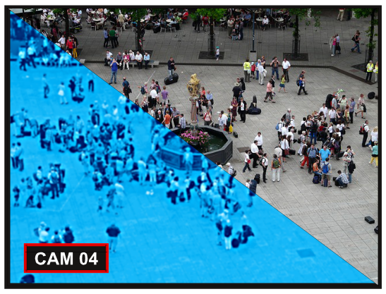
This tutorial will show you how to convert a normal image into something that looks like it's been captured on a CCTV camera. (Not a particularly useful thing to do but it might give you some inspiration.)
Picture Choice
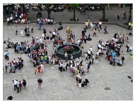
First choose a picture that looks like it could have been taken by a CCTV camera. A nicely framed picture from eye level won't look right. To look best it should be taken from a height, from a distance, and (perhaps) be at a strange angle.
If you're following this tutorial to the letter you can download the image used - figure 1 - from here: http://pixabay.com/en/human-personal-meeting-58331/
Colours
Now you need to create two new colours.
- Start Scribus and create a new blank document (A4/Letter Portrait will do).
- Choose menu Edit → Colors…
- Press the New button.
- Enter the name of the colour as "CCTV Blue 1".
- Select "CMYK" as the colour model.
- Set the CMYK values as: C 64%, M 22%, Y 0%, K 0%.
- Press OK to create the new colour.
You now need to repeat the above for the additional colour: "CCTV Blue 2" - C 40%, M 8%, Y 0%, K 0%.
- OK the Colors dialog when you've created both new colours. Figure 2 shows all of the colours you need.
Initial Image
- Choose menu Insert → Insert Image Frame
- Draw the image frame to put your image into - half of the page width should be fine.
- Right-click the image frame and choose Get Image… from the menu.
- Locate your image and OK the dialog.
You should now use whatever tools you want - adjust, scale, etc. - to get the image looking as you want it.
Image Effects
- Select your image frame.
- Go to
 Properties Image and press the Image Effects button.
You've now opened the "Image Effects" dialog. There's a lot to see in here but it won't be explained in this tutorial. You'll be taken through only what you need to do for this effect but you'll need to find more information elsewhere if you're interested.
Posterizing
- From the middle list select "Posterize".
- Press the >> button to copy the effect to the right-hand list.
- Select "Posterize" on the right-hand list.
- In the "Options" area on the left, drag the slider to 8.
Tritone
- From the middle list select "Tritone".
- Press the >> button to copy the effect to the right-hand list.
- Select "Tritone" on the right-hand list.
- In the "Options" area on the left, set "Color 1" to "Black".
- Set the "Shade" for Black - just under where you selected the colour - to be 50%.
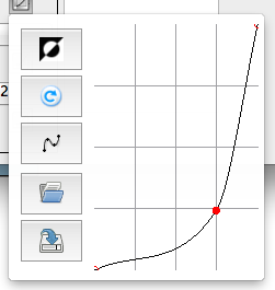
- Press the "Curve" icon to the right of where you set the Shade.
- Drag the red dot down and to the right so it's at point 3,1 on the grid - see figure 3.
- Press the "Curve" icon again to close the little window.
- In the "Options" area on the left (again), set "Color 2" to "CITV Blue 1".
- Press the "Curve" icon under "Color 2".
- Drag the red dot up and to the left so it's at point 1,3 on the grid.
- Press the "Curve" icon again to close the little window.
- In the "Options" area on the left (again), set "Color 3" to "CITV Blue 2".
- Press the "Curve" icon under "Color 3".
- Drag the red dot up so it's at point 2,3 on the grid.
- Press the "Curve" icon again to close the little window.
Blur
- From the middle list select "Blur".
- Press the >> button to copy the effect to the right-hand list.
- Select "Blur" on the right-hand list.
- In the "Options" area on the left set the "Radius" to 1.
Sharpen
- From the middle list select "Sharpen".
- Press the >> button to copy the effect to the right-hand list.
- Select "Sharpen" on the right-hand list.
- In the "Options" area on the left set the "Radius" to 10.
- Set the "Value" to 5.
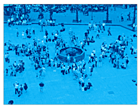
You can now OK the Image Effects dialog and you should have something like figure 4. Try adjusting the various things you changed until it looks right.
Once you're happy with the effect you can embellish it with an outline and some text like the image at the top of this tutorial.


