Given sufficient time and patience, you could play around with the Color tab in Properties to figure out how to change line and fill colors. Admittedly, it's takes more time and perhaps a lot more patience to understand how the gradients feature is used. Here we try to give you a head start on this.
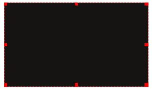
| Here is a basic rectangle shape with the familiar default line and fill colors – black on black. We've just made this, so it's selected, but suffice it to say that whenever you are performing some operation on a frame, you will need to select if it isn't already.


|
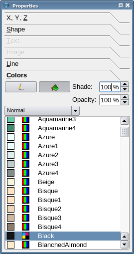
To the right is the Properties palette with the Color tab selected. From now on, we'll just focus in on the Color tab. As you see here, the default is to have a Normal setting, meaning a single, solid color for line or fill – this is pretty intuitive.
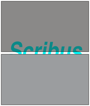
While we're at it, we will also point out the Shade and Opacity settings. Below the black rectangle to the left the grey rectangles and underlying text illustrate the difference. The top grey shape has a black color but 50% opacity, the bottom is set at 50% shade (ie, saturation).
|

|
On To the Gradients
