How to fake defocussing part of an image
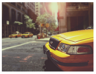
Sometimes you have a nice image but you only want your reader to focus on what is in the foreground - the subject. In cases like this you can defocus the unwanted part of the image - the background - to direct the reader to the important part.
NOTE: This effect isn't a replacement for good image manipulation tools. It's a simple way of doing the job reasonably quickly without needing to learn anything outside of Scribus. (For a more professional effect I'd recommend using GIMP instead.)
Choosing the image
The technique described below works best on images where there is a distinct foreground and background. It doesn't really work very well if all of the image was at the same distance from the camera.
Also, it's best to pick an image where the subject you want to highlight has a simple shape. You can use this technique on complex subjects but it takes a lot more time to get it looking right.
If you'd like to follow this tutorial I'd suggest downloading this picture from Ryan McGuire on Pixabay http://pixabay.com/en/taxi-cab-taxicab-taxi-cab-new-york-238478/ The 640x480 version is of good enough resolution for the purposes of this tutorial. [[File:defocus-original.png|right]
Foundation
First you need to get your "base" image set-up as you want it to show on the page. It is important to do this early on as it will make things much easier later. Getting the image to the right size first will stop a lot of hassle later.
- Create an image frame.
- Put the image in the frame.
- Resize the image and frame appropriately to the same size.
- Go to "Properties / Image" and select the "Free Scaling" radio button.
IMPORTANT: That last step is very important because it will stop the image being resized later.
Selecting the Subject
- Choose menu "Item -> Multiple Duplicate" and OK the dialog to create a copy - "subject image" - of the original - "base" image frame over the top of the base image.
If you use another duplication method you may have to reposition the subject image.
- Go to "Properties / Shape" and press the "Edit…" button.
And here's where all of the work goes in.
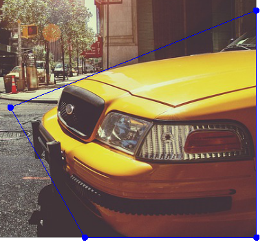
- Drag the nodes of the frame to approximate the shape of the subject - see Figure 1.
As you can probably see, this isn't a very good approximation the of the shape of the subject so you need to add more nodes to further refine the shape.
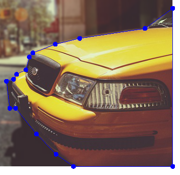
- Use the "Node Editor" dialog to add more nodes along the shape, dragging the nodes to the shape of the subject.
NOTE: Don't forget to use the zoom functions to help you place the nodes in good places.
Figure 2 shows an idea of where you can put the nodes for the image in this tutorial. The more time you take to position the nodes the better the result will be.
- When you've positioned your nodes as you want, press the "End Editing" button the on the "Node Editor" dialog.
You now have two images but they don't look distinct, and that's fine so far.
Adding The Effect
- Select the "base" image.
- Go to "Properties / Image" and press the "Image Effects" button.
- Click on "Blur" from the list in the middle of the dialog.
- Click on the ">>" button to add the blur effect to the image.
- On the left of the dialog change the blur radius to 2 (you can change this later if you want to experiment).
- Click on "Brightness" from the list in the middle of the dialog.
- Click on the ">>" button to add the brightness effect to the image.
- On the left of the dialog change the brightness to something like minus 10 to darken it a bit (you can change this later if you want to experiment).
- OK the dialog.
And that's it, you're done. Your subject should now be much more visible than the background.
Try editing the shape of the subject image and using a different blur radius and darkening to get the effect how you want it.
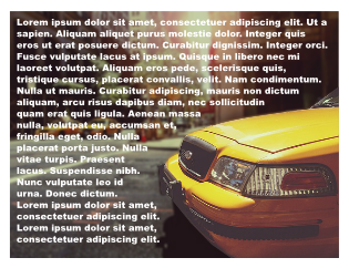
BONUS: You can use this technique to allow you to put text over the background of an image as shown in figure 3.


