How to create a fuzzy-edged picture frame
| Installation • Usage • PDF issues • Imposition • Other |
Introduction
This tutorial will show you how to create a fuzzy-edged picture frame.
Specific techniques used in this tutorial
- Creating a new colour.
- Adding an image and resizing/adjusting.
- Resizing a shape.
- Creating a radial gradient.
- Altering the opacity and shade of a fill.
Set-up
- Open a new Scribus document.
First you'll need your image. Whatever image you use I'd recommend that the subject(s) is (are) near the centre of the image to get the best results. Also it will help if the background is a light colour, or preferably white.
If you're following the tutorial you can download the image used from here. (The smallest resolution will be fine.)
Next you'll need a colour for your frame. Any colour will do - as long as it suits the image - but if you're following along you'll need to create a new colour, we'll call it "Shocking Pink".
To do this:
- Choose menu Edit → Colors…
- Press the New button.
- Change the name to "Shocking Pink" (without the quotes).
- Select "CMYK" from the "Color Model" drop-down list.
- With the sliders or the input fields to change "C" to 2%, "M" to 90%, "Y" to 20%, and "K" to 2%.
- OK the Edit Color dialog.
- OK the Colors dialog.
You also need a "White" colour but you've probably already got one from whatever default palette you have. (If you haven't, what sort of palette are you using that hasn't got a white in it?!?)
You're now ready to create your fuzzy frame.
The Image
- Create an image frame that is approximately the same shape as a passport photo in the centre of your document canvas. Size isn't really important but make its width around half the page width so you can see the effect nicely.
If your chosen image was landscape in aspect then make the image frame landscape instead of portrait.
- Right-click the image and choose Get Image… from the menu.
- Select your image and OK the dialog.
- Right-click the image frame and choose Adjust Image to Frame from the menu.
- Right-click the image frame and choose Adjust Frame to Image from the menu (it's a different menu item from the last step).
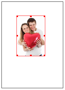
You should now have something like figure 1 but you need to lose some of the image that you don't want. This is just for the tutorial image; if you're using your own image you'll need to make your own choices.
- In the "Properties Palette" select the "Image" tab.
- Click the "Free Scaling" radio button (just under Page Number).
- Drag the bottom of the image frame up so its just under the girl's arm, so that the jeans disappear (as in figure 2).
That's probably enough for the image editing for now. You can always come back and change things later if you're not happy with it.
The Frame
- Select the image frame and choose menu Item → Multiple Duplicate
- Accept the defaults and OK the dialog.
- Select the duplicated image (you always select the top one).
- Choose menu Item → Convert To → Polygon
- Double-click the polygon - again it will be the top one - to open the Nodes Editor.
- Enter 60pt in the third input field down from the grid of icons. (The exact size will depend on how large your original image frame was; you may need to experiment.)
- Press the Tab key to make sure the value has been entered (because of a current bug).
- Press the "Enlarge the Size" icon to the far left of the text field you entered the value into.
- Press the End Editing button to exit the Nodes Editor.
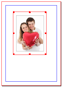
You should now have something like figure 3.
The Fill
- With the larger polygon selected go to the "Colors" tab of the "Properties Palette".
- Make sure Fill is selected by pressing the Fill icon.
- Select your fill colour; for this tutorial select "Shocking Pink".
The image has disappeared behind the polygon but that's okay because of what you do next.
- Choose a "Radial Gradient" from the drop-down list below the Fill icon.
- Drag the left-hand gradient stop - the small triangle - to the 50% position.
- Select "White" from your list of colours.
You should now have a white circle in the middle of your polygon, like figure 4.
The Fuzz
- Under the list of colours in the "Colors" tab, in Transparency Settings" set the Opacity to 0%.
Some of your image should have come back.
Now you need to make more alterations to the radial gradient fill.
- Click on the gradient fill bar to create a new gradient stop and drag it to the 60% position.
- Make sure the colour has been set to "White".
- Set the Opacity to 30%.
- Create another gradient stop at position 70%.
- Set it to the colour of "Shocking Pink".
- Set its Opacity to 50%.
- To the right of the Fill icon set the Shade to 50%.
- Drag the right-hand gradient stop the the 80% position.
You should now have a gradient bar something like figure 5.
If the "fuzzy border" goes up to the edge of the frame - as it does in figure 6 - you might want to slightly change the gradient stops by dragging them all to the left by around 10/15% or so (keeping them the same distance apart).
Once you've got the "fuzzy border" to the correct size you can move the whole frame to centre the subject properly if necessary.
And that's it done.
If you want the transition between white and your fill colour to be smoother then you'll need to add more gradient stops between the existing ones, altering the Opacity and Shade settings to suit.


