Creating a brochure
| Installation • Usage • PDF issues • Imposition • Other |
How To Create a Brochure
I should start by saying a "brochure" can be any of several, very different sized pieces. There are as many ways to make a brochure as there are designers, and then some! For this article, I will focus on a common commercial sized brochure set that is found throughout the U.S. and Canada – The Rack Card/Brochure. If you have ever stayed in a hotel, somewhere near the front desk is a large rack containing many cards and brochures, advertising local attractions, events, dining and even other places to stay.
The focus here is going to be in describing how to set up your Scribus document so that you can produce a brochure that prints and folds correctly. At the end I will give some design advice, but this is not a tutorial on typography, design layout, or how to make a stunning brochure that everyone will notice.
Notes on terminology: Panels refer to the actual pages of the final brochure. I refer to page sizes here as your overall page size in Scribus. Supplied Scribus layouts will only have 2 pages (front and back or inside and outside). Guides will be placed for trim edges and folds. crop and fold marks will be provided in the bleed area (outside the trim guides). More complex layouts will have "front cover", "back cover", and "inside front cover", "inside back cover". All dimensions are given in inches and fractions of an inch.
The Rack Card
The most basic Brochure is the Rack Card. It is a simple 4" x 9" piece of paper with information printed on both sides (usually). These are generally printed on a moderate cover weight stock, usually 65 pound to 80 pound cover either coated or uncoated (more information on paper wieghts can be found here). The content usually printed on these is intended to display room rates and other pricing information, and will probably be found closer to the check-in or check-out counters, in their own holders, away from the rack.
The Rack Brochure
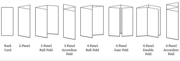
Now things get tricky. Adding panels to a rack card to make a brochure provides many choices in the layout, without even placing a single graphic. Moving to a 2-panel layout is generally quite simple. Your page size now becomes 8" x 9", folding to 4" x 9". That is assuming you want to open it like a book while holding it vertically. One could open vertically from the top or bottom resulting in a 4" x 18" page. This can be used as a very strong vertical, or rotated over to be used as a very strong horizontal. Layouts like this can add additional visual impact due to the dimensions of the piece.
Once you move past 2 panels, your page sizes may need to adjust to allow the piece to lay flat. A 3-panel roll-fold brochure adds a 3-15/16" wide panel to the end of the two previous 4" panels, resulting in an overall page size of 11-15/16" x 9". The third panel is reduced by 1/16" so that the 3rd panel can be folded inside the first 2 without hitting the first fold on the inside, bowing out the panels. A 3-panel accordion-fold does not need to have a panel width reduction as the panels never fold inside of each other. Overall page size in Scribus; 12" x 9" --Accordion-fold brochures can have as many panels as you like, the panels all stay the same size.
4-panel brochures give even more options for folding and overall layout. Roll-folding requires that the fourth panel is reduced by another 1/16", down to 3-7/8". Overall page size is up to 15-13/16" x 9" Double-folding uses two 4" panels and two 3-15/16" panels. Overall page size is 15-7/8" x 9" Gate folding uses the two 4" panels and two 3-15/16" panels as well, but in different positions to accommodate the different folding arrangement. The page size is still 15-7/8" x 9" Accordion folding allows the same size panel to be used throughout, resulting in an overall page size of 16" x 9". The main disadvantage of accordion folding is that readability across the piece suffers as it is opened. Road maps are commonly accordion folded, and then roll folded over, resulting in what can become a very confusing mess when one tries to fold it back up.
Design Advice
My advice for making things such as brochures is to keep the design simple and clean. -Generally speaking a clean design is easier to read and understand. -Control your fonts. Don't get carried away with how many differnt fonts you can use. 2-3 typefaces generally are all that are needed to get your information across. -These points are anything but rules, just my suggestions. Feel free to ignore them.
