How to use Pantone colours with Scribus: Difference between revisions
mNo edit summary |
mNo edit summary |
||
| Line 1: | Line 1: | ||
{{HOWTO Index}} | {{HOWTO Index}} | ||
<div style="background-color: #fee; margin: 0 1em; padding: 0 10px; border: 1px dotted #c00;"> | |||
'''IMPORTANT NOTE:''' | |||
This article is still work in progress, the intended target audience are '''DTP beginners'''. Therefore, please keep it simple. | |||
</div> | |||
==Spot colours== | ==Spot colours== | ||
Revision as of 22:37, 5 May 2006
| Installation • Usage • PDF issues • Imposition • Other |
IMPORTANT NOTE: This article is still work in progress, the intended target audience are DTP beginners. Therefore, please keep it simple.
Spot colours
Spot colours are colours made from pure ink, rather than being a mixture of the primary colours of CMYK (or other colour space).
Spot colours may be desired for two reasons:
- economy: if the document to print contains less than the number of primary (4 in the case of CMYK) it may be less expensive to use spot colours than to render them as a mixture of the primaries
- quality: it isn't allways possible equal a certain colour with a mixture of inks
More on spot colours can be found here.
The PDF specification supports the concept of spot colour. In terms of PDF information a spot colour is merely a colour reference which is defined by a name. This name is supposed to be known and will determine how the colour is printed. A PDF spot colour also includes the RGB/CMYK information to be used in cases where spot colours are not supported, eg, viewing the file with a PDF reader.
More on PDF spot colors here (see pages 234 and 532)
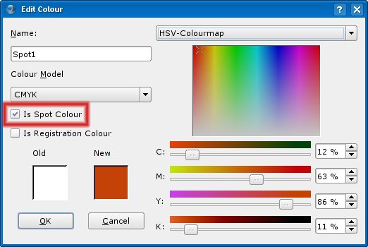
Scribus provides a way to generate PDFs with spot colours: it is as simple as checking the corresponding checkbox in the Edit Colour window.
Pantone colours
The Pantone colour set is a list of colours maintained by a company with the same name. To each colour corresponds a name assigned by Pantone.
The Pantone set exists only on paper. There is no such thing as on screen Pantone colours.
In terms of software, Pantone colours are treated as spot colours. To produce a document with Pantone colors, one must:
- choose the colours on a Pantone colour table
- mark the colours used in the document as spot colours, and assign the the correct Pantone names.
- assign them RBG or CMYK values (optional: doesn't affect how the final result comes from the press...)
- generate the PDF leaving the option "Convert spot colours to process colours" unchecked
- handle the PDF file to a print shop that supports Pantone
Although the Pantone colour table contains and RGB triplet for each colour, the way the colour looks on screen (either on Scribus or on the generated PDF) is irrelevant, because it will be printed according to its name.
Of course, it's better if the document on screen is as closer as possible (this doesn't mean very close) to the final one, so assigning RGB values may help for visualization. If one wants a very rough preview on a regular printer, the CMYK values from the Pantone table should be assigned instead.
Some programs like Quark Xpress already come with built in list of Pantone colour names and RGB/CMYK representations. In terms of workflow this feature eliminates the need for steps 2 and 3. However since there is no real on screen representation, the most important step, which is step 1, must be kept.
The reason Scribus doesn't have such a table built-in, is caution regarding potential legal issues with Pantone. However one can build such a table for personal use and include it on Scribus.rc
