How to Create a High-Quality Chart Using OpenOffice.org and Scribus
As most office suites, OpenOffice.org Calc provides a wide range of graph charts for the visualisation of data. Unfortunately, office suites are not programmed with the requirements of professional printing in mind, and as a result, the graphs created by spreadsheet and other components have a low resolution of 72 dpi. Fine for the web or the casual presentation but not even close enough for a print run.
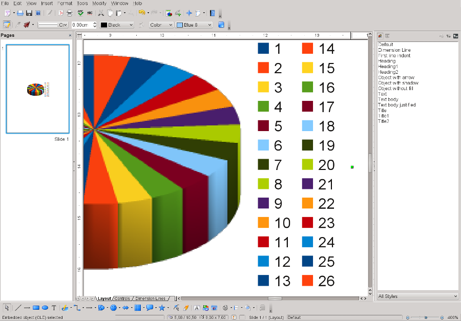
Let's have a look at the default quality of a spreadsheet graph in Calc. Below you see a 3D "realistic" pie chart created in OO.o Calc and copied and pasted into OO.o Draw:

It is obvious that the chart itself is a low-resolution bitmap file, whereas the caption to the right consists of vector data, which can be imported crisply into Scribus. Unfortunately, no matter which export option in Draw you choose, the bitmap doesn't become any better and will appear pixellated in Scribus, a PDF exported from Scribus and, of course, a printout.
There is, however a safe workaround, namely printing to a PostScript file. After copying and pasting the file into OO.o Draw, go to File > Print and choose "Print to File" in the print dialog. On Linux, UNIX and Mac OS X you can use a so-called "generic printer" or a PostScript printer out of the box, even if no printer is installed. On Windows and OS/2 you need to install a PostScript printer driver first.
After printing to a file, you should be able to locate the PS file under the name you chose. Note that under Windows and OS/2 the file may have the extension *.prn, so you have to replace "prn" with "ps" before you can import the file into Scribus.
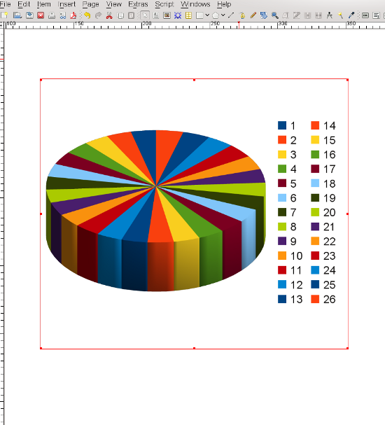
In Scribus, go to File > Import > Get Vector File and select the the PostScript file in the file dialog. After clicking "OK" you can place the file freely on the page. As you can see, you now have a crisp chart that will print without any ugly pixel squares:
