How to create a distressing mask to make more interesting fill effects
| Installation • Usage • PDF issues • Imposition • Other |
Button … Menu → Choice … Keyboard
Introduction
The different fills available in Scribus are great but sometimes you want something a little bit different.
By spending a little bit of time in GIMP you can create all kinds of effects that you can use in Scribus to make your fills a bit special. (See here for more examples.)
In this tutorial you'll learn how to create a "distressing mask" that you can use in all kinds of projects, and not just for text as we'll be looking at here.
If you're going to be following this tutorial by the letter you'll need to have the font "Crash Scene" installed on your machine. You can download it for free from dafont.com here.
Specific techniques used in this tutorial
GIMP
- Creating a pattern
- Applying the Cartoon filter
- Adding a layer mask
Scribus
- Converting text to polygons
- Converting polygons to an image frame
Creating the "Distressing Mask"
First you need to create a base image.
- Go to GIMP.
- Choose menu File → New…
- Set the width of the new image to 800px and the height to 200px.
- Open the Advanced Options drop-down and set "Fill With" to White.
- OK the dialog.
Next you'll create a pattern.
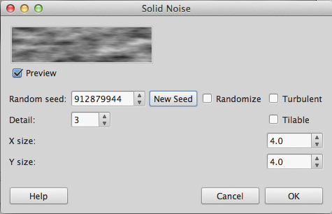
- Choose Filters → Render → Clouds → Solid Noise…
- Set "Detail" to be 3 - this gives the pattern a bit of graininess.
- Set X size and Y size to 4 - this gives a pleasing effect for current purposes but feel free to experiment.
- Keep pressing the "New Seed" button until you get a pattern you're happy with - Figure 1.
- OK the dialog.
Now you've got a cloudy pattern but you can alter it slightly to get a better effect.
- Choose menu Filters → Artistic → Cartoon…
- Set "Mask radius" to 8 and "Percent black" to 0.2 - again this is right for what we want here but you should experiment later.
- OK the dialog.
You've now made the pattern a bit more "grungy", which is what you want, so now you'll need to make it into a layer mask.
- Choose menu Layer → Mask → Add Layer Mask…
- Select "Grayscale copy of layer".
- Press the Add button.
This has now copied the pattern to a layer mask.
Only a few more things to do with the mask now.
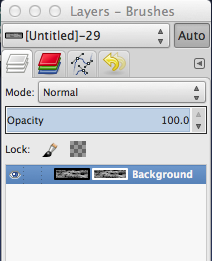
- In the "Layers" dialog - Figure 2 - you'll see two copies of the image, click on the left—hand one to select it (the one on the right is the layer mask itself).
- In the toolbox dialog double-click the foreground colour swatch (it's on the left), see Figure 3.
- Select Black through whatever method you like and OK the dialog.
- Choose menu Edit → Fill with FG Color
Your pattern should have got darker. Has it? Good. Now you'll save the image and get to the Scribus stuff.
- Choose File → Save, give the file a name, and press Save
- Choose File → Export As…, give the file a name, choose "PNG" as the file type (you need PNG for the transparency), and press Export
- Accept all of the defaults and press Export again.
That's all of the GIMP work done now so it's off to Scribus.
Creating the Text
- Go to Scribus.
- Choose menu File → New…
- Accept the defaults and OK the dialog.
- Create a large text frame, around the width of a landscape A4 page.
- Double-click the frame and type your text - if you're following along use "CRASH" as the text.
- Go to
 Properties ⟩⟩ Text and select the font you want to use. If you're following along you'll need to select "Crash Scene".
 - Set the font size to be 120pt (or whatever size you want, but big is better).
- Open the "Color & Effects" drop-down in Text and select the colour you want to use. If you're following along choose the standard "Red" but you can experiment as much as you like.
Masking the Text
- With the text frame selected choose menu Item → Convert To → Outlines
- Re-select the text and right-click choosing Ungroup from the menu.
- Choose menu Item → Combine Polygons
- Re-select the converted text and right-click choosing Convert to → Image Frame from the menu.
- Right-click the new image frame and choose Get Image… from the menu.
- Select the PNG file you exported from GIMP and OK the dialog.
- Right-click the text and choose Resize Image to Frame from the menu.
Conclusion
And that's it, you're done.
Try experimenting with different colours, patterns, etc. And, since the text is now a shape, you can also try setting the fill to be a gradient and see what happens.
Using different fonts with different fills can give you all kinds of unusual, and perhaps even useful, effects. And you can use a similar technique on many other types of object in Scribus.
Figure 4 is an example where the font is different and the fill colour is Green, but the mask is the same one.
And figure 5 is an example where a smiley has been filled with a Cyan to White radial gradient, and the fill colour in GIMP was changed to White instead of Black.
Or how about using a different filter - Qbist in this case - to create the layer mask and using a Free Linear Gradient with many colour stops, as in figure 6?
The possibilities are almost endless. Have fun experimenting.


