How to create some spooky text
| Installation • Usage • PDF issues • Imposition • Other |
Button … Menu → Choice … Keyboard
Introduction
This tutorial will show you how to create some spooky text to put over a background image using a combination of various GIMP and Scribus techniques.
Specifically, you are expected to already know how to do the following things:
- Create and edit colours.
- Create an image frame and put an image in it.
- Create layers and rename them.
- Create a text frame, enter text and change the formatting.
- Convert text to outlines.
- Ungroup objects.
- Combine polygons.
- Change fill/line colours and line sizes.
- Convert polygons to image frames.
- Create paths from strokes.
- Change layer properties.
If you don't know how to do these things then you probably aren't going to be able to follow the steps below. Some hints are given along the way but you really need to know what you're doing. All of the techniques used are explained elsewhere on this wiki, in various other tutorials, and the in the Scribus Manual (which is supplied with some installations). You are also expected to know how to use the basics of GIMP. There are plenty of tutorials on the web to get you started with that.
With all of that said, if you're ready, let's make a start…
Set-up
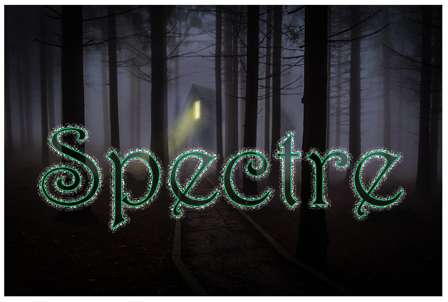
- Download the background image - figure 1 - from here. Make sure, for the purposes of this tutorial, that you download the small 640x426px version.
- Download the "Harrington" font - figure 2 - from here (if you don't already have it).
GIMP Work
- Open GIMP and set the background colour to Black.
- Create a new image 640x400 filled with the background colour.
- Use Filters → Noise → Hurl… and accept the defaults.
- Use Colours → Desaturate and accept the defaults.
- Use Layer → Transparency → Colour to Alpha…, choose Black as the colour, and OK.
- Export the image as a PNG (to keep the transparency) and call the file "sparkle.png".
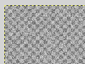
You should now have a semi-transparent image that consists of a lot of greyscale dots - figure 3 shows the top-left corner.
Scribus Work
Background
- Open Scribus and create a new A4/Letter document that's Landscape oriented. (If you use portrait you'll have to do more work later.)
- Create an image frame of any size.
- Put the background image you downloaded into the image frame.
- Right-click and choose Resize Frame to Image.
- Move the image frame to X,Y = 50pt,50pt. Take note of these values, you'll need them later.
That's the background done.
Colour
- Create a new colour of R,G,B = 0,255,133.
You'll need this new colour later.
Layers
- Create 4 (four) new layers.
- Rename them - from top to bottom - as "top", "5", "9", "15" (without the quotes).
- Select the "top" layer.
Naming the layers this way will help you to make sure you put the right thing on the right layer, and therefore in the right order.
Initial Text
- Create a text frame the same size as the background image frame. (You don't need to be accurate, it's just to make sure the text you make will fit.)
- Enter "Spectre" as the text. (You probably can't see it yet.)
- Change the font to "Harrington" and the size to 160pt. (You should be able to see it now.)
- Convert the text to Outlines - Item → Convert To → Outlines
- Ungroup the Outlines - Item → Ungroup
- Combine the Polygons - Item → Combine Polygons
- Move the outlined text over the image to where it looks best. Use the outline to see where you're placing it. (If in doubt, put the text so that it's bottom-half is over the ground.)
Make sure that the X,Y position values of this "outlined text" are integers as this will help later. Keep a note of these X,Y values as you'll need them later.
Sparkles
- Make sure you're on the "top" layer.
- Select the outlined text.
- Multiple Duplicate the text and accept the defaults to create the duplicate directly over the original.
- Select the new copy and send to layer "5".
- Select layer "5", then select the copied text.
- Set the line width to 5 (five) with a line colour of Black.
- Create a path from the stroke - Item → Path Tools → Create Path from Stroke
- Set the fill and line colour to None - don't forget to do this or the effect won't work properly. (The transparency of the image will be lost if you keep the filled background.)
- Convert the object to an image frame - Item → Convert To → Image Frame
- Put the "sparkle" image in the new image frame.
Now you've got the sparkle started.
- Repeat the same steps as above but use layer "9" with a line width of 9 (nine).
- Then do the same for layer "15" with a line width of 15 (fifteen).
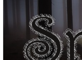
You're getting there - see figure 4 - and it looks quite nice as it is, but the best part is next.
Overlay
- Select the "top" layer.
- Select the original outlined text.
- Convert it to an image frame.
- Put the background image into this frame.
That looks wrong but you need to do bit of arithmetic.
- Subtract the X position of this "text image" from the X position of the background image. E.g. 105-50 = 55 (fifty five).
- In "Properties / Image" set the image to "Free Scaling" and enter the negative value of the subtraction you just made. E.g. -55 (minus fifty five).
- Do the same for the Y positions.
By doing this arithmetic and specific positioning you've essentially made the background "punch through" the middle bit of the "sparkles" by creating a text-shaped image at the front. It should look like there's now a gap inside the letters. Look where the trees and ground pass through the text to see the effect best.
Finishing Off
- Still on the "top" layer, select the "text image" and give it the outline colour you created earlier with a line width of 1pt.
- Select layer "15" and set its Opacity to 60%.
- Select layer "9" and set its Opacity to 80%.
- Select layer "5" and set its Blend Mode to "Difference". (Notice how using the "Difference" blend mode, in this case, makes the light between the trees come through more.)
- Enable the "Preview Mode" to see the effect at its best without any outlines added by Scribus.
Done?
And you're done. Well, sort of.
Try changing the Opacity and Blend Modes of the different middle layers - "5", "9" and "15" - to change the effect and see what you think looks best.
Also, try using a different image and see what difference that makes. You don't need to start again, just change the background image, then the foreground "text image", making sure you change the X and Y offsets again.
As with most creative things, it's the experimentation that brings the benefits.


