Whitespace: Difference between revisions
No edit summary |
No edit summary |
||
| (15 intermediate revisions by one other user not shown) | |||
| Line 1: | Line 1: | ||
[[Category: | [[Category:Design]] [[Category:EN]] | ||
Whitespace, in the context of layout and design, is the "empty" space on your page, not containing text, graphics, or other elements. It is said that layout is mainly an issue of managing the whitespace, of carefully, artfully using this space, but | Whitespace, in the context of layout and design, is the "empty" space on your page, not containing text, graphics, or other elements. It is said that layout is mainly an issue of managing the whitespace, of carefully, artfully using this space, and some designs have little but whitespace. | ||
Some things that the whitespace does are the following: | Some things that the whitespace does are the following: | ||
| Line 8: | Line 8: | ||
Keep in mind that this is largely, if not entirely, happening on a subconscious level. The mind almost instantly reacts to the layout and very quickly may be pleased or displeased with the visual appearance, even before there is any sense of what the content is about. Often we see a reliance on eye-popping graphics, bright colors, disjointed and misaligned layout. These are legitimate things to use, but judiciously. As we see in [[Avoiding Design Problems]], sometimes the things which involuntary grab the attention have nothing to do with the content we wish to show. | Keep in mind that this is largely, if not entirely, happening on a subconscious level. The mind almost instantly reacts to the layout and very quickly may be pleased or displeased with the visual appearance, even before there is any sense of what the content is about. Often we see a reliance on eye-popping graphics, bright colors, disjointed and misaligned layout. These are legitimate things to use, but judiciously. As we see in [[Avoiding Design Problems]], sometimes the things which involuntary grab the attention have nothing to do with the content we wish to show. | ||
=== | What I'm going to do next is take some examples from elsewhere on the wiki, mainly from [[Success stories]] for a discussion of some of these features using the whitespace. | ||
===Example 1=== | |||
{|width=80% | |||
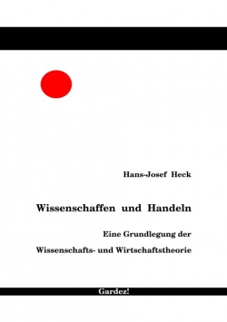
|Here is something Hans-Josef contributed to our wiki. This is a very striking design for his cover, using bold colors, and note the abundant whitespace. The red circle is nicely sized and positioned to counterbalance the text in the opposite corner of the bounded rectangular space. So the red dot grabs your eye, but doesn't distract you from the author and title information, and the whitespace helps this happen. | |||
|[[Image:cover.jpg|thumb|250px]] | |||
|} | |||
===Example 2=== | |||
{|width=80% | |||
|This page submitted by Julian Robbins right away shows us that whitespace doesn't have to be white. This background grey color serves the purpose and has a more calming visual feel than white would have. The company's logo, by being a variation of the background color might even arguably be termed whitespace on this page. | |||
Even without being able to read the paragraphs of text, we sense this must be a calm, collected company (translate to a sense of trustworthiness), yet our small graphics show that inside there is complexity in what this company does. Finally, the angulated graphic and sinuous, twisted wires prevent this layout from having a stiff, regimented appearance. Overall, very pleasing to the eyes (and mind). | |||
|[[Image:Q-par1.png]] | |||
|} | |||
===Example 3=== | |||
{|width=80% | |||
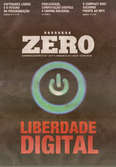
|This cover from Ludi takes us even farther down this path to understanding that whitespace isn't necessarily white. We can't tell if this is an image digitally processed, or a graphic, but it doesn't matter, since this background is not content. | |||
We also see here how a boldly colored layout doesn't need to be garish, since all the colors are muted and there is more than enough contrast to see the text and other important elements. | |||
|[[Image:Zero.jpg]] | |||
|} | |||
===Example 4=== | |||
{|width=80% | |||
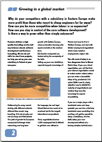
|Now we're back to white again, where we see that, in contrast to many company brochures, Cedric Sagne has contributed one with a light, airy appearance, with these prominent whitespaces around the title, the graphics, even the individual paragraphs and between lines of text. Had this page been crowded with text, it would be much less likely that people would actually read it. | |||
|[[Image:Csagne success story1.png]] | |||
|} | |||
Latest revision as of 19:08, 5 January 2011
Whitespace, in the context of layout and design, is the "empty" space on your page, not containing text, graphics, or other elements. It is said that layout is mainly an issue of managing the whitespace, of carefully, artfully using this space, and some designs have little but whitespace.
Some things that the whitespace does are the following:
- Visually guide the eye across your page. You might think the content does this, but imagine a page absolutely filled with content, how cluttered, maybe even disorganized this would be – where does the eye go first, and then where? Whitespace can help your reader mentally organize what is on the page.
- Set an emotional tone. Whitespace generally will have a calming effect just by its own nature, but when a reader can look at a page and immediately get a sense of what it is about, go from one item to another in a logical way, the mind is calmed. Moreover, your reader will likely spend more time on your content, rather than quickly going to something else.
Keep in mind that this is largely, if not entirely, happening on a subconscious level. The mind almost instantly reacts to the layout and very quickly may be pleased or displeased with the visual appearance, even before there is any sense of what the content is about. Often we see a reliance on eye-popping graphics, bright colors, disjointed and misaligned layout. These are legitimate things to use, but judiciously. As we see in Avoiding Design Problems, sometimes the things which involuntary grab the attention have nothing to do with the content we wish to show.
What I'm going to do next is take some examples from elsewhere on the wiki, mainly from Success stories for a discussion of some of these features using the whitespace.
Example 1
| Here is something Hans-Josef contributed to our wiki. This is a very striking design for his cover, using bold colors, and note the abundant whitespace. The red circle is nicely sized and positioned to counterbalance the text in the opposite corner of the bounded rectangular space. So the red dot grabs your eye, but doesn't distract you from the author and title information, and the whitespace helps this happen. |


