How to put Text on a Path: Difference between revisions
mNo edit summary |
|||
| (4 intermediate revisions by the same user not shown) | |||
| Line 1: | Line 1: | ||
{{HOWTO Index}} [[Category:EN]] | |||
[[File:text_on_path_title.png|centre]] | [[File:text_on_path_title.png|centre]] | ||
<div style="float: left;">__TOC__</div>{{TutorialKey}}{{clear}} | <div style="float: left;">__TOC__</div>{{TutorialKey}}{{clear}} | ||
| Line 174: | Line 175: | ||
{{Annotation|caution|'''This technique is not undo-able.''' Once you have started to convert the text there is no going back to the original text again. So, unless you absolutely know what you're doing and you're totally confident that you're doing it exactly right you should make duplicates of the path and text so that you have the originals to go back to.}} | {{Annotation|caution|'''This technique is not undo-able.''' Once you have started to convert the text there is no going back to the original text again. So, unless you absolutely know what you're doing and you're totally confident that you're doing it exactly right you should make duplicates of the path and text so that you have the originals to go back to.}} | ||
{{Annotation|warning|'''The "Path Along | {{Annotation|warning|'''The "Path Along Path" function used below is not yet completely stable.''' It is so easy to do something wrong with this function that you '''<u>must</u>''' save your document before you try using it. Problems experienced range all the way up to the document being totally unusable. However, if the function works properly then you shouldn't have any problems once you've used it. Just be careful. You have been warned.}} | ||
* Find the duplicate text and curve that you made at the start. If you didn't make a duplicate then you'll have to re-create them. | * Find the duplicate text and curve that you made at the start. If you didn't make a duplicate then you'll have to re-create them. | ||
| Line 181: | Line 182: | ||
* Select your text frame. | * Select your text frame. | ||
* Choose menu {{MenuString|Item|Convert To|Outlines}} (or right-click and choose {{MenuString|Convert To|Outlines}} | * Choose menu {{MenuString|Item|Convert To|Outlines}} (or right-click and choose {{MenuString|Convert To|Outlines}} ) | ||
* Re-select the text and choose menu {{MenuString|Item|Ungroup}} (or right-click and choose {{MenuString|Ungroup}} | * Re-select the text and choose menu {{MenuString|Item|Ungroup}} (or right-click and choose {{MenuString|Ungroup}} ) | ||
* Choose menu {{MenuString|Item|Combine Polygons}} | * Choose menu {{MenuString|Item|Combine Polygons}} | ||
| Line 228: | Line 229: | ||
In figure 11 you will see that that text looks similar to that in figure 10 but it has been stretched so that it fits the whole curve, rather than keeping to the font size it was created with. | In figure 11 you will see that that text looks similar to that in figure 10 but it has been stretched so that it fits the whole curve, rather than keeping to the font size it was created with. | ||
{{clear}} | |||
=== Repeated / Repeated, Stretched === | === Repeated / Repeated, Stretched === | ||
| Line 243: | Line 245: | ||
Notice that there is no gap between the repeated text. You can fix that by changing the "Gap Between Objects" setting, as shown in figure 13. | Notice that there is no gap between the repeated text. You can fix that by changing the "Gap Between Objects" setting, as shown in figure 13. | ||
{{clear}} | |||
== Conclusion == | == Conclusion == | ||
Latest revision as of 11:27, 10 April 2015
| Installation • Usage • PDF issues • Imposition • Other |
Button … Menu → Choice … Keyboard
Introduction
Normally, text will just follow a straight line across the page or, if your text frame is rotated, a straight line which is parallel to the top of the text frame. For almost all purposes this is what you want. However, sometimes you want something a little different.
This tutorial will show you two different methods of making text follow a path other than a straight line. A path can be almost any bezier line or curve, within reason.
This tutorial is fine for anyone who already knows how to create/edit text frames and create bezier lines and curves. If you don't know how to draw bezier lines and curves you will probably find this tutorial useful to go through first.
Specific techniques used in this tutorial
- Attaching Text to a Path.
- Manipulating the Text on Path options.
- Converting Text to Outlines.
- Putting a Path Along a Path.
- Manipulating the Path Along Path options.
Set-up
First you need to create your document and some text:
- Open Scribus and create a new document. (A4/Letter of any orientation will be fine.)
- Create a text frame and insert a short piece of text, e.g. "SOME TEXT".
- Change the size of the font to something large, e.g. 40pt.
- For the purposes of this tutorial, change the font to something bold or thick. ("Open Sans Bold" is ideal if you've got it but you can use whatever you want.)
Now you need a line or curve to put the text on. You can use both methods in this tutorial with either bezier lines or curves (depending on what you want to do). Examples are shown for both.
- Choose menu Insert → Insert Bezier Curve
- Draw the line or curve which you want to put the text along.
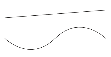
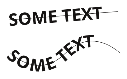
This tutorial shows examples for two different beziers: a simple line; and a simple sine-wave curve. They are shown in figure 1. If you just want to use something simple, once you've selected to insert the curve: click somewhere on the page; then click somewhere to the right and above the original click; then right-click. This creates a simple sloped bezier line (like that at the top of figure 1).
- Duplicate your text and curve and move the duplicates away from the originals. (This is only so you don't have to re-create them later in the next section.)
From this point on, for brevity, both bezier lines and bezier curves will be referred to as simply "curves".
Attaching Text to a Path
Default Placement
- Select both the text and the curve. (You can either drag-select both or select the first and shift-select the other, the order of selection is not important.)
- Choose menu Item → Attach Text to Path
You should now have something that looks like either of the examples in figure 2.
This shows the default way that Scribus attaches text to a path. Each character glyph is rotated to align the centre of its base with the tangent of the curve at the point at which the base of the character meets the line. Figure 3 shows that the "T" in "TEXT" has been rotated so that its base is perpendicular to the magenta tangent of the cyan curve.
It might look like some of the characters - as in figure 2, on the bottom - do not fall exactly on the original curve. This isn't quite what's happened and you'll see later what's going on. For the moment, don't worry about it.
You'll also notice that some characters overlap - the "O", "M" and "E" in the example on the bottom of figure 2, for instance. This is because Scribus draws the characters at their proper size and shape, and if they are angled in towards each other - as you'd get when they're following a concave curve - this will be unavoidable. This can - up to a point - be fixed, and you'll look at that later.
Stair Step
Now you'll look at changing the way Scribus attaches the text to the path.
- Go to
 Properties ⟩⟩ Text
You should now see that a new sub-window called "Path Text Properties" (see figure 4) is shown under "Advanced Settings". This sub-window can only be seen when you have selected an object which is text attached to a path. At all other times it will be invisible. This may be why you've never seen it before.
- Open the Path Text Properties sub-window.
Here you are given some options where you can change how the text attaches to the path. These options are:
- Type - The type of attachment, explained below.
- Start Offset - How far from the start of the path to start drawing the text.
- Distance from Curve - Tells Scribus to put the bases of the characters either above or below the curve.
- Flip Text - Tells Scribus to mirror the text "through" the curve.
- Show Curve - Normally, once the function has been used, the curve is made invisible. Use this option to make the curve visible again.
- Use the "Type" drop-down menu to select "Stair Step".
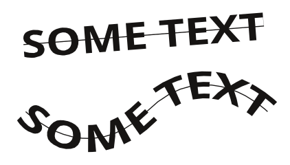
Figure 5 shows two examples of how the text now looks on the curve.
Using the "Stair Step" type of positioning the characters are written upright - as they would be normally - but the centre of their bases are moved to coincide with points of the curve.
You might notice that - see the "T" and "E" on the bottom in figure 5 - the spacing between the characters is no longer as you would expect if they were drawn normally. This is because Scribus can no longer rely on its usual calculations for character placement so it makes its best guess. When you've got text on a path like this, proper typographical concepts such as "Tracking" and "Kerning" no longer apply as there is no way of calculating good spacing when Scribus doesn't know where the characters will be.
Skew
Now you'll change to a different type of placement.
- Make sure your "text on path" object is still selected.
- Go to
 Properties ⟩⟩ Text again.
 - Open the Path Text Properties sub-window again.
- Use the "Type" drop-down menu to select "Skew".
Figure 6 shows two examples of using the "Skew" placement type.
When using this placement type Scribus manipulates the curves that a character is drawn from. Skewing is difficult to describe fully without a lot of complicated words or mathematics but the easiest way of looking at it is that Scribus will keep all the verticals of the character vertical while modifying the horizontals of the character to be perpendicular with the tangent of the curve at the centre of the character base. It's easier to just look at the picture!
As with the other two placement types, the spacing between some of the characters might not look right.
Fixing the Problems
On the Curve
With all of the placement types - especially when using a curved curve rather than a straight curve - it looked like the characters were not drawn exactly on the curve. Now you'll see that this wasn't quite true.
- Make sure your "text on path" object is still selected.
- In
 Properties ⟩⟩ Text ⟩⟩ Path Text Properties use the "Type" drop-down menu to select "Default".
 - Check the "Show Curve" checkbox.
You will now see in figure 7 - especially on the bottom example - that the characters are actually drawn on the curve (shown in red). It's just that when the curve isn't a straight line, the grey outline box doesn't exactly follow the line of the curve. This is just the way Scribus works and is something you've just got to remember, or not worry about.
- Un-check the "Show Curve" checkbox to stop the curve getting in the way.
Now you'll look at the character spacing issue.
Character Spacing
- Make sure your "text on path" object is still selected.
- In
 Properties ⟩⟩ Text open the Advanced Settings sub-window.
Because the text on the path is still fully editable you can still change any of the usual text properties.
- In Advanced Settings change the "Manual Tracking" setting (it looks like an "AV" symbol with a red double-headed arrow beneath it).
As you change the tracking, notice how the characters move away from - or towards - each other (depending on how you change the setting). If you're using a straight curve then doing this is probably fine if it looks okay - even though it breaks some typographical rules. However - as can be seen in figure 8 - if you've got a real curve, the characters on a convex section of the curve move away from each other faster than those on a concave section of the curve. Unfortunately this is just how Scribus works. It's not nice but it's how things are.
If you use the "Stair Step" or "Skew" placement types you might be able to alter the spacing as shown above to get something that looks okay. Just don't expect too much from it. Experiment by all means but you shouldn't blame Scribus if it doesn't look right. It's trying it's best with what it's given.
- In Advanced Settings change the "Manual Tracking" setting back to 0% (unless you already have).
Changing the Path
While the text is attached to the path (curve) you can also still change the path.
When text is attached to a path the object you select is actually the path, not the text. So if you resize the object you're resizing the path. Similarly, if you double-click the object you will be taken to the ![]() Node Editor where you can change the curve as though the text wasn't attached. Once you've changed the curve, the text will be re-drawn according to the changes you've made.
Node Editor where you can change the curve as though the text wasn't attached. Once you've changed the curve, the text will be re-drawn according to the changes you've made.
Try resizing the path and editing it through the ![]() Node Editor to see what happens.
Node Editor to see what happens.
Other Settings
Try experimenting with the other settings in Path Text Properties to see what happens. Most of them are fairly self-explanatory but the best way to see what they do is to try them. Check the "Show Curve" checkbox to give you a better idea of what happens when you change the settings. If the text looks like it hasn't been re-drawn properly then de-select everything and re-select the text to have it re-drawn.
Detach
If you no longer want the text attached to the path - or curve - then, with the object selected, choose menu Item → Detach Text from Path and the text and curve will be separated.
Once detached, any changes you made to the text or path while they were attached will remain in effect, except that the text will no longer be attached to the path and will be written horizontally again.
Path Along Path
While the "Attach Text to Path" function is great for some purposes, it's not ideal and has some drawbacks. The biggest drawback being that the text is - with the exception of "Skew" placement - always drawn the same way, e.g. as it normally would be if it wasn't attached.
Sometimes this is good enough for what you want but you might want something more. This is where "Path Along Path" comes in.
- Find the duplicate text and curve that you made at the start. If you didn't make a duplicate then you'll have to re-create them.
The "Path Along Path" function only works with curves and polygons (which are actually curves). It won't work with normal text so you need to convert the text into something else.
- Select your text frame.
- Choose menu Item → Convert To → Outlines (or right-click and choose Convert To → Outlines )
- Re-select the text and choose menu Item → Ungroup (or right-click and choose Ungroup )
- Choose menu Item → Combine Polygons
You have now converted the text into a polygon consisting of multiple shapes.
For the purposes of this tutorial make two duplicates of both the text and curve. Arrange the sets of duplicates around the page so that you can see the differences between the different effects.
- Select one set of "text and curve" together. (You can either drag-select both or select the first and shift-select the other, the order of selection is not important.)
- Choose menu Path Tools → Path Along Path…
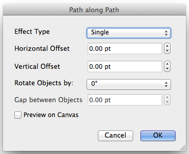
You will have been presented with a new dialog like that in figure 9.
The options on this dialog are:
- Effect Type - The sort of effect you want.
- Horizontal Offset - How far from the start of the path to start drawing the text. (It performs the same function as "Start Offset" in the Path Text Properties sub-window.)
- Vertical Offset - Tells Scribus to put the bases of the characters either above or below the curve. (It performs the same function as "Distance from Curve" in the Path Text Properties sub-window.)
- Rotate Objects By - Tells Scribus how far to rotate the polygon (in this case the text) around the start of the path (curve).
- Gap Between Objects - Is only used for "Repeated" effects and tells Scribus the size of the gap to put between each instance of the object being repeated.
Single
- Press OK to accept all of the default values.
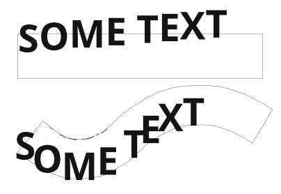
Figure 10 shows the result if you leave all of the options as their default values.
Putting the text along a straight curve isn't very much different from using the default "Attach Text to Path" function except that the text is centred along the curve by default, although you can change this with the "Vertical Offset" option.
However, putting the text along a curved path is quite different from "Attach Text to Path". As you can see - at the bottom of figure 10 - the characters have been squashed and expanded on each side of the curve so that the characters don't overlap each other as they sometimes did using "Attach Text to Path".
Single Stretched
- Select another duplicated set of "text and curve" together.
- Choose menu Path Tools → Path Along Path…
- Change the "Effect Type" drop-down menu setting to "Single, Stretched".
- OK the dialog.
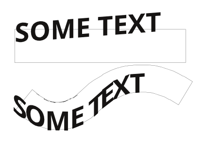
In figure 11 you will see that that text looks similar to that in figure 10 but it has been stretched so that it fits the whole curve, rather than keeping to the font size it was created with.
Repeated / Repeated, Stretched
- Select another duplicated text.
- Resize the text so that it's half as wide as it was.
- Select the resized text and a duplicated curve together.
- Choose menu Path Tools → Path Along Path…
- Change the "Effect Type" drop-down menu setting to "Repeated".
- OK the dialog.
Figure 12 shows the result of using "Repeated" at the top, and below is the result if you selected "Repeated, Stretched" instead.
Notice that there is no gap between the repeated text. You can fix that by changing the "Gap Between Objects" setting, as shown in figure 13.
Conclusion
You've now been through various ways that you can put a text along a path. Try experimenting with the different settings and see what kind of effects you can make.

