How to be artistic with image effects: Difference between revisions
m (→Effects Basics) |
m (→Effects Basics) |
||
| Line 35: | Line 35: | ||
{{Annotation|note|You can alternatively get to this dialog by going to {{Window|Properties|icons}} ⟩⟩ {{Window|Image}} and pressing the {{Button|Image Effects}} button. It's up to you which method you use.}} | {{Annotation|note|You can alternatively get to this dialog by going to {{Window|Properties|icons}} ⟩⟩ {{Window|Image}} and pressing the {{Button|Image Effects}} button. It's up to you which method you use.}} | ||
On this dialog there are four main areas | On this dialog there are four main areas: | ||
# The first, at the top-left, is the Preview panel. Here you'll see what applying the effects will do to your image. | |||
The first, at the top-left, is the Preview panel. Here you'll see what applying the effects will do to your image. | # The second, at the bottom-left, is the Options panel. Here you'll give some effects different settings that change how they are applied to the image. | ||
The second, at the bottom-left, is the Options panel. Here you'll give some effects different settings that change how they are applied to the image. | # The third, vertically in the centre of the dialog, is the list of "Available Effects". You choose effects from here to apply to the image. | ||
The third, vertically in the centre of the dialog, is the list of "Available Effects". You choose effects from here to apply to the image. | # And lastly, on the right, is a list of the effects that are currently being applied to the image, the "Effects in Use". | ||
And lastly, on the right, is a list of the effects that are currently being applied to the image, the "Effects in Use". | |||
To add an effect to the image, select it from the middle list and press the {{Button|>>}} button to send it to the right-hand list. | To add an effect to the image, select it from the middle list and press the {{Button|>>}} button to send it to the right-hand list. | ||
Revision as of 11:49, 21 April 2015
Introduction
Did you know that you can create some quite nice image effects within Scribus without having to learn GIMP/Photoshop?
If so, then this tutorial probably isn't for you but it could be worth a quick read anyway. If not, then read on to find out the sort of things you can achieve with very little work.
This tutorial isn't meant as a fully comprehensive guide to the Scribus image effects. It introduces some of the basics - in case you've not used the effects before - then dives in to show some specific effects that you can achieve. It's up to you how much time and effort you put into experimenting with them.
It is assumed that you already know how to put an image in an image frame and manipulate the frame so that the image looks good inside the frame.
Set-up
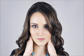
Before you start you'll need to download this image. You can use the effects on any image but this portrait is good for showing what you can do.
- Start Scribus and create a new document. (Any normal page will be fine.)
- Create an image frame with the same shape as the image (in this case, a landscape-style photo).
- Right-click the frame and choose Get Image… from the menu.
- Choose the image you've just downloaded and OK the dialog.
- Adjust the image and frame until you've got the whole image nicely in the frame.
Effects Basics
What are image effects? Well, basically, they're changes that you can apply to images in Scribus. They don't change the original image, they only apply changes within Scribus that you will see on-screen and that will go into your final output. The original image is not altered.
First, you'll start by applying a few basic effects to see how things work.
- Right-click on the image frame and choose Image Effects from the menu.
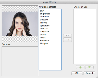
You've now been taken to the Image Effects dialog as shown above.
On this dialog there are four main areas:
- The first, at the top-left, is the Preview panel. Here you'll see what applying the effects will do to your image.
- The second, at the bottom-left, is the Options panel. Here you'll give some effects different settings that change how they are applied to the image.
- The third, vertically in the centre of the dialog, is the list of "Available Effects". You choose effects from here to apply to the image.
- And lastly, on the right, is a list of the effects that are currently being applied to the image, the "Effects in Use".
To add an effect to the image, select it from the middle list and press the >> button to send it to the right-hand list. The remove an effect from the list of applied effects, select it from the right-hand list and press the << button.
The effects in the right-hand list are applied to the image in a top-down order. The effect at the top of the list is applied first, then the next one down, and so on. You can alter the order in which effects are applied by using the up- and down-pointing arrow buttons below the "Effects in Use" list.
Your First Effect
Now you're ready to start applying some effects.
- Select "Brightness" from the middle list and press the >> button.
If you look at the Preview Panel nothing has changed. This is because the "Brightness" effect defaults to doing nothing - at first - until you tell it otherwise using the Options Panel.
- In the Options Panel, drag the slider to the right and the left.
You can see how the effect will be applied to the image in the Preview Panel. Slide the brightness to the right - a positive brightness - to make the image lighter, slide it to the left - a negative brightness - to make it darker. Simple.
Now you'll change the effect.
- On the right-hand list select "Brightness" and press the << button.
That effect has now been removed and you will see that the Preview has also changed back to the original image.
- Select "Greyscale" from the middle list and press the >> button.
The Preview Panel should now show the image as a grey picture with no colour, as you might have expected from the name of the effect.
Looking at the Options Panel you'll also notice that there are no options. Some effects have no options, they simply do one thing and you can't change what they do.
- OK the dialog.
You'll now see that the "Greyscale" effect has been applied to your image, and that's fine but it's not very artistic. Next you'll be applying some effects in more complicated - and interesting? - ways.
A Better Greyscale
If you're ready to move on, you'll now make a more artistic greyscale image.
You'll have seen the greyscale version of the image earlier and it looks a bit "artistic" - as most black-and-white pictures do - but Scribus can do better.
- Open the
 Image Effects dialog and remove any effects that are currently in use (select them and use the << button).
 - Select "Duotone" from the Available Effects and press the >> button.
You'll notice that your image looks greyscale again but it's a bit darker than before. That's a start but lighter is better here.
- In the Options Panel, press the drop-down colour list for "Colour 2" and choose "White".
Your image looks like the earlier Greyscale effect now, and that's fine but you can get it looking better.
- Under the colour-choice drop-down for "Colour 1" there's a strange square icon showing a diagonal line
 . Press that icon.
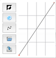
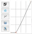
You've just opened the "Curve Editor" for Colour 1, see figure 1. While it might look complicated - and it can create some powerful effects - you don't really need to know what it does just now. Simply follow the instructions then play around with it later.
- Click-hold a point on the diagonal line at what would be (1,1) on the curve editor grid and drag it down to (1,0) on the grid - see figure 2.
Did you see the Preview change? Did you notice the background of the image disappearing?
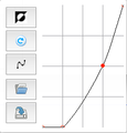
- Now click-hold a point on the diagonal line where it crosses the third vertical line on the curve editor grid and drag it down to (3,2) on the grid - see figure 3.
This has again altered the preview slightly.
- Click the "Curve Editor" icon again to dismiss the editor and OK the Image Effects dialog.
I Hope you'll agree that the image - figure 4 - looks a lot more "aristic" than the normal greyscale effect.
Simulating 1-Bit
What about if you want a truly black-and-white image instead of a greyscale one?
Well, that's simple too. Scribus can do quite a reasonable job of simulating what's sometimes called a "1-bit image".
- Open the
 Image Effects dialog again and select "Duotone" in the list of "Effects in Use" (on the right).
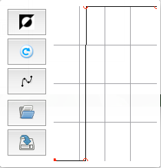
 - Open the Curve Editor for "Colour 1" and drag the curve so it looks like figure 5.
- Click the Curve Editor icon for "Colour 1" to dismiss the editor and OK the Image Effects dialog.
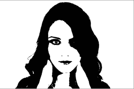
You should now have something that looks like figure 6. While it's not totally 100% 1-bit black-and white it's good enough for most purposes.
Sepia tone
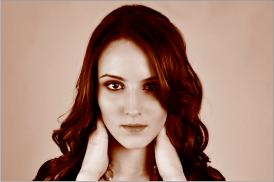
Have you ever wanted to make an old-style sepia-tone image from an existing one? It's easy with Scribus.
First you'll need to create a new colour to use with the effect.
- Choose menu Edit → Colors…
- Press the New button.
- Enter "Sepia" as the name.
- Set the Color Model as "RGB".
- Set the RGB values as: R=235, B=130, B=40.
- OK the dialog.
- OK the dialog again.
Next you'll create the effect.
- Open the
 Image Effects dialog and remove any effects that are currently in use.
 - Select "Duotone" from the "Available Effects" and press the >> button.
- Set "Color 2" to be "Sepia".
- OK the dialog.
And that's all you have to do to get something like figure 7. Easy.
X-Ray Specs?
Ever needed an image that looks like an X-Ray photo? Well, Scribus can do that too.
- Open the
 Image Effects dialog and remove any effects that are currently in use.
 - Select "Invert" from the Available Effects and press the >> button.
- OK the dialog.
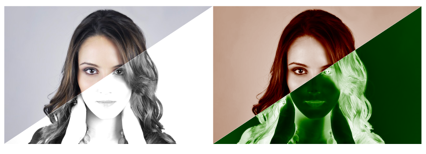
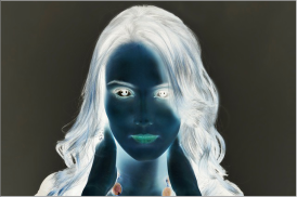
The image looks a bit like an X-Ray photo - figure 8 - but X-Ray photos aren't coloured like that.
There are two things you can do to remedy this.
Multiple Effects
- Open the
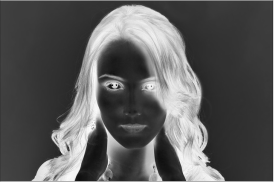
 Image Effects dialog, select "Greyscale" from the Available Effects, and press the >> button adding it to the list of effects.
 - OK the dialog.
This is fine - see figure 9 - but you can do it better.
Duotone Inversions
- Open the
 Image Effects dialog and remove any effects that are currently in use.
 - Select "Duotone" from the Available Effects and press the >> button.
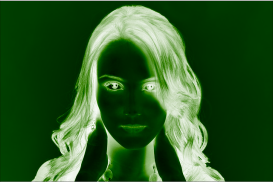
- In the Options Panel, select "Green" from the drop-down list for "Color 2".
- Press the Curve Editor icon for "Color 2" and press the "Invert" icon
 at the top-left.
 - Dismiss the Curve Editor.
- Press the Curve Editor icon for "Color 1" and press the "Invert" icon
 at the top-left.
 - Dismiss the Curve Editor.
- OK the dialog.
Now that, figure 10, is a lot better. Most X-Rays aren't green but it's a much better "Sci-Fi" effect, I hope you'll agree.
Backgrounds
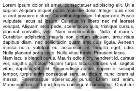
Sometimes you want to put an image under some text to make it a little more interesting but the image gets in the way of the text making it difficult to read.
You can achieve a good, but simple, effect using the Scribus image effects.
- Open the
 Image Effects dialog and remove any effects that are currently in use.
 - Add the "Greyscale" effect.
- Add the "Brightness" effect and set the Brightness option slider to around 100.
- Add the "Blur" effect and set the Radius option to 5.
- OK the dialog.
- Add a text field over the image and enter some text.
You'll now have something like figure 11. Feel free to change the effects options to get it how you like it.
Pop Art?
You can also combine different effects to produce something that looks a little bit like pop art. (Well, not much like pop art but it's an unusual and colourful effect that might come in useful at some point.)
- Open the
 Image Effects dialog and remove any effects that are currently in use.
 - Add the "Blur" effect and set the Radius option to 1.
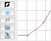
- Add the "Curves" effect and drag the curve in the options panel so it looks like figure 12.
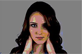
- Add the "Posterise" effect and set the Posterise option to 4
- Add the "Sharpen" effect and set the Radius and Value options both to 4.
- OK the dialog.
You should now have something like figure 13. You'll probably never use an image like this but you can see how the effects can be added to each other to produce different cumulative effects.
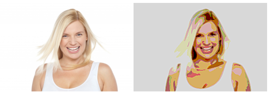
You can see below how the same effects can be used slightly differently on a different image to give a different overall effect.
Conclusion
The whole point of this tutorial was to show you that Scribus has lots of image effects that can be used in many ways to create some unusual and wonderful things. Sometimes the result is pointless and you'll never use it, but you'll never know what's possible if you don't have a go and try.
