How to make a treasure map
| Installation • Usage • PDF issues • Imposition • Other |
Button … Menu → Choice … Keyboard
Introduction
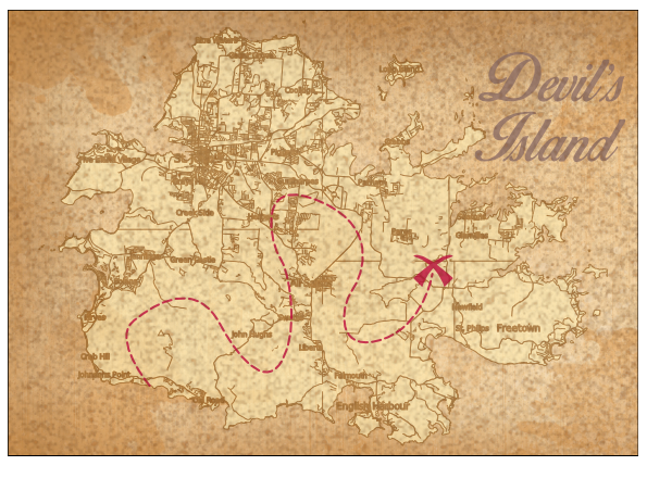
This tutorial will show you how to create your own little treasure map of anywhere in the world. You wouldn't need to do this sort of thing on a daily basis - unless you worked making a treasure maps! - but the techniques used might be useful, for example, if you wanted to make something for a school geography lesson, or for a treasure hunt game.
You will need to have internet access to get the font(s) and map, and (optionally) have GIMP installed. The GIMP section isn't absolutely necessary but you'll see a better result if you use it.
This is a long tutorial that might take a very long time to get through so make sure you have enough coffee/beer/crisps/biscuits to keep you going.
You are expected to know the Scribus basics including: Creating image frames, creating text frames and basic text modification, etc.
Set-up
Background
First you need to get a nice old piece of paper for your background. You can download a good one from here but you can use you own.
Font(s)
You need to select a nice font or two to use on your map. You can either go for something calligraphic like Birds of Paradise or something hand-written like MAWNS Handwriting. The choice is up to you. Maybe you've already got a nice font installed on your system?
The Map
Next you need a map. A great resource for maps is OpenStreetMap. If you're following along with the tutorial exactly you can find the map used here but you can use anything you want.
- Go to OpenStreetMap and find the map you want by scrolling around and zooming.
- Press the "Layers" icon on the right of the browser window (it looks like a stack of papers).
- Select the type of map you want. The different layers show different types of information. It's best, in this instance, to choose something that doesn't contain too much modern stuff such as road names, etc. Transport, MapQuest Open or Humanitarian might be good choices depending on the area you've selected.
- Close the "Layers" options (press the cross at the top-right).
- Press the "Share" icon on the right (it looks like a square with an arrow coming out of it).
- In the Image section choose "SVG" from the "Format" drop-down menu.
- Press the Download button.
The OpenStreetMap servers will now be compiling an SVG version of the map for you. Depending on the map you've chosen this might take some time so just be patient.
- Save the download to your normal local storage.
The Overlay
Before you get stuck in with Scribus you also need an overlay to put over the map that will make it look like it's a bit older. You'll need GIMP for this.
You can skip this section if you're not comfortable with using GIMP. It's not vital but it does make the end result look better and it's not too difficult to do.
- Open GIMP and create a new document. Use the in-built 1024x768 template to get a good sized image.
- Choose menu Filters → Noise → Hurl…
- The settings are largely irrelevant but if you make them the same as in figure 8 you should be fine.
- OK the dialog.
You should now have an image full of noise that looks like figure 2.
- Choose menu Filters → Blur → Pixelize…
- Set both the Width and Height to 4 pixels as in figure 9.
- OK the dialog.
You should now have an image full of pixelated noise that looks like figure 3.
- Choose menu Filters → Blur → Gaussian Blur…
- Set both the Horizontal and Vertical to 4 pixels and the Blur Method to RLE as in figure 10.
- OK the dialog.
You should now have an image full of blurred pixelated noise that looks like figure 4.
Now you need to do some alterations to the colours.
- Choose menu Colors → Levels…
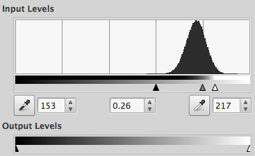
- Drag the little arrows under the "Input Levels" histogram so that they are in similar positions as that in figure 11.
- OK the dialog.
You should now have an image full of dark coloured blobs that looks like figure 5.
Just a little bit more to do.
- Choose menu Colors → Colorify… (not "Colorize" near the top of the menu but "Colorify" near the bottom).
- Press the colour panel to the right of "Custom Colour".
- Use the various controls to select a mid-to-dark-brown. (RGB of 147,72,11 looks good.)
- OK the dialog.
- OK the dialog again.
You should now have an image full of dark brown blobs that looks like figure 6.
One last thing in GIMP and you can move to Scribus.
- Choose menu Layer → Mask → Add Layer Mask…
- Select the "Greyscale copy of layer" radio button.
- Press Add to add the layer mask.
Your image should look like a grey checkerboard with a bit of hazy brown in places, see figure 7. That's fine. The grey checkerboard just shows where there's some transparency - all over the image in this case - and the brown that's there doesn't show up very well (at the moment).
- Choose menu File → Save…
- Select a good name and press Save
- Choose menu File → Export As…
- Select a File Type (bottom of the dialog) as PNG, give the image a good name and press Export
- Accept the defaults of the next dialog and press Export again.
You've now got the image that will go over your map to add an extra bit of "age" to the page.
Cartography
Now you need to start creating the map.
Initial Import
- Open Scribus and create a new landscape-oriented page. (A4/Letter will be fine.)
- Choose menu File → Import → Get Vector File…
- Select the map SVG you downloaded near the start and OK the dialog.
At this point Scribus might show a message saying "SVG file contains some unsupported features". That's okay. Just OK the message box and continue.
You might also have noticed that Scribus has resized your drawing canvas and your page might have gone missing. This is okay and you'll fix it later.
- Click anywhere on your drawing canvas to import the map.
You've now imported the map but it's probably way too big and it could also contain stuff you don't want.
Resizing
- Make sure the map object is selected and go to
 Properties ⟩⟩ X,Y,Z
 - Make sure that the "Width" and "Height" fields are locked together by clicking on the chain icon to the right so that the two chain links are connected.
- In the "Width" field enter 800 and press ENTER. (The resize may take some time.)
- Choose menu Windows → Align and Distribute to open the
 Align and Distribute palette.
 - With the map still selected go to
 Align and Distribute and choose "Page" from the "Relative To" drop-down menu.
 - Press the "Centre on Vertical Axis" icon.
- Press the "Centre on Horizontal Axis" icon.
Your map might have vanished but that's okay.
- Choose menu View → Fit to Width then View → Fit to Height .
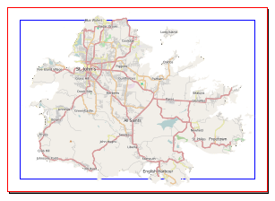
Your map should now be in the centre of your window. (If it's not you will have to scroll around until you see it.) Figure 13 shows an example of how the frame might look over the page.
- Zoom out a bit - View → 50% - until you can see all of the frame around the map.
Unless you have been very lucky your imported map probably has lots of unwanted stuff. You now need to delete what you don't need.
Trimming
- With the map still selected, right-click and choose Ungroup from the menu.
- Then right-click and choose Ungroup from the menu again.
You should now be able to see all of the vectors that make up the map. There will probably be a lot of frames.
- Select anywhere there isn't a frame to de-select everything.
- Select anything that protrudes outside the "real" map rectangle and press Delete
- Repeat selecting and deleting until you haven't got anything that protrudes outside the sea area too much.
- Once you're done, delete any sea that's there too.
Now you need to get the map centred properly on the page.
Moving
- Drag-select everything.
- Right-click and choose Group from the menu.
- Make sure the
 Align and Distribute palette is open.
 - Make sure "Page" is still set in the "Relative To" drop-down menu.
- Press the "Centre on Vertical Axis" icon.
- Press the "Centre on Horizontal Axis" icon.
Your map should now be nicely centred on your page like that in figure 14.
If your map doesn't fit properly on the page do this below:
- With the map object selected go to
 Properties ⟩⟩ X,Y,Z
 - Make sure that the "Width" and "Height" fields are still locked together.
- Click on the centre circle in the "Basepoint" diagram

- In the "Width" field enter 840 and press ENTER
Use different "Width" values to get it looking just right but don't worry if the map goes slightly over the edge of the page. Pirates weren't too fussy with the accuracy of their maps.
Now you will fix the Scribus drawing canvas (if it's gone wrong).
Canvas Fix
- Choose menu File → Save
- Give the file a good name and press OK to save it.
- Choose menu File → Close
- Choose menu File → Open Recent and select your file from the top of the list.
Scribus has now recalculated the canvas size and it should be back to normal.
Further Editing
- Select the map object.
- Right-click and choose Ungroup from the menu.
If you still have any sea or ocean on your map you should delete it - select, then Delete.
Now look for anything that looks out of place for a treasure map - airports, road numbers, ferry routes, etc. - and delete those too. This process might take some time so just battle through it. Don't worry if you accidentally delete something minor. Not many people will notice.
You should be aiming for something that looks like figure 15.
Layers
You now need to set-up some layers so that later editing will be easier.
- Choose menu Windows → Layers to open the
 Layers palette.
 - Double-click on the name of the "Background" layer.
- Rename the layer "Map" (without the quotes) and press ENTER
- Press the + button to create a new layer.
- Double-click the name of the "New Layer 1" layer and rename it to "Paper". This is the layer onto which you will put the paper image you downloaded at the start.
- Press the + button to create another new layer.
- Double-click the name of the "New Layer 2" layer and rename it to "Text". This is where you will put some text and other stuff.
- Press the + button to create yet another new layer.
- Double-click the name of the "New Layer 3" layer and rename it to "Overlay". This is where you will put the "Wear" overlay you created in GIMP. (If you didn't do the GIMP work then you don't need this layer.)
- Select the "Paper" layer and press the ⇓ button to move it to the bottom of the stack.
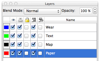
Your layers should be (as in figure 16), from top to bottom: Overlay, Text, Map, Paper.
- Re-select the "Map" layer. If you don't do this you won't be able to select your map in a later section.
Now you need to create some suitable colours.
Colours
If you don't know how to create colours, see this article: How to create your own colours
- Create an RGB colour "Route" as R=190, G=13, B=60. This will be used to show the route to your treasure.
- Create an RGB colour "Outlines" as R=141, G=86, B=22. This will be used for the outlines on your map.
- Create an RBG colour "Land" as R=255, G=238, B=182. This will be used for your map's land.
- Create an RGB colour "Text" as R=143, G=111, B=103. This will be used for the text over your map.
Now you need to make your map look "older".
Outlines and Land
- Select one vector on your map. Any will do.
- Go to
 Properties ⟩⟩ Colour
 - Click the "Line Colour" icon.
- Drag-select everything. Do not use Edit → Select All as it will close the Colour tab.
- Select the "Outlines" colour from the list of colours.
- Still in the Colours tab, click the "Fill Colour" icon.
- Select the "Land" colour from the list of colours.
- Go to
 Properties ⟩⟩ Line
 - Enter 1.5pt as the Line Width. (Don't use the spinners, enter the value manually and press ENTER instead.)
You should have something like that in figure 17, where everything is made of brown outlines with a slightly yellow fill.
Don't worry if there are still things outside the page. When you come to create the final PDF they will be cut off.
- Save your document under a new name so that you have a previous version you can go back to if you want to make some changes differently.
Now you can now start to add things to your page.
Adding the Paper
- Zoom out a bit so that you can see the whole page (75% is probably good).
- In the
 Layers palette select the "Paper" layer.
 - Choose menu Insert → Insert Image Frame
- Draw the image frame from just outside the top-left of your page to just outside the bottom-right so that the frame totally covers the page.
- With the frame still selected, right-click and choose Get Image… from the menu.
- Locate the paper image you downloaded at the start and OK the dialog.
- Right-click and choose Adjust Image to Frame
- Go to
 Properties ⟩⟩ Image
 - Click the "Free Scaling" radio button.
- Make sure that the "X-Scale" and "Y-Scale" fields are locked together by clicking on the chain icon to the right so that the two chain links are connected.
- Change either the "X-Scale" or "Y-Scale" values so that the image totally covers the frame.
You should have something that look like figure 18. It's starting to come together but there's still quite a lot of work to do.
Checking For Anomalies
At this point you should have a look round your map and see if anything doesn't look right. Sometimes things haven't been filled with the "Land" colour. Sometimes things have been filled when they shouldn't be. Look for straight lines where you didn't expect them.
You can fix some small problems by using the Bezier Curve tool to draw a shape round the problem area, removing the outline of the new shape and filling it with the "Outlines" colour. Or you can change the Fill Colour to "None" or just delete the object that looks wrong. It depends on what's wrong. You need to decide what's best for you.
The Route
- In the
 Layers palette select the "Text" layer.
 - Choose menu Insert → Insert Bezier Curve
- Draw your treasure map route from your starting point to your end point.
You can just use straight lines or drag the points to make the line curvy. If you haven't used Bezier Curves before then you might want to look at the article Bezier Curve Basics - Part 1 - Simple Geometric Shapes before continuing.
- Once your route is drawn how you want it, and with it selected, go to
 Properties ⟩⟩ Colour
 - Press the "Line Colour" icon.
- Select the "Route" colour from the list.
- Go to
 Properties ⟩⟩ Line
 - Change the "Line Width" to 3pt.
- Change the "Type of Line" to the first dashed line in the drop-down menu.
- Change the "Endings" to "Round Cap".
You've now got your route - as in figure 19 - but you also need the most important part: "X" marks the spot!
The X
- Choose menu Insert → Insert Bezier Curve
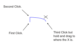
- Draw the shape - highlighted in blue - in figure 20 by clicking and dragging as shown. You don't have to be too accurate.
- Double-click the shape to enter the
 Node Editor
 - Click the icon for "Close this Bezier Curve" (third down, second from left).
- Click the icon for "Move Control Points" (second down, far left).
- Drag the magenta circle on the bottom-right to the middle of the top curve (as shown in figure 21).
- Press End Editing on the Node Editor
- Go to
 Properties ⟩⟩ Colour
 - Change the "Line Colour" to "None".
- Change the "Fill Colour" to "Route".
- Go to
 Properties ⟩⟩ X,Y,Z
 - Change the "Rotation" value to 45 degrees.
- Choose menu Item → Duplicate
- With the duplicate selected, go to
 Properties ⟩⟩ X,Y,Z
 - Press the "Flip Horizontal" button.
- Change the "Rotation" to 315 degrees.
- Shift-select the original curve.
- Open the
 Align and Distribute palette.
 - Set "Relative To" to "First Selected".
- Press the "Centre on Vertical Axis" button.
- Press the "Centre on Horizontal Axis" button.
- Right-click any of the curves and choose Group from the menu.
- Drag your "X" to the end of your route.
You should now have something that looks like figure 22 and you're almost finished. Just a bit more to do.
Adding Text
The text you add is really up to you. Just make sure you put it on the "Text" layer and give it the colour of "Text".
Adding the Overlay
- In the
 Layers palette select the "Overlay" layer.
 - Choose menu Insert → Insert Image Frame
- Draw the image frame from just outside the top-left of your page to just outside the bottom-right so that the frame totally covers the page.
- With the frame still selected, right-click and choose Get Image… from the menu.
- Locate the overlay image you created in GIMP and OK the dialog.
- Right-click and choose Adjust Image to Frame
- Go to
 Properties ⟩⟩ Image
 - Click the "Free Scaling" radio button.
- Make sure that the "X-Scale" and "Y-Scale" fields are locked together by clicking on the chain icon to the right so that the two chain links are connected.
- Change either the "X-Scale" or "Y-Scale" values so that the image totally covers the frame.
The whole map should now look a little "older" than before.
Map Revisited
And now for some final touches.
- In the
 Layers palette select the "Map" layer.
 - Still in the
 Layers palette, at the top right set the "Opacity" to 50% or 60% (whichever looks best to you).
 - Now set the "Opacity" for the "Text" layer to be 80%.
And you're done!
Conclusion
You've now created your very own treasure map.
Why not have a play around with:
- Changing the colours (maybe the text looks better darker?),
- Adding more text,
- Removing more of the map detail,
- Finding some clipart of dragons or sea monsters and adding them to the "Text" layer,
- Changing the opacity of the "Map" and "Text" layers to see what happens.
Basically just mess about with stuff and see what you can create.


