Get Started With Scribus:7: Difference between revisions
C schaefer (talk | contribs) (→Done!) |
No edit summary |
||
| Line 22: | Line 22: | ||
{| | {| | ||
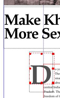
| valign="top" |If you go back to '''Edit > Paragraph Styles...''' in the menus, and edit any existing style, you'll note an automatic drop-cap feature available, for your preferred number of lines. But let me show you how to create hanging drop-caps, and you'll also learn how to handle wrap-arounds the Scribus way. Take the 'Draw Shapes' tool, draw a rectangle, at '''X-Pos:59, Y-Pos:200, W:19, H:24.3'''. Fill and stroke this with 'None' in 'Colors' so it does not show. Check 'Text flows around frame' and you'll see the first para of your article flowing around this “empty” space. Next, draw a text frame at '''X-Pos:52, Y-Pos: 195, W: 24.5, H: 36'''. Uncheck 'Flow text around frame' for this. Using either the '''Story Editor''' or the '''Edit Contents''' tool, enter the letter 'D' in this text frame. In Properties, set this to Georgia Roman, 87 point, with leading at 104 points. Fill this with Black. Click on 'Shade' choose 'Other' from the drop-down manu, and type 69%. Your drop-cap is done. Should you want to select the invisible rectangle used for wrapping text, and end up selecting this text frame stacked on top of it, press control+shift click and repeatedly press until you select the correct object in the stack. | | valign="top" |If you go back to '''Edit > Paragraph Styles...''' in the menus, and edit any existing style, you'll note an automatic drop-cap feature available, for your preferred number of lines. But let me show you how to create hanging drop-caps, and you'll also learn how to handle wrap-arounds the Scribus way. Take the 'Draw Shapes' tool, draw a rectangle, at '''X-Pos:59, Y-Pos:200, W:19, H:24.3'''. Fill and stroke this with 'None' in 'Colors' so it does not show. Check 'Text flows around frame' and you'll see the first para of your article flowing around this “empty” space. Next, draw a text frame at '''X-Pos:52, Y-Pos: 195, W: 24.5, H: 36'''. Uncheck 'Flow text around frame' for this. Using either the '''Story Editor''' or the '''Edit Contents''' tool, enter the letter 'D' in this text frame. In Properties, set this to Georgia Roman, 87 point, with leading at 104 points. Fill this with Black. Click on 'Shade' choose 'Other' from the drop-down manu, and type 69%. Your drop-cap is done. Should you want to select the invisible rectangle used for wrapping text, and end up selecting this text frame stacked on top of it, press control+shift click and repeatedly press until you select the correct object in the stack. | ||
|- | |||
| [[Image:Hanging_dropcap_fyug.jpg]] | | [[Image:Hanging_dropcap_fyug.jpg]] | ||
| width="10px" | | | width="10px" | | ||
Revision as of 00:21, 4 October 2006
Get Started With Scribus 2006
| ||||||||
Chapter 7
|
- What Can You Do With Scribus
- Scribus And Its Sisters
- Empty, White Spaces
- Cover Page
- Working With Layers On A Page
- Design Multiple Pages
- Create Final Page Layouts
- Design With Graphics And
Freedom - Set Fire With SVG Graphics
- Publishing Demands Freedom.PDF.
- Travel At The Speed Of Scribus
- Contributors
- GNU Free Documentation Licence
Create Final Page Layouts
Make space for Photos and Headline
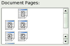
You've got the general idea of how Scribus creates templates, paragraph styles, and works with text frames and picture frames. Time to design all the feature pages of the cover story. Go to page two. This you can do by clicking on the page icon in the page palette (Arrange Pages in 1.3.X), or at the extreme bottom of your screen, you will see a go forward button, a go back button, and pop-up list in-between where you can choose the page you want to visit.
Click the text frame on page two, and in Properties, in 'XYZ' key-in X-Pos: 65mm, Y-Pos: 201.5, and Height: 48.5mm. The text frame shrinks to the bottom of the page. Note how the text automatically flows to the next page. Link the text frame on page three, to the subsequent text frame on page four, so text flows from page to page.
Insert Picture
Select the picture frame icon ![]() from Tools, just like you did for the cover page. This time, draw a random picture frame on the top of page two. In Properties, give it X-Pos: 20mm, Y-Pos: 35 mm, W: 135mm, H: 100mm. Right-click this picture frame. From the pop-up menu, choose 'Get Picture...'. Go to the images folder inside the FYug folder, select the file 'EnterTitle.jpg' and click 'Open.'
from Tools, just like you did for the cover page. This time, draw a random picture frame on the top of page two. In Properties, give it X-Pos: 20mm, Y-Pos: 35 mm, W: 135mm, H: 100mm. Right-click this picture frame. From the pop-up menu, choose 'Get Picture...'. Go to the images folder inside the FYug folder, select the file 'EnterTitle.jpg' and click 'Open.'
Resize Picture
In the Properties palette, click on the 'Image' tab, check 'Free Scaling' and then key-in X:0mm, Y:-30mm, X-Scale and Y-Scale at 32% each. This will shift the photograph 30 mm to the left, inside the frame, and then scale it down to 32% for that perfect crop.
Typeset Headline
Draw a text frame. X-Pos: 20mm, Y-Pos: 142mm, W: 165mm, H: 39mm. Enter the text, "Make Khajuraho More Sexy" on two lines. In the 'Text' tab, choose Georgia Roman 48 pts on line spacing of 42 pts. You could choose Garamond or Times if you wish. Set kerning to -1.0pts. Then zoom in and manually kern the individual letters until you get a crisp, neatly tucked-in headline.
Hanging Drop Cap
Done!
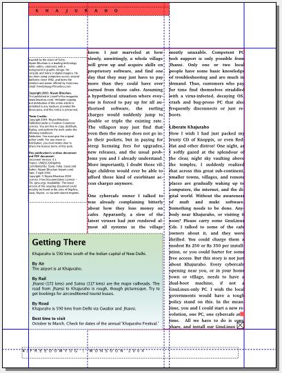
| Go to View menu and hide the guides, frames, margins, and grids or choose Preview Mode (only in 1.3.4cvs or higher). Your layout will look like the above screenshot.
On page three, the sculpture picture frame has an invisible rectangle behind it, that wraps around the text. Just like we did with the drop-cap. The captions are just a text frame in the half-column. The generous white space at the bottom of the first column, is likewise just an invisible rectangle with 'flow text around frame' checked. Study the provided FYug.sla file for further details. |
Here is Page 3 with frames highlighted. Note how the caption frame upper right lines up with guides, then uses an adjustment in left border to create a gap (Properties > Shape > Distances of Text > Left).
Notice the use of a frame lower left to create a space for balance. Finally, while this page used a strategy similar to the hanging drop cap for making space to the left of the image, one could alternatively make this space with Properties > Shape > Edit Shape and editing the contour line. |
Gradient-Filled Box Story
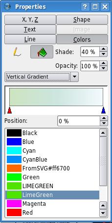
| The body text flows to page four. A single text frame in the half-column on the left contains the story and photo credits. The box-story at the bottom is a text frame that is formatted with various paragraph styles. The gradient in the text frame is applied in the 'Colors' tab of Properties. Underneath the 'bucket' icon a drop-down menu with the word 'Normal' reveals 'Vertical Gradient' among others. Choose LimeGreen at 40% as color#1, and CyanBlue at 20%.
The text has a gap of 2.5mm from top, bottom, left, and right of the text frame. This is set in the 'Shape' tab of Properties. A red square is drawn to mark the story end. |


