Вводный курс по Scribus:4: Difference between revisions
Prokoudine (talk | contribs) m (renamed chapter -> глава :)) |
|||
| Line 4: | Line 4: | ||
==Обложка== | ==Обложка== | ||
Если вы видите слишком много салатовых линий на только что созданной странице, то зайдите в меню '''“Вид”''' и уберите галочку напротив '''"Показывать сетку"'''. Должны остаться только синие линии, обозначающие границы страницы. Принцип работы в Scribus’е прост: что бы поместить фотографию на страницу, необходимо сначала создать для нее рамку, в которую уже и будет вставлена сама фотография. Точно так же и со вставкой текста. Сначала создаем рамку, а потом уже импортируем в него текст, который мог быть создан в любом текстовом редакторе. В скором времени, вы поймете, что данный подход имеет существенные преимущества. | |||
===Вставка блока изображения=== | ===Вставка блока изображения=== | ||
Revision as of 11:50, 31 January 2008
Вводный курс по Scribus 2006
| ||||||||
Глава 4
|
- Что вы можете делать при помощи Scribus
- Перед началом работы
- Изначальный вакуум
- Обложка
- Работа со слоями страницы
- Макетирование нескольких страниц
- Создание конечного макета
- Макетирование с графикой
- Зажгите огонь графикой в SVG
- Публикации нужны свободные PDF
- Путешествие на скорости Scribus
- Участники
- GNU Free Documentation Licence
Обложка
Если вы видите слишком много салатовых линий на только что созданной странице, то зайдите в меню “Вид” и уберите галочку напротив "Показывать сетку". Должны остаться только синие линии, обозначающие границы страницы. Принцип работы в Scribus’е прост: что бы поместить фотографию на страницу, необходимо сначала создать для нее рамку, в которую уже и будет вставлена сама фотография. Точно так же и со вставкой текста. Сначала создаем рамку, а потом уже импортируем в него текст, который мог быть создан в любом текстовом редакторе. В скором времени, вы поймете, что данный подход имеет существенные преимущества.
Вставка блока изображения
A toolbar contains all the Tools that Scribus offers. You can use this link to get your bearings, but remember that gliding your mouse over each icon will display a tool tip with the name of each tool. Click on the third one (Insert Image Frame ![]() )[keyboard: I]. This allows you to insert an image frame in the page. That's what you want for placing the cover picture. Drag your mouse from the top-left of the Scribus page, to the bottom-right, or any corner to its opposite. Don't worry if you don't get it exactly right. You'll find an image frame drawn on your page, in the shape of a large rectangle, with black-colored diagonal lines forming a large 'X' through it . This is a traditional printing industry custom, to distinguish image frames from text frames. That 'X' won't ever print, so don't worry.
)[keyboard: I]. This allows you to insert an image frame in the page. That's what you want for placing the cover picture. Drag your mouse from the top-left of the Scribus page, to the bottom-right, or any corner to its opposite. Don't worry if you don't get it exactly right. You'll find an image frame drawn on your page, in the shape of a large rectangle, with black-colored diagonal lines forming a large 'X' through it . This is a traditional printing industry custom, to distinguish image frames from text frames. That 'X' won't ever print, so don't worry.
Душа Scribus
From the menus, go to Tools > Properties (in 1.3.x Windows > Properties). Along comes a dialog box that is the heart and soul of Scribus. All objects you add to the page, from image frames, text frames, or even actual photos, text, or lines, are all controlled from this central dialog box. Make sure the image frame you just created is highlighted, or selected. Usually red-colored or other colored square dots will mark all the four corners as a visual cue. If not, in the Toolbar, click on the first icon ![]() (Select Item), and just click on the image frame. The Properties Tool will instantly show all its details. An object must be selected to be modified or deleted.
(Select Item), and just click on the image frame. The Properties Tool will instantly show all its details. An object must be selected to be modified or deleted.
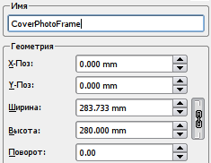
Give a human-readable label to this image frame, such as 'CoverPhotoFrame' in the 'Name' field of Properties. In case you do not see the 'Name' field, just click once on the top tab, that says X,Y,Z. Next, precisely place the top-left of your picture frame on the top-left edge of your page. In the X-Pos and Y-Pos fields, type in the values of 0mm, each. Pos is obviously a short-form of Position. Type in the Width and Height at 210 mm and 280 mm respectively. Your frame is precisely placed on the page. While you can resize and reposition with the mouse, typing in values is much faster for a task like this.
Получение изображения
After you make sure your image frame is selected, then right-click anywhere inside this image frame. You will see a Context Menu pop-up right under the mouse cursor. Select Get Picture... from this menu (in 1.3.x this is Get Image). A file dialog box opens up for you to navigate into your FYug folder, and then into the images folder, so you can select the 'TitleFX.jpg' sample image. Click on the OK button. The image frame on your Scribus page is immediately filled with the TitleFX.jpg image.
Смещение изображения влево
Note the sculpture in the image is too much to the right. We must drag the picture inside the image frame to the left, so that the sculpture is positioned in the centre of the image frame. Extra parts of the picture will get automatically cropped out of view beyond the boundaries of the image frame. First, let's play with this positioning with the mouse. On the toolbar, click on the icon for Edit Contents of Frame ![]() .
.
Now when you left click inside the image frame you can manually slide your picture around, and for some projects this may be accurate enough. For our project let's be very precise. First, make sure the image frame is selected (click Select Item on the toolbar then click your frame again, or try this: left-click outside your frame and you will see the Select Item icon become highlighted, then left-click inside the frame to select it). Now go back to the Properties Tool and click on the tab titled 'Image'. In the field marked X-Pos, just type in the value “-90mm” to move the image 90 mm to the left. Note how the image is shifted inside the image frame.
Цветовая карма
At the bottom of the Properties Tool (Image tab), you may have noticed a section called 'Input Profiles.' This will only show if the LittleCMS on your PC is correctly installed and configured. The color of your images may look markedly different on your screen, and even more when you print them. This little area minimizes such color mismatch. From the pop-up for 'Input Profile', choose a color profile that closely matches your monitor. Scribus immediately re-renders the image on the screen to display colors according to that profile.
The actual installation of LittleCMS and how to use it under Scribus is actually quite simple, but beyond the scope of this tutorial. Here are some good tips:
- Download a set of free profiles from the Adobe site, so you can send images between Mac, Windows, and Linux.
- Create a custom color profile of your own monitor and use that instead of any other.
Сохранение
You may want to save your file before proceeding. So head over to File>Save and type the name 'Fyug.sla' for your file. Save it in the FYug folder. You can also just click on the floppy icon in the taskbar, right underneath the menus, to save your file.![]()
Блок названия журнала
The cover page of any magazine has its name emblazoned across the top. This is called the Masthead. Ours is titled “FreedomYug.” We'll start by creating a semi-transparent band for the Masthead. Go to Settings > Preferences > Display (in 1.3.x File > Preferences > PDF Export). Make sure this checked: “Use PDF1.4 Transparency Features” (In 1.3.x make sure the PDF 1.4 is chosen under Compatibility). Click OK. Your document now supports transparent objects.
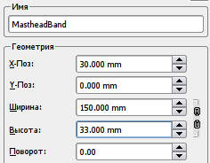
Click the fifth tool ![]() in the Toolbar. Should you hover your mouse over this, the roll-over text would display “Draw Various Shapes” or something similar. Select the rectangle shape from the drop-down menu. Click anywhere near the top-centre of the page and draw a rectangle. Make sure the rectangle is selected, and immediately go to the Properties Tool, click on the X,Y,Z tab, and enter the following values: X-Pos: 30mm. Y-Pos: 0mm. Width: 150mm. Height: 33mm. Give it a name, such as 'MastheadBand' in the Name field.
in the Toolbar. Should you hover your mouse over this, the roll-over text would display “Draw Various Shapes” or something similar. Select the rectangle shape from the drop-down menu. Click anywhere near the top-centre of the page and draw a rectangle. Make sure the rectangle is selected, and immediately go to the Properties Tool, click on the X,Y,Z tab, and enter the following values: X-Pos: 30mm. Y-Pos: 0mm. Width: 150mm. Height: 33mm. Give it a name, such as 'MastheadBand' in the Name field.
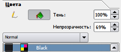
Then click on the Colors tab in Properties. Click the Pencil tool ![]() to select the stroke or outline border. Click on 'None' in the colors list. Then, click the bucket icon to select the fill color. Click on 'Black' from the list of colors, and in the opacity field, enter 69% (if you do not see an Opacity field, you have not selected PDF 1.4 transparency features -- see first paragraph above in this section). You will see the band has turned semi-transparent, and partly shows the image through itself, in darkened colors. Experiment with Opacity and other colors to your taste.
to select the stroke or outline border. Click on 'None' in the colors list. Then, click the bucket icon to select the fill color. Click on 'Black' from the list of colors, and in the opacity field, enter 69% (if you do not see an Opacity field, you have not selected PDF 1.4 transparency features -- see first paragraph above in this section). You will see the band has turned semi-transparent, and partly shows the image through itself, in darkened colors. Experiment with Opacity and other colors to your taste.
Остальные блоки обложки
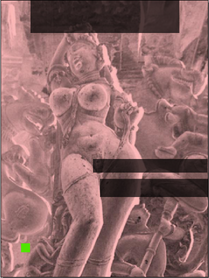
Draw another rectangle towards the centre of the image. In the Properties Tool (X,Y,Z), give X-Pos: 93mm. Y-Pos: 160mm. Width: 115.35mm. Height: 13.75mm. Again in Colors, set the stroke to 'None', and the fill with 'Black' at an opacity of 69%. Call this the 'HeadlineBand'. A third rectangle, named 'SubHeadBand' can be drawn slightly underneath this, at X-Pos: 100mm. y-Pos: 180mm. Width: 109.7mm. Height: 18.35mm. The fourth and final rectangle, this time a little square box, will have the following Properties: X-Pos: 20.5mm. Y-Pos: 245mm. Width and Height will both be 9mm.
| Here is a shortcut you might try for a repetitive job like this. Instead of making each rectangle from scratch, then changing all of these parameters, after you make the first one and adjust its colors, just copy it: Item > Duplicate. Then all you have to adjust is its name, position, and size. |
Создание цветов
| Hold on! Don't fill this with the same 69% Black. Let's give it a fresh lime green color. Go to Edit > Colors... in the menu. A dialog box listing existing colors displays on your screen. Click on 'New' and give your new color swatch a name, 'Lime Green' (if you already have a LimeGreen, call it LimeGreen2 or something else). In the second dialog-box that opens up, choose 'CMYK' as the Color Model. This closely follows the inks of Cyan, Magenta, Yellow, and Black, used in your desktop printer and in printing plants, that mix inks to create new colors. With the sliders at the bottom, give C:69%, M: 10%, Y:100%, and K: 0%.
Click OK in this dialog box, and then click OK again in the Colors dialog box, where you'll notice your new color added. Go back to your page, click on the small square you just created, and in the Colors tab of Properties Tool, give it a stroke of None, and a fill of LimeGreen, at 100% opacity. You cover should look like the screenshot here, with all the bands for text. |

|
Запертые блоки
One last thing. Select each semi-transparant band individually, and in the Properties palette, in the X,Y,Z tab, click on the icon of the padlock ![]() at the bottom. This ensures you accidentally do not move or resize each locked object.
at the bottom. This ensures you accidentally do not move or resize each locked object.
Similarly, lock the CoverPicture Frame as well, and the green square, using this padlock. Also, uncheck 'Text Flows Around Frame' in the Shape tab of the Properties Tool for each of these rectangles. This allows text to overlap the rectangles.


