Get Started With Scribus:5: Difference between revisions
| Line 7: | Line 7: | ||
We are going to format the text for the magazine's [[Wikipedia:Masthead_(publishing)|masthead]], the [[Wikipedia:Headline|headline]], and the subhead. Imagine if this [[Wikipedia:Magazine|magazine]] is published in several languages. One way to then produce this [[Wikipedia:Magazine|magazine]] would be to recreate the magazine layout for each language. The other way, is to have the text for each language on another layer. Think of layers like transparent sheets that overlap one another. You could hide or view layers, for example: hide the English text layer, and show the Hindi text layer. | We are going to format the text for the magazine's [[Wikipedia:Masthead_(publishing)|masthead]], the [[Wikipedia:Headline|headline]], and the subhead. Imagine if this [[Wikipedia:Magazine|magazine]] is published in several languages. One way to then produce this [[Wikipedia:Magazine|magazine]] would be to recreate the magazine layout for each language. The other way, is to have the text for each language on another layer. Think of layers like transparent sheets that overlap one another. You could hide or view layers, for example: hide the English text layer, and show the Hindi text layer. | ||
[[Image:LayersTool125.png|left|thumb|300px|Layers Tool v1.2.5<br>v1.3.x has a different arrangement]] | [[Image:LayersTool125.png|left|thumb|300px|Layers Tool v1.2.5<br>v1.3.x has a different arrangement]] | ||
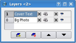
Layers bring a lot of convenience into page-design. For our [[Wikipedia:Magazine|magazine]], I will keep the background image and bands in one layer, and have the text contained in another layer. Go to '''Tools > Layers''' (in 1.3.x '''Windows > Layers'''). In the dialog box, you will see one existing layer, that contains all your objects so far. Uncheck the 'eye' icon to the right of this, and all elements of this layer disappear, leaving you with your empty page. | Layers bring a lot of convenience into page-design. For our [[Wikipedia:Magazine|magazine]], I will keep the background image and bands in one layer, and have the text contained in another layer. Go to '''Tools > Layers''' (in 1.3.x '''Windows > Layers'''). In the dialog box, you will see one existing layer, that contains all your objects so far. Uncheck the 'eye' icon to the right of this (in 1.3.x the box is underneath), and all elements of this layer disappear, leaving you with your empty page. | ||
Double-click on the name of this layer, and change it to 'Bg Photo'. Click the bottom-left icon, that adds a new layer on top of the existing layer. Change the name of this layer to 'CoverText'. Make sure this layer is highlighted, so Scribus knows whatever elements you create will exist on this layer. Ensure the 'eye' icon is checked so you can view your layer. | Double-click on the name of this layer, and change it to 'Bg Photo'. Click the bottom-left icon, that adds a new layer on top of the existing layer. Change the name of this layer to 'CoverText'. Make sure this layer is highlighted, so Scribus knows whatever elements you create will exist on this layer. Ensure the 'eye' icon is checked so you can view your layer. | ||
Revision as of 01:30, 13 February 2007
Get Started With Scribus 2006
| ||||||||
Chapter 5
|
- What Can You Do With Scribus
- Scribus And Its Sisters
- Empty, White Spaces
- Cover Page
- Working With Layers On A Page
- Design Multiple Pages
- Create Final Page Layouts
- Design With Graphics And
Freedom - Set Fire With SVG Graphics
- Publishing Demands Freedom.PDF.
- Travel At The Speed Of Scribus
- Contributors
- GNU Free Documentation Licence
Working With Layers On A Page
Why We Need Layers
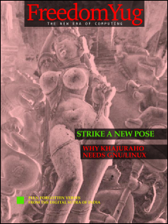
We are going to format the text for the magazine's masthead, the headline, and the subhead. Imagine if this magazine is published in several languages. One way to then produce this magazine would be to recreate the magazine layout for each language. The other way, is to have the text for each language on another layer. Think of layers like transparent sheets that overlap one another. You could hide or view layers, for example: hide the English text layer, and show the Hindi text layer.
Layers bring a lot of convenience into page-design. For our magazine, I will keep the background image and bands in one layer, and have the text contained in another layer. Go to Tools > Layers (in 1.3.x Windows > Layers). In the dialog box, you will see one existing layer, that contains all your objects so far. Uncheck the 'eye' icon to the right of this (in 1.3.x the box is underneath), and all elements of this layer disappear, leaving you with your empty page.
Double-click on the name of this layer, and change it to 'Bg Photo'. Click the bottom-left icon, that adds a new layer on top of the existing layer. Change the name of this layer to 'CoverText'. Make sure this layer is highlighted, so Scribus knows whatever elements you create will exist on this layer. Ensure the 'eye' icon is checked so you can view your layer.
Entering Text in a Text Frame
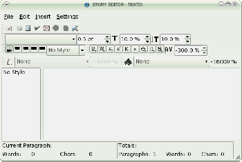
Ensure the CoverText layer is highlighted in Layers. Click on the the text-frame ![]() in tools (keyboard: T) and drag a text frame across the MastheadBand. For the moment, make the text frame as wide as the page and nearly double the height of the MastheadBand. Click the Story Editor icon
in tools (keyboard: T) and drag a text frame across the MastheadBand. For the moment, make the text frame as wide as the page and nearly double the height of the MastheadBand. Click the Story Editor icon ![]() in the Toolbar (keyboard: Ctrl+Y). This is next to the Edit Contents of Frame
in the Toolbar (keyboard: Ctrl+Y). This is next to the Edit Contents of Frame ![]() icon. A dialog box displays, where you can enter the text you wish to have published in the text frame. Think of the Story Editor dialog box as a mini notepad or word processor for each text frame. This is the second-most important dialog box in Scribus, after the Properties Tool we saw earlier. Type the text: “FreedomYug” in the Story Editor. Then click on File > Save and Exit inside the Story Editor (File > Update Text Frame and Exit in 1.3.X). This publishes your text into the text frame, and exits the Story Editor.
icon. A dialog box displays, where you can enter the text you wish to have published in the text frame. Think of the Story Editor dialog box as a mini notepad or word processor for each text frame. This is the second-most important dialog box in Scribus, after the Properties Tool we saw earlier. Type the text: “FreedomYug” in the Story Editor. Then click on File > Save and Exit inside the Story Editor (File > Update Text Frame and Exit in 1.3.X). This publishes your text into the text frame, and exits the Story Editor.
Make Text Look Beautiful
'FreedomYug' will look attractive if the gaps between the letters are reduced, and if the text fits into the MastHeadBand. The overall gap between letters is called 'Tracking.' To reduce this tracking, right-click on the text frame, and from the pop-up menu, choose 'Show Properties'. In Shape uncheck 'Text flows around frame'. On the buttons at the top of this dialog box, click on Text.
Tracking
From the drop-down menu of Fonts in the Properties dialog box, choose 'Utopia Regular' or else Times Roman or any other font you fancy. Make the size: 84 points. Traditionally, a point is a unit of measure in the printing industry. 72.27 points make an inch. In digital print publishing, this is rounded-off to 72 points make an inch. Text size is usually measured in points. Select 'Red' from the drop-down menu next to the bucket icon, which stands for 'Fill Color' for our text. In the field labelled Tracking, enter -5 pts. Line Spacing at 72 pts. You will find the gaps between the text has squeezed, and the text has changed to the color red.
Note that all of these font sizes, settings, and positioning values may vary depending on which exact font you choose. The important thing is to fit them in the space provided, with a look that is pleasing to you. In particular, you may find that the text frame height may need to be much larger than you expect. Look for a small rectangle with an X inside in right lower corner of the frame that tells you there is not enough space for the text
| Troubleshooting text that won't appear
If you are struggling to have your text appear:
|
More Text, More Frames
Use the same technique, make new text frames as follows:
| Content | Font (or similar) | Color |
|---|---|---|
| THE NEW ERA OF COMPUTING | Bitstream Vera Sans Mono Roman | White |
| STRIKE A NEW POSE | URW Palladio L Bold | LimeGreen2 |
| WHY KHAJURAHO NEEDS GNU/LINUX |
URW Palladio L Bold | Red |
| PLUS: FORGOTTEN VERSES FROM THE DIGITAL SUTRA OF INDIA |
URW Palladio L Bold | Yellow |
Adjust size, tracking and line spacing to fill the space as needed.
And While We're At It
Here is an excerpt from Working with text frames elsewhere on the Wiki. You should find this useful when adjusting sizes, positions, and other settings.
There are three ways to change the individual settings --
- editing with the keyboard
- clicking on the up or down arrows to the right of each value. The keyboard up and down arrows will accomplish the same thing.
- using the mousewheel on each setting -- usually hovering the cursor will be enough, if not, click on the value first
Also note that for 2 and 3, holding down Ctrl, Shift, or Ctrl+Shift will alter which decimal place is affected. In addition, when using the Properties window width and height are by default linked, but you need only click the chain icon to the right to unlink them. Refer to this article for more on keyboard shortcuts.


